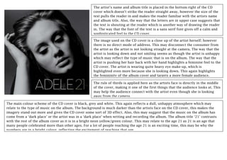
1. The artist’s name and album title is placed in the bottom right of the CD
cover which doesn’t strike the reader straight away, however the size of the
text pulls the reader in and makes the reader familiar with the artists name
and album title. Also, the way that the letters are in upper case suggests that
the text is shouting at the reader which is another way of drawing the reader
in. The way that the font of the text is a sans serif font gives off a calm and
sophisticated feel to the CD cover.
The image used on the CD cover is a close up of the artist herself; however
there is no direct mode of address. This may disconnect the consumer from
the artist as the artist is not looking straight at the camera. The way that the
artist is looking down and not smiling seems as though the artist is unhappy
which may reflect the type of music that is on the album. The way that the
artist is pushing her hair back with her hand highlights a feminine feel to the
CD cover. The artist is wearing quite heavy eye make-up, which is
highlighted even more because she is looking down. This again highlights
the femininity of the album cover and targets a more female audience.
The main colour scheme of the CD cover is black, grey and white. This again reflects a dull, unhappy atmosphere which may
relate to the type of music on the album. The background is much darker than the artists face on the CD cover, this makes the
imagery stand out more and gives the CD cover some sort of 3D effect. Also, this may suggest that the music on the album has
come from a ‘dark place’ or the artist was in a ‘dark place’ when writing and recording the album. The album title ‘21’ contrasts
with the rest of the album cover as it is in a bright neon yellow/green colour. This may relate to the age 21 as 21 is an age that
many people celebrated more than other ages. For a lot of people reaching the age 21 is an exciting time, this may be why the
numbers are in a bright colour, reflecting the excitement of reaching that age.
The rule of thirds is applied here as the artists face is directly in the middle
of the cover, making it one of the first things that the audience looks at. This
may help the audience connect with the artist even though she is looking
away from the camera.
2. The typography is the same as what it used on the CD cover. The sans serif font
suggests a sophistication and maturity of the album. The upper case letters may
suggest that the text is shouting at the audience, pulling them in to buy the CD.
There is quite a comparison between the size of the numbers and the song titles,
suggesting that the song titles are much more important than the numbers.
The image of the artist is similar to the one on the CD cover, a close up of
the artists face. The image used has a direct mode of address with the audience,
straight away letting the audience connect with the artist when they look at the
back cover. The facial expression that the artist has makes her look as if she’s
unhappy, similar to the image on the CD cover, reflecting the type of music
within the album.
The colours used on the back cover and dark and dull, giving off a sad,
mysterious atmosphere to the audience. Like the CD cover, the dark background
suggests that the music has come from a dark place. Also, the way that the
artist’s face is a lot lighter than the background on the back cover, and the way
that she has a sad facial expression, again reflects the music within the album.
The bright, neon green colour of the CD straight away strikes the
consumer as it’s such a bright colour and such a contrast against the CD
front and back cover. This could portray that the artist feels mixed emotions
and the music contains this. This confusion may pull the audience in and
make them want to buy the album. Like the CD front cover, the colour may
represent the exciting time in somebody’s life of turning 21. Also, the way
that the number ‘21’ is presented on the CD, as if somebody has written it,
may represent a slight immaturity as although 21 is adulthood, it’s still a
fairly young age.