
Recommended
More Related Content
What's hot
What's hot (20)
Similar to Promoting a Music Tour and New Album
Similar to Promoting a Music Tour and New Album (20)
More from Curtis_Price
More from Curtis_Price (20)
Promoting a Music Tour and New Album
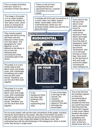
- 1. This is a poster promoting their tour, which is a promotion of their new album. The image in the poster is in an urban location, similar to the location of their album cover, which gives it a strong link to promoting their album. There is a list of music companies that have sponsored the tour, a typical convention of a music poster. It includes all of the main conventions of a music video; tour dates; support artists; record label; name of tour (rudimental live); where you can purchase tickets; where you can find out about the band. They include support artists that will be touring with them and who featured on their tracks from their album. The typography for ‘John Newman’ is a bit different to the others, it has a more old fashioned look, connoting the artists contrasting style to the others. The poster is in a very similar style to their album cover and single cover, with a landscape of buildings and a light blue sky with misty clouds. Therefore, you can link all of their work together. The poster is in a very similar style to their album cover and single cover, with a landscape of buildings and a light blue sky with misty clouds. Therefore, you can link all of their work together. In the background there are many high buildings (city). They are representing their roots. In the corner there is the logo for BB records, the company rudimental are signed to.This also promotes the record label. On my music poster I will use the main conventions of the poster, including having the record label on the poster. Also like in the Wretch 32 poster, I will have outlets where the song can be purchased from and listened to. I will also include a main image that relates to the album cover, like rudimental have with the city landscape in the background, which is similar to the ‘Not Giving In’ single cover. If you were to see the top of the album cover alone, you would know it’s rudimental, the music group because on their album and single covers they all have this style of typography, there is always a bold box around ‘Rudimental’, also it is in full caps font,like it is their logo. Also round on the text there is dirty and rough around the edges connoting the urban background. This is the first time the members appear on their print promotions/album covers, therefore possibly the first time you would have seen what they look like, as they don’t appear in their music videos, therefore the reason they use distinctive typography and similar style print work, so that you clearly know who it is.