1. Double Page Spread Analysis
Thisis a double page spreadforthe
magazine ‘Topof the Pops’. The
double page spreadfollowsthe
general layoutconventionsof a
double page spreadasit has a large
image of the artist being
interviewed andthe actual
interview placedaroundit.There is
alsoa headlinewhichisrelatedto
the text.Thisparticulardouble
page spreadis mainlysimilarto
otherdouble page spreadsforthis
magazine whichhelpsmaintain
brand identity,thoughthe colour
scheme isslightlydarkerthanusual.
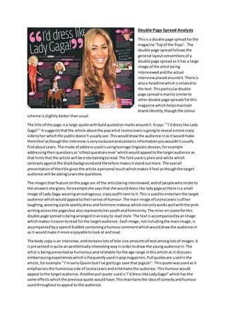
The title of the page isa large quote withboldquotationmarksaroundit.Itsays ‘‘’I’ddresslike Lady
Gaga!’’’It suggeststhatthe article aboutthe popartist LeonaLewisisgoingto reveal amore crazy
side toher whichthe publicdoesn’tusuallysee.Thiswoulddraw the audience inasitwouldmake
themfeel asthoughthe interview isveryexclusiveandcontainsinformationyouwouldn’tusually
findaboutLewis.The mode of address usedisusingteenage linguisticdevices,forexample
addressingtheirquestionsas‘silliestquestionsever’whichwouldappeal tothe targetaudience as
that hintsthat the article will be entertainingtoread.The fontusedisplainand white which
contrastsagainstthe blackbackgroundand therefore makesitstandoutmore.The overall
presentationof the title givesthe article apersonal touchwhichmakesitfeel asthoughthe target
audience will be askingLewisthe questions.
The imagesthat feature onthe page are of the artistbeinginterviewed,andof peoplewhorelate to
the answersshe gives,forexampleshe saysthatshe woulddresslike ladygagasothere isa small
image of Lady Gaga wearinganoutrageous,crazyoutfitnexttoit.Thisis usedto entertainthe target
audience whichwouldappealtotheirsense of humour.The mainimage of LeonaLewisisof her
laughing,wearingapinksparklydressandfeminine makeupwhichnotonlyworkswellwiththe pink
writingacrossthe pagesbut alsorepresentsheryouthandfemininity.The mise-en-sceneforthis
double page spread isbeingarrangedinaneasyto read style.The textisaccompaniedbyanimage
whichmakesiteasiertoread forthe targetaudience. Eachimage,notincludingthe mainimage,is
accompaniedbya speechbubble containingahumourcommentwhichwoulddraw the audience in
as it wouldmake itmore enjoyabletolookat andread.
The body copyis an interview,andcontainslotsof bite size amountsof text amonglotsof images.It
ispresentedinquite anaesthetically interestingwayinordertodraw the youngaudience in.The
artistis beingpresentedas humorous andrelatable forthe age range inthisarticle as it discuses
embarrassingexperienceswhichisfrequentlyusedinpopmagazines.Pull quotesare usedinthe
article,forexample ‘’I’msorryQueenbut I’ve gottogo save that pigeon’’.Thisquote wasusedasit
emphasises the humorous side of LeonaLewis andentertainsthe audience.Thishumourwould
appeal tothe targetaudience.Anotherpull quote usedis‘I’d dresslikeLadyGaga!’whichhas the
same effectswhichthe previousquote wouldhave.Thismaintainsthe ideaof comedyandhumour
usedthroughouttoappeal to the audience.
2. Othertextfeaturesonthe double page spreadare placingthe questionsbeingaskedinpinkpuff’s
above the paragraph of text,whichgoeswiththe theme of makingthe textmore digestibleforthe
audience due totheiryoungage range.The mode of addressisquite comical asthe questionsbeing
askedare notveryserious, andthere are a lot of brightcoloursusedwhichlightensthe tone and
makesitevenlessserious.
The layoutof the double page spreadisverysimilarineachissue whichmaintainsthe brandidentity.
Pinkfeaturesheavilywhichgoeswiththe popgenre asit isquite feminine andfunandreflectsthe
age range and genderof the readershipof the magazine.There isalotof boldfontsusedon specific
wordsand sentencestoputemphasisontheirimportance,forexamplethe word‘outrageous’.Each
piece of textisplacedwithanimage whichiseffective forthe audience astheymayfindi harderto
readlarge chucksof text.
The font whichmainlyappearsisCalibri Body,andthere issome variationof size andwhetherornot
it iswritteninboldor italics.The variationinsize maintainsthe brandidentity asitputsmore
attentiononbuzzwords.
3. Double Page Spread Analysis
Thisis a double page spreadforthe magazine ‘We Love Pop’. Itfollowsthe general conventionsof a
standarddouble page spreadasthere isa large image of the artist usedalongside the article,there is
a title to the article andthe questionsbeingaskedare writteninalternate colourstothe replies
fromthe artistbeinginterviewed.Despitethe factthisisa Christmaseditionof the magazine,ithas
still managedtomaintainbrandidentityasthe title iswritteninaredshape and the artistis
photographedona page to themselves withnotextsurroundingit.Thisreinforcesbrandidentity.
The title of the page is‘Merry Christmurs!’whichisapun linkedtothe artistbeinginterviewedashe
iscalledOllie Murs.The title suggeststhatthe article andartistwill be amusing. Itwill draw the
audience inasit isplacedinfrontof a red backgroundandthisis a veryeye catchingcolour.It will
alsoappeal to the targetaudience astheyare also humorous.The mode of address isinformal as
there isa pun used. The writingusedisina bold,white andyellow font.
The images whichfeature onthe page are all of Ollie Murs,and theyrepresenthiminapositive,
jokeylight,butalsoasbeingquite masculineandinfashion.Thiswouldappealtothe target
audience astheygetto relate tohismore funnyside butalsoadmire hisstyle inateenage girl way.
The mise-en-sceneforthe imagesisof snowflakeswhichreflectthe seasonal editionof the
magazine forChristmas.One genre specificpiece of iconographyisthe tinsel aroundhisneckinone
of the images.Thisisquite afun,playful thingtoaddto the magazine andthe sparkly,reflective
elementof tinselgoeswiththe genre well. There isone image oneachside of the article andone
nextto the headline.Thismeansthatthe pagesare not too busy,anddon’tdistract fromthe article
but workwell withit.There isa textbox placedinone of the imagessaying‘Doyou promise thisis
straightoff the Burberrycatwalk?’whichreflectshisstyle.Also,BurberryisanEnglishshopsothis
alsoindicatesthathe isfrom Britain. The humourusedinthistextbox appealstothe target
audience.
The body copyis an interviewwithawell knownBritishpopartistwhichgoeswell withthe pop
genre as popmagazinesusuallycontaininterviewswithartists.Itisnotpresentedasbite size
amountsof textamidstlotsof imagesbutinsteadhasimagessurroundingthe interview.Ithasbeen
presentedclearlyasyoucan obviouslysee whichpartsare the questionsandwhichare the artist’s
4. replies.Thiswouldmake iteasierforthe youngaudience toread.The artistis beingpresentedas
verydownto earth,as he refersto himself asa‘geezer’,andalsosweetandcaringas he says thathe
wouldgive RitaOra (anotherpopartist) ‘anice cuddle. A pull quote usedis‘Ryanwalkedaround
nakedmostof the time’.Thisquote wasusedasit isentertainingtoread andyou learnmore about
otherpop artists.The audience wouldfindthe informationappealinganddraw theminas theyget
to not onlylearnmore abouta famouspopartist butalso aboutother’swhoOllie Mursisfriends
with. The mode of addressusedisquite casual and usesa lotof teenslangtorelate to the target
audience,sotheywill therefore feel like theyare able torelate toandunderstandthe magazine
more.
The textboxesandspeechbubblesof textare beingusedtomake the spreadmore interesting,
digestible andinterestingtothe audience asitshowsthe textinmore bite-sizedchunks anddraws
more attentiontothe more exciting,interestingpiecesof texttothe audience.Italsohelpsgive a
betterideaof the personalityof the artistbeinginterviewedaswell.The textispresentedinquite an
organisedwaybutalsofunand excitingasthe magazine haschosensome quite boldcoloursforthe
font.
The organisationof the double page spreadiskept verysimilarineachmagazine whichhelps
maintainbrandidentity.There isalwaysalarge image fillingupone whole page of the artistbeing
interviewed,withthe otherpage devotedtothe interview itself,connectedbyapiece of textor an
arrow. The layoutisusedto make the article more interestingasone page isusedto appeal to
teenage girlsaestheticallybyshowingoff the looksof the artist,andthe otheris used(alongside
smallerimages) toshowthe artist’spersonality.
The colourswhichdominate the double page spreadare red,yellow,blackandwhite.Theseare not
veryfemininecolours,thoughthisparticulararticle hasbeendedicatedtoamale celebrity.The
coloursblackand white contraststronglysothismakesthe textstandout more, and the colours
yellowandredare alsoveryboldand eye catchingso overall the coloursare usedtomake the
interview standoutamongthe otherpages.The colourssuggestthatthe readershiplike tostandout
fromthe crowd.
The font ismainlykeptserif,thoughsome partsare initalics,bold,orsansserif.The effectsof the
fontsusedare to draw attentiontocertainpiecesof textorto presentthe moodof the text,for
example the partsinlarge boldfontare more importantthanthose insmall,paintext.The fontsand
typefacesusedmaintainbrandidentityas the italicsiscurly,andthe feetonthe fontalsomakesit
lookslightlymore fun,creativeandfeminine.