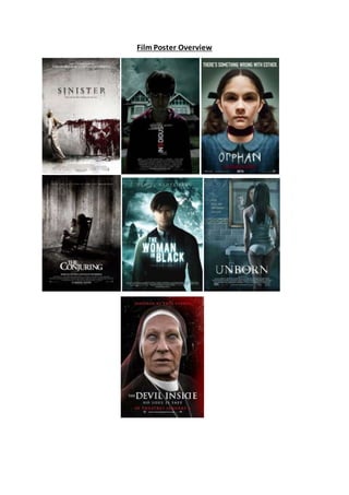
2. Above are seven different film posters which have all been designed to promote films which
belong to the horror sub-genre ‘supernatural’. In this investigation a number of different
themes on the posters will be analysed in order to identify similarities between them and
discover what makes a successful horror movie poster.
These seven posters all share the main similar conventions which are usually used in film
posters, in that they are all eye catching to their audience, there is a focal picture which
links with the films genre, the title is in a bold and obvious font so it clearly stands out
among the other pieces of text, and also there is a clear indication of the films genre
through the overall theme of the poster. In addition to this they all feature a slogan which
relates to the movie in some way.
There are many repeated patterns across these posters, for example five out of seven of
these selected posters feature a child as the antagonist. For example, on the ‘Insidious’ film
poster the mid shot of the young boy shows him with blackened eyes and a blank
expression, making him appear lifeless and soul-less. In addition to this, the discolouration
of his face makes him appear slightly ill or diseased as though something has taken over
inside him. In the ‘Unborn’ poster, it shows a female protagonist looking into the mirror
with a ghostly child looking back at her. He is wearing old fashioned clothes and again has
blackened eyes. These characters in supernatural horrors are typically children as by using
innocent people or objects and turning them into something evil, they almost becoming the
opposite of what they were originally. This shocks and horrifies the audience as children are
typically innocent and joyous, so seeing an evil child it is increasingly horrifying.
Another repeated theme across these posters is religious imagery. This is first shown in the
background of the filmposter for ‘The Woman in Black’. There is a dark shadow standing by
a crucifix, which demonstrates how horror films try and turn religion into something dark
and horrific by putting emphasis on the dark stories and myths within them. This idea is
furthered on ‘The Devil Inside’ filmposter as the antagonist appears to be a possessed nun.
Like what films try and do with young children, this is similarly done with religion as they try
and turn something which is typically used for hope and strength into something evil,
demonstrated by the nun who is meant to be a symbol of purity.
These posters have all been designed to scare the audience and make them curious about
the movie, as well as signalling which genre of horror the film belongs to. In ‘The Conjuring’
film poster, we see a long haired figure facing the wall wearing a white night gown. This has
been done to terrify the audience as by not seeing the character’s face it makes them
appear more inhuman. In addition to this, the character is holding a puppet/toy,
representing how childlike objects are used as a passage for evil to travel through, and in
the process taking away the identity of the owner. The decaying, bleak walls behind show
the effect that evil is having on the environment. These conventions used to scare the
audience are similar to those used on the ‘Sinister’ filmposter. This poster features a female
protagonist in white pyjamas. White is usually representative of innocence, yet in the image
she is wiping blood across the walls which link with the movie name ‘Sinister’. This conjures
up the ideas of what terrifying things can happen in the night and of the vulnerability people
acquire while sleeping. The blood running down the walls has formed a disturbing,
3. abnormal face which hints that the young girl has been affected in some way by the
creature.
There is a consistency with the colour schemes used across these posters as well. Cold,
ghostly colours especially blue and grey are used to create a ghostly, haunting feel to the
poster. In the cases of Sinister, Insidious, The Conjuring and The Unborn the characters all
appear to blend into the background. This is done as the audience isn’t immediately struck
by the character but almost has to search for it, which links with a common human fear of
the unknown or what is not obviously there. It is almost as though the characters are
trapped in this ghostly place and they are seeking to escape from it.
In each of these posters the film title has been made the most prominent text on the page,
and is located beneath the image so that they can fully appreciate the image before being
invited to find out the name. The reoccurrence of this placement allows the audience to be
familiarised with where they should expect to find the title. On the ‘Orphan’ film poster the
font has been designed to be more childish and messy, as though a young person had
scribbled it down, linking to the image being of a young girl. Each of these posters have
been presented in an uppercase font which is highly visible in contrast to the image as this
again makes it easier for the audience to spot. The majority of these posters use a
traditional looking font linking with how they recreate a lot of old myths within the movies.
Each have their own small variation for example on ‘Sinister’ poster there is a ghostly drop
shadow, and on ‘the Unborn’ poster there is a light mist surrounding the text.
Five out of seven of these posters provide institutional information at the bottom of the
page, and the two remaining posters use a tagline to draw the audience in and relates
strongly to the film name or plot. On the ‘Orphan’ poster, the tagline says ‘There’s
something wrong with Esther’, indicating that the girl on the poster is probably possessed
which links with the genre of the movie. In addition to this, writing ‘based on a true story’
increases the audience’s fear as it makes them think that it could happen to them. All the
text is presented to the audience in a clear and simple font (usually sans serif) so as not to
make the page look too busy, and easier to read.
All of these seven posters have been effective in drawing in the audience and they are
simplistic and contain minimal text therefore allow the main image to entice the viewer
most strongly.