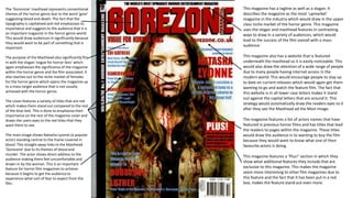
1. The ‘Gorezone’ masthead represents conventional
themes of the horror genre due to the word ‘gore’
suggesting blood and death. The fact that the
typography is capitalised and red emphasises its
importance and suggests to the audience that it is
an important magazine in the horror genre world.
This would draw audiences in significantly because
they would want to be part of something that is
important.
The purpose of the Masthead also significantly fits
in with the slogan ‘vogue for horror fans’ which
again emphasises the significance of the magazine
within the horror genre and the film associated. It
also reaches out to the niche market of females
for the horror genre which opens the magazine up
to a mass target audience that is not usually
achieved with the horror genre.
The cover features a variety of titles that are red
which makes them stand out compared to the rest
of the blue text. This is done to emphasise their
importance on the rest of the magazine cover and
draws the users eyes to the red titles that they
want them to see.
The main image shows Natasha Lyonne (a popular
actor) standing central to the frame covered in
blood. This straight away links to the Masthead
‘Gorezone’ due to its themes of blood and
murder. The actor shows direct address to the
audience making them feel uncomfortable and
drawn in by the woman. This is an important
feature for horror film magazines to achieve
because it begins to get the audience to
experience what sort of fear to expect from the
film.
This magazine has a tagline as well as a slogan. It
describes the magazine as the most ‘upmarket’
magazine in the industry which would draw in the upper
class niche market of the horror genre. This magazine
uses the slogan and masthead features in contrasting
ways to draw in a variety of audiences, which would
lead to the success of the film overall with a mass
audience.
This magazine also has a website that is featured
underneath the masthead so it is easily noticeable. This
would also draw the attention of a wide range of people
due to many people having internet access in the
modern world. This would encourage people to stay up
to date on current releases which would again get them
wanting to go and watch the feature film. The fact that
this website is in all lower case letters makes it stand
out against the capital letters that are around it. This
strategy would automatically draw the readers eyes to it
after they see the Masthead ad the Main Image.
The magazine features a list of actors names that have
featured in previous horror films and has titles that lead
the readers to pages within the magazine. These titles
would draw the audience in to wanting to buy the film
because they would want to know what one of their
favourite actors is doing.
This magazine features a ‘Plus!’ section in which they
show what additional features they include that are
exclusive to this magazine. This makes the magazine
seem more interesting to other film magazines due to
this feature and the fact that it has been put in a red
box, makes the feature stand out even more.
2. The Masthead has been cleverly made
large, red, capitalised and prominent on the
front of this magazine cover. The name
‘Empire’ creates the sense of sophistication
which can be associated to large companies
over the world, most particularly within
New York, America. This draws in a higher
class audience as well as a lower class
audience that looks up to and dreams of
upper class companies and people.
The Main Image overpowers this magazine
unlike the previous Gorezone poster. In this
magazine, the famous actor Leonardo
Dicaprio is placed in front of the masthead
to show his importance and to ensure that
his fans are instantly drawn to him. He is
seen in a suit, which again reinforces the
theme of sophistication around this
magazine and also makes the magazine
appear more dominant over other
magazines within the entertainment
industry.
The image behind Leonardo Dicaprio is
carefully edited to look as though the actor
is dominating the New York sky line. Due to
New York being such a conventional place
for popular films to be set, this draws in the
audience and would make them want to
watch the featured film. This again creates
a link between the Empire title which is
associated with New York, and the
sophistication and dominance that
Leonardo shows in the main image.
This magazine promotes features of other popular
films and these film features are laid out cleverly to
frame Leonardo Dicaprio so that all of the attention
is on him. They are each individually slanted inwards
towards Leonardo which makes the writing look
dramatic and important. As a result the audiences
focus is pulled to the film name as well as the main
image which are important for the promotion of the
film.
The strapline ‘the dark knight returns’ also links in
with the famous actor and again makes the audience
fully aware of how famous he is. It also links to
connotations of other popular films such as Batman,
which are very popular with the male demographic.
The fact that this strapline is right at the very top of
the cover and is quite large also makes the
importance of the film Inception seem more
prominent because of how famous the actor in it is.
This would lead them wanting more and therefore
going to watch the film as a result.
The main title is just as big as he masthead in this
magazine and even dominates over the main image.
This has been done to prevent it from being over
looked by the famous actor. The fact that it is read
and straight across the middle of the magazine
makes the audience instantly draw their eyes to it
and make a link between the film and the actor. They
would be made aware that Leonardo features in the
film and would be more than willing to buy the
magazine to learn more about it.
3. The Empire Masthead is large and
capitalised to represent its importance as
it dominates over the image. It is in front
of the main image and is the largest
typography on the magazine which makes
it stand it the most to the audience.
The main image is a close-up of the main
character within the Tron Legacy. This aims
at a niche market who knows the actor
and the film which means the largest fans
of the film will want to buy the magazine.
The use of colour is done effectively in this
magazine. The blue of the characters eyes
matches the background and the fact that
he is giving direct address makes the
audience feel dominated by the actor and
intrigued as to what their character is.
The main title ‘Tron legacy’ is in all capital
letters and in white and blue to make it
contrast and stand out the rest of the
typography on the magazine cover. This is
effective for the audiences eyes to be
drawn to the name of the film leading
them to be intrigued as to what it is.
The strapline for this magazine is
‘Magazine of the year’. The strapline is
plain and simple and this shows its
dominance within the entertainment
industry in a sophisticated way.
The strapline suggests to the audience that they are
special because they are experiencing an award
winning event and film that is the best of its kind this
year. This would encourage them to go and see the
film.
This film magazine uses titles that are yellow. Yellow
is the first colour that the human eye is drawn to
according the scientific research, therefore by them
using this very contrasting colour the audience would
have no trouble noticing events such as the Oscars
and the rhetorical questions that are on the cover in
yellow. This makes the magazine look interesting
which would draw them into watching the films that
are featured.
This magazine features a small tab showing other
magazines within this special collectors edition set for
this particular film. This would encourage the readers
to go out and buy the other magazines in order to be
involved with the film even more.
The word ‘god’ is put in red so that the audience are
drawn to it after the see the title due to them being
the same colour. This makes them aware that this is
what the actor in the front cover plays within the film,
Tron Legacy. The fact that they have used the colour
red which is only featured in the Masthead and the
word Ultimate on the cover shows how important
this character is. This would make the audience want
to know more about the character as a result and
they would therefore want to watch the film that is
featured in the magazine.