
Recommended
More Related Content
Viewers also liked
Viewers also liked (18)
Similar to Conetents page analysis 2
Similar to Conetents page analysis 2 (20)
More from matt perki
More from matt perki (20)
Recently uploaded
Recently uploaded (20)
Conetents page analysis 2
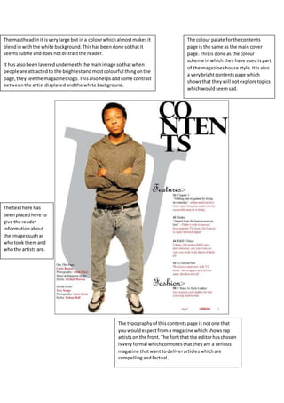
- 1. The mastheadinit isverylarge but ina colourwhichalmostmakesit blendinwiththe white background.Thishasbeendone sothatit seemssubtle anddoesnotdistractthe reader. It has also beenlayeredunderneaththe mainimage sothatwhen people are attractedto the brightestandmostcolourful thingonthe page,theysee the magazineslogo.Thisalsohelpsaddsome contrast betweenthe artistdisplayedandthe white background. The typographyof thiscontentspage is notone that youwouldexpectfroma magazine whichshowsrap artistson the front.The fontthat the editorhaschosen isveryformal whichconnotesthattheyare a serious magazine thatwant todeliverarticleswhichare compellingandfactual. The colour palate forthe contents page is the same as the main cover page.Thisis done as the colour scheme inwhichtheyhave used ispart of the magazineshouse style. Itisalso a verybrightcontentspage which showsthat theywill notexploretopics whichwouldseemsad. The texthere has beenplacedhere to give the reader informationabout the imagessuchas whotook themand whothe artists are.