Micro-Scholarship, What it is, How can it help me.pdf
Double page spread analysis 2
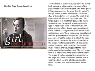
1. The masthead of this double page spread is across
both pages and takes up a large amount of the
page. It reads ‘Girl Uninterrupted’. The word ‘girl’ is
in lowercase whereas the word ‘Uninterrupted’ is
in capitals this makes it all effective. The house
style of this article is very simple. The small detail
gives the article a formal, structured look. The
target audience is most likely going to be mainly
females around the ages of 16 as these are the
type of people that listen to Adele’s music. The
colour scheme of this double page spread is red,
white and black. This give the article a formal and
sophisticated look. These colour used go really well
with the greyish type of background. The double
page spread has the text on one side of the page
which means they want the main focus to be on
the image. The font used for the article is simple
and sophisticated, which matches the type of
music releases and would appeal to the older
audiences that listen to her music. The only image
used is of Adele, who is the feature of the article.
The image stretches across a large proportion of
the pages and is one of the main focuses. She is
wearing a black top and is holding a cigarette,
which creates a very sophisticated and formal
tone.
Double Page Spread Analysis