1. Masthead: the masthead reads “I’m bringing sexy back!” text used is bold and contrasts with the colour
of the image behind it making the words appear more passionate. Intertextuality is used as the masthead
is play on words from Justin Timberlake’s song “sexy back” which consists of the lyrics “I’m bringing sexy
back”, the masthead replaces the word sexy for ginger suggesting and promoting that being ginger is sexy.
This changes readers view towards the singer and their perception of the young artist who wouldn’t be
seen as sexy or attractive under today’s stereotype and opinion towards ‘Gingers’. The word ginger is also
in red which creates a contrast from the rest of the masthead.
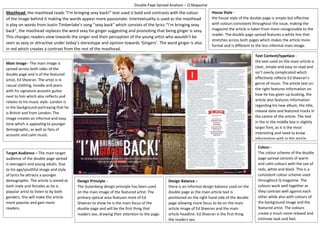
Main Image - The main image is
spread across both sides of the
double page and is of the featured
artist, Ed Sheeran. The artist is in
casual clothing, hoodie and jeans
with his signature acoustic guitar
next to him which also reflects and
relates to his music style. London is
in the background portraying that he
is British and from London. The
image creates an informal and easy
tone which is appealing to younger
demographic, as well as fans of
acoustic and calm music.
Target Audience – The main target
audience of the double page spread
is teenagers and young adults. Due
to his age/youthful image and style
of lyrics he attracts a younger
demographic. The article is aimed at
both male and females as he is
popular artist to listen to by both
genders, this will make the article
more popular and gain more
readers.
Colour -
The colour scheme of the double
page spread consists of warm
and calm colours with the use of
reds, white and black. This is a
consistent colour scheme used
throughout Q magazine. The
colours work well together as
they contrast well against each
other while also with colours of
the background image and the
featured artist. The colours
create a much more relaxed and
intimate look and feel.
Design Balance –
there is an informal design balance used on the
double page as the main article text is
positioned on the right hand side of the double
page allowing more focus to be on the main
article image of Ed Sheeran and the main
article headline. Ed Sheeran is the first thing
the readers see.
House Style -
the house style of the double page is simple but effective
with colours consistent throughout the issue, making the
magazine the article is taken from more recognisable to the
reader. The double page spread features a white line that
stretches across both pages which makes the article more
formal and is different to the less informal main image.
Text Content/typeface -
the text used on the main article is
clear, simple and easy to read and
isn’t overly complicated which
effectively reflects Ed Sheeran’s
genre of music. The article text on
the right features information on
how he has given up busking, the
article also features information
regarding his new album, the title,
release date and featured tracks in
the centre of the article. The text
in the in the middle box is slightly
larger font, as it is the most
interesting and need to know
information with in the article.
Design Principle -
The Gutenberg design principle has been used
on the main image of the featured artist. The
primary optical area features most of Ed
Sheeran to show he is the main focus of the
double page and will be the first thing that
readers see, drawing their attention to the page.
Double Page Spread Analysis – Q Magazine