On National Teacher Day, meet the 2024-25 Kenan Fellows
Album analysis
1. The only text on the albumreads ‘Take Care’ which is the name of the
album. Itlooks gold which could mean that he likes luxury.The title is
fairly subtlebutis still oneof the main focuses of the covers.The title
could suggest that there’s love songs on the albumand that he’s talking
about a pastlover. The colour of the text links to the rest of the items on
the cover such as the candle,the cup and watch etc. The image grabs
attention becauseDrake’s faceis the main focus of the cover because iti s
in the centre, the picturedepicts Drake lookingdown which could suggest
he’s feeling down. The picture itself has very littleeditingand is very
simplewhich could mean he is beingmore down to earth on this album.
The cover does not showus the demographic. Drake usually has a target
audienceof teens and young adults who likerap and rnb. This cover gives
of the impression thatyou might have to be more mature becauseit’s not
all flashy and colourful.
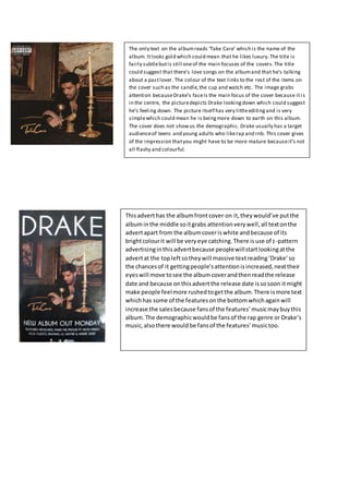
Thisadverthas the albumfrontcover on it,theywould’ve putthe
albuminthe middle soitgrabs attentionverywell,all textonthe
advertapart from the albumcoveriswhite andbecause of its
brightcolourit will be veryeye catching.There isuse of z-pattern
advertisinginthisadvertbecause peoplewillstartlookingatthe
advertat the topleftsotheywill massive textreading‘Drake’so
the chancesof it gettingpeople’sattentionisincreased,nexttheir
eyeswill move tosee the albumcoverandthenreadthe release
date and because onthisadvertthe release date issosoon itmight
make people feelmore rushedtogetthe album.There ismore text
whichhas some of the featuresonthe bottomwhichagainwill
increase the salesbecause fansof the features’musicmaybuythis
album.The demographicwouldbe fansof the rap genre or Drake’s
music,alsothere wouldbe fansof the features’musictoo.
2. There is very little text on this album cover, because it’s a
collab album it has written on it the artists names in green
this is so it stands out from the rest of the cover. The title
of the album is presented by a tattoo around the kid’s
neck, because this is a different idea it is very eye catching.
The overall darker colours of the album cover are very
commonly seen in the rap genre, it could also connote the
content of the album suggesting that some of the song are
dark or have a dark theme to them.
This is the poster for Kanye’s 2013 album ‘Yeezus’. This album
poster is very basic seeing as it has very little text on it and the
only image is the album cover. This is still quite common the
genre with albums and posters being fairly simplistic. At its time
this album was very different because most albums in 2013 had
covers that were bright and had a lot going on, they may have
designed the album cover like that to show how the artist is
unique and different. They have made all added text on the
poster very large and bold so it is very easy to read and
accessible to everyone, it is also very eye catching. They may
have also made the title and the release date the smallest
sections to make it the biggest to show its importance