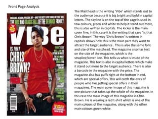
1. The Masthead is the writing ‘Vibe’ which stands out to
the audience because it is big bright and bold in capital
letters. The skyline is on the top of the page is used in
tow colours, green and white to help it stand out more,
this is also written in capitals. The kicker is the main
cover line, in this case it is the writing that says ‘ is that
Chris Brown’ The way ‘Chris Brown’ is written in
capitals shows how this is the main part they want to
attract the target audience . This is also the same font
and size of the masthead. The magazine also has text
on the side of the magazine, which is the
strapline/cover line. This tells us what is inside of the
magazine. This text is also in capital letters which make
it stand out more to the target audience. There is also
a barcode in the magazine with the price. The
magazine also has puffs right at the bottom in red,
which are special offers. This will catch the eyes of
people who like getting special offers in their
magazines. The main cover image of this magazine is
one picture that takes up the whole of the magazine. In
this case the main image of this magazine is Chris
Brown. He is wearing a red t-shirt which is one of the
main colours of the magazine, along with the other
main colours green white.
Front Page Analysis