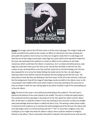
1. Images The image used on this CD front cover is of the artist Lady gaga. The image is large and
stands out bold to the audience this creates an effect as it becomes more eye catching and
persuades the audience more to buy it as they can recognise easily that it is Lady Gaga as of
how the size of the image is portrayed. Lady Gaga has used a white short wig which makes her
CD cover eye catching to the audience to create an effect on the audience as she looks
mysterious which could mean her album is mysterious. As it is a black and white picture, Lady
Gaga has used little make up on her face so her natural face will fade in with her hair this
creates an eye catching effect as her face and hair stand out on the dark background. She has
also exposed her arm across her body holding her jacket across her face. As Lady Gaga is
wearing a black shiny leather costume this blends into the background of the CD cover. Her
head and arm look like they are floating on the front cover of the CD as the costume is dark just
like the background. Overall the image of Lady Gaga stands out bold on her album cover as she
is portrayed in the middle of the cover which makes it more eye catching to the consumer as
they are drawn in with her eyes staring right at you which could be a sign of her persuading you
to buy her album.
Text: The text on this cover is very bold and outstanding to the audience. The main text is
placed at the bottom of the cover placed in the middle. The text is in bold and capital letters,
this could portray that Lady Gaga is shouting out to her fans about her album and her album
title. As the text is in bold this makes it more eye catching to the consumer as they can straight
away acknowledge what the album is called and who it is by. The writing is white which makes
it stand out to the audience as it contrasts the white background of the CD over The album title
and Lady Gages name is in formal writing until the ‘T’ The T is more like a religious cross, this
could give us an insight into what her album is about, there could be relations to religious
themes in the album. There is also other text which is placed in the top left corner and near the
2. bottom right. These texts give us an insight into the album as there is warning about the songs
but also some of the tracks which are on the album which will persuade the audience to buy
the CD. The writing is on a white background and the text is black, the white background makes
the writing stand out and creates an eye catching effect on the audience. Overall the text on
this album cover is bold and eye catching to the consumer which makes it easier for the CD to
sell as it is appealing to the audience.
Colour scheme: A black and white colour scheme has been used to create an effect as black and
white contrast off each other to make it stand out to the audience. A black background has
been used to maybe show the dark side of the album or even scary as we can associate black or
a dark colour as being scary. Whereas white could have been used to show the good side of the
album which shows that there could be two sides of her. This maybe why she has only used two
colours in her colour scheme to represent her maybe good and evil side. Overall the colour
scheme has created a good eye catching effect so that the audience can be persuaded to buy
the album with the bold colours used.
Gutenberg principle: The Gutenberg principle has been used well here on this album cover. The
principle isn’t perfect but the album cover designer has been able to place the image on the
cover in the middle of it so it is eye catching to the audience. The image makes the audience be
drawn in to look at the alum and persuaded to buy it.
3. Text: For Lady Gagas CD cover her text is in bold and capital letters which stand out to the
audience. The significant of the writing being in capital letters could indicate that she is
shouting to the audience the album title has words in capital letters can be associated with
shouting. The writing is bold which makes it easier to read and makes it stand out to the
audience so it catches there eye. This album cover is very different as usually an image is on the
CD but Lady Gaga has put her name and her album title this instead. She may have done this so
separate herself from different artist so her CD is unique. The CD also has small text which is
hard to read. This is explaining the terms and conditions and the advertising the record label.
This is smaller than the other text of the CD cover as it is not as important to the audience.
Colour scheme
The colour scheme for this CD is black and white; the colour scheme is consistent throughout
the CD. The black background makes the text stand out to the audience, this is significant as it is
eye catching to the audience and makes it clearer. The black and white could also indicate that
the album is mysterious. Overall the colour scheme is very plain and dull, but the colour scheme
could create and mysterious vibe about the album, it could also make the audience want to find
out what her album is like.
4. Images: One image has been used on this album back cover. This image is of Lady Gaga the
artist. A large image of her has been used and placed mostly in the middle of the back cover.
Lady gaga is now wearing a black long wig with a white pale face and she is also exposing abit of
her arm which is also pale. As she has a pale face and a pale arm this stands out from the black
wig and the black background. This makes it more eyes catching and draws the audience in to
look and recognise the artist on the back cover. This image could be portrayed as Lady Gaga
‘other side’. The front cover image could be Lady Gagas ‘good’ side and the back cover could be
her ‘bad’ side as on the front cover she was wearing a white wig with a natural face and on this
back cover she is wearing a black wig and dark make up. Lady Gaga is wearing very dramatic
make up, the black make up which is rolling down her cheek could indicate that they are tears.
Her wig is covering her other eye so we cannot make a judgement if she has tears rolling down
her cheek. Overall the image is very dark which creates a mysterious vibe which could relate to
a mysterious album. Overall the image is very dark and makes the white face stand out to the
audience on the dark background.
Text: The text is on the right hand side and is written the opposite way. The text is in bold and
in capital letter which makes it easier to read, it stands out as it is in capital letters. The colour
of the text is white which contrasts from the black background to make it easier for the
audience to read what songs are included in the album. The text is quiet small for the consumer
to read so they could be put off buying the album as the songs are not clear. Overall the text
does stand out on the dark background but the writing is a little small which makes it harder to
read.
Colour scheme: A black white and grey colour scheme has been used this colour show the ‘dark
side’ of the album. The black and grey could represent a mysterious vibe to the album and the
5. white could represent pure side to the album. The black and grey could have also been used for
it to be eye catching to the audience as Lady Gaga has a white face and arm; she stands out to
the audience.
Gutenberg principle: The Gutenberg principle hasn't been used as effectively on the back
cover. The image is more to the left of the back cover so the principle hasn't been used to
create an effect on the reader.