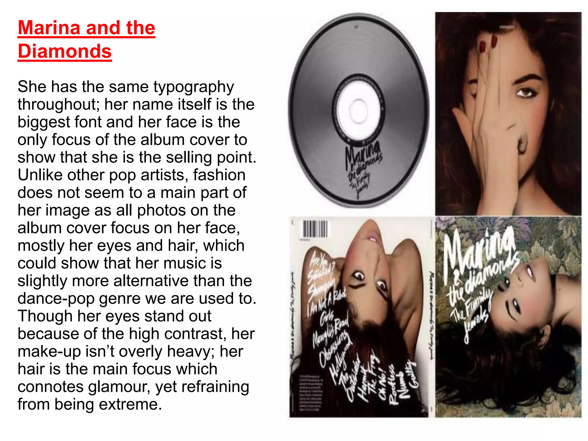
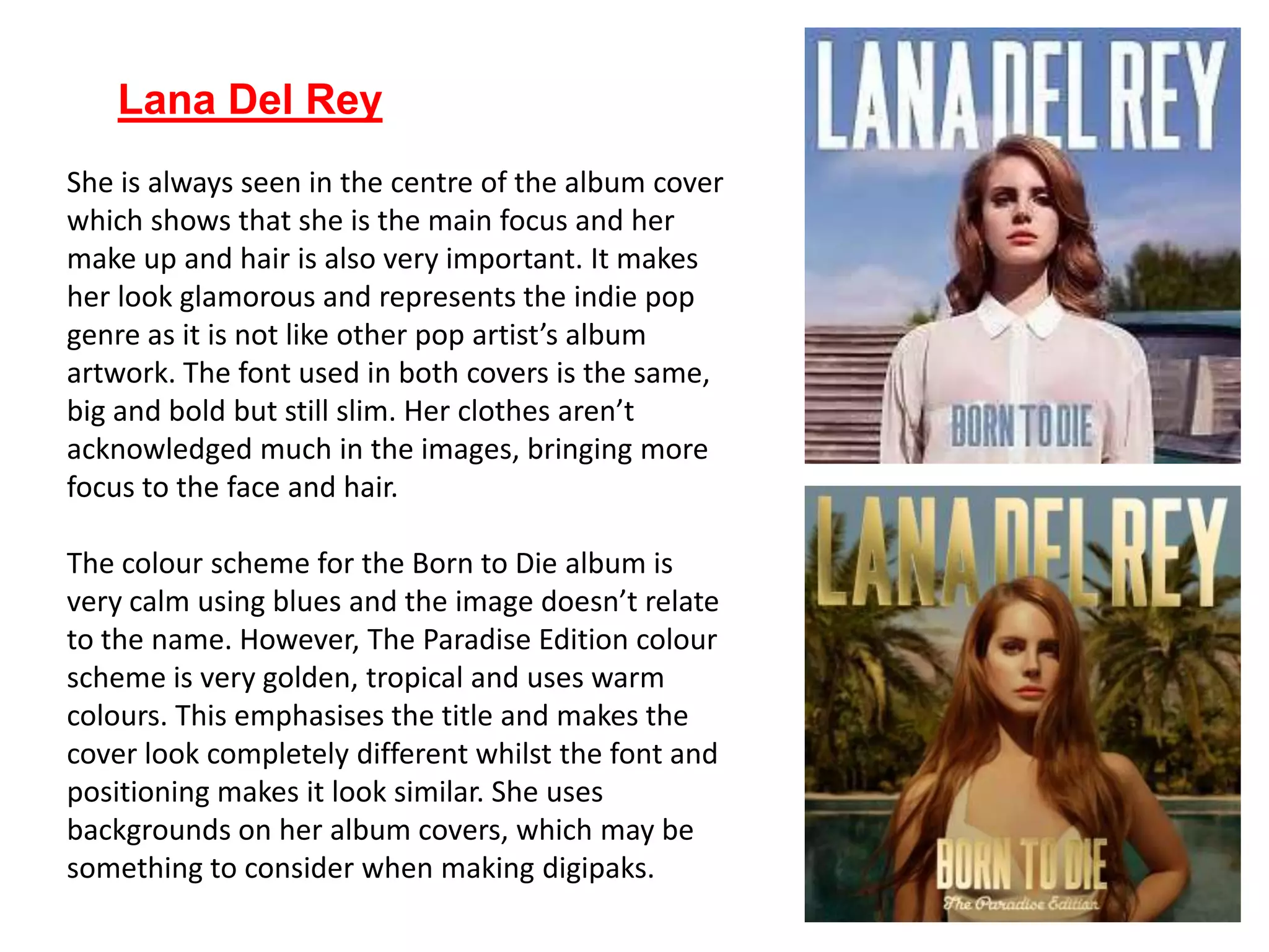
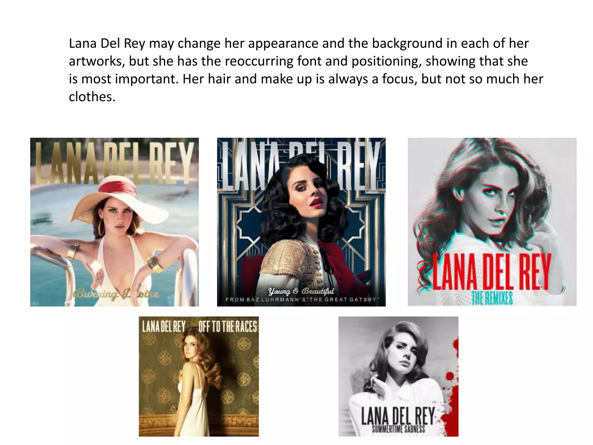
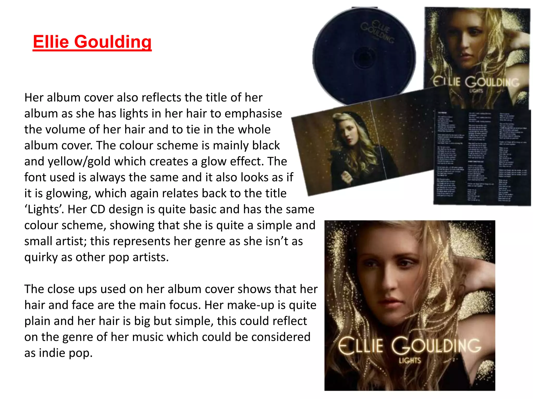
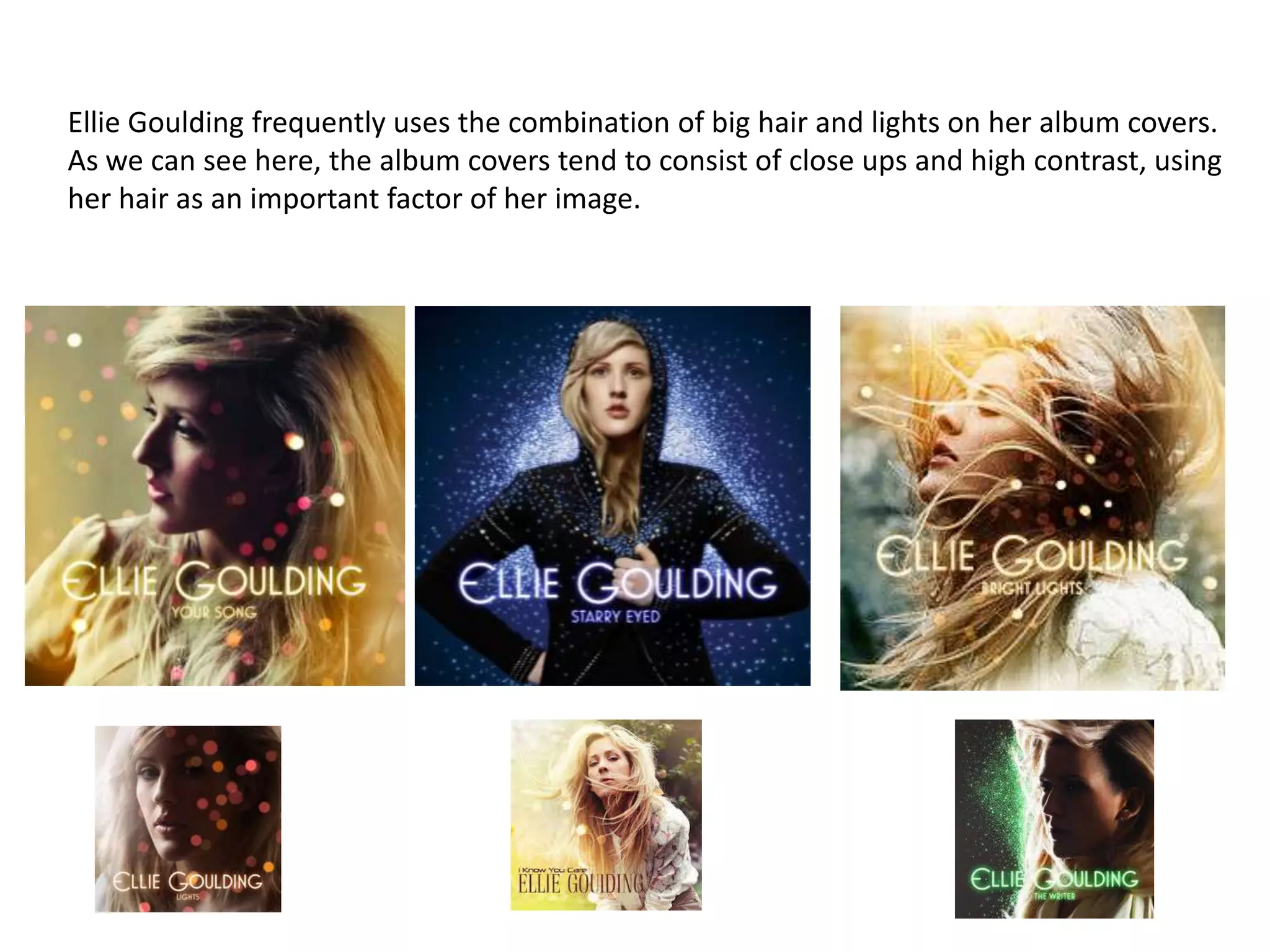
She has the same typography
throughout; her name itself is the
biggest font and her face is the
only focus of the album cover to
show that she is the selling point.
Unlike other pop artists, fashion
does not seem to a main part of
her image as all photos on the
album cover focus on her face,
mostly her eyes and hair, which
could show that her music is
slightly more alternative than the
dance-pop genre we are used to.
Though her eyes stand out
because of the high contrast, her
make-up isn’t overly heavy; her
hair is the main focus which
connotes glamour, yet refraining
from being extreme.
Marina and the
Diamonds
Design links together throughout (even single artwork is
similar) with same font and background decor for
familiarity, typography printed onto CD also.
Image has changed for second
album and, whilst the genre is
more pop/dance that what we
want our female solo artist to
be, we included this album as
her face continues to be the
same focus of the album
[whilst image seems to be
more important for this
album, there is no focus on
the clothes, just on hair and
the heavier make-up, again
the photo is edited to enhance
these features].
• Instead of just additional
photos and the actual CD, it
included jewellery and a
compact mirror [reflecting
target audience]
Lana Del Rey
She is always seen in the centre of the album cover
which shows that she is the main focus and her
make up and hair is also very important. It makes
her look glamorous and represents the indie pop
genre as it is not like other pop artist’s album
artwork. The font used in both covers is the same,
big and bold but still slim. Her clothes aren’t
acknowledged much in the images, bringing more
focus to the face and hair.
The colour scheme for the Born to Die album is
very calm using blues and the image doesn’t relate
to the name. However, The Paradise Edition colour
scheme is very golden, tropical and uses warm
colours. This emphasises the title and makes the
cover look completely different whilst the font and
positioning makes it look similar. She uses
backgrounds on her album covers, which may be
something to consider when making digipaks.
Lana Del Rey may change her appearance and the background in each of her
artworks, but she has the reoccurring font and positioning, showing that she
is most important. Her hair and make up is always a focus, but not so much her
clothes.
Ellie Goulding
Her album cover also reflects the title of her
album as she has lights in her hair to emphasise
the volume of her hair and to tie in the whole
album cover. The colour scheme is mainly black
and yellow/gold which creates a glow effect. The
font used is always the same and it also looks as if
it is glowing, which again relates back to the title
‘Lights’. Her CD design is quite basic and has the same
colour scheme, showing that she is quite a simple and
small artist; this represents her genre as she isn’t as
quirky as other pop artists.
The close ups used on her album cover shows that her
hair and face are the main focus. Her make-up is quite
plain and her hair is big but simple, this could reflect
on the genre of her music which could be considered
as indie pop.
Ellie Goulding frequently uses the combination of big hair and lights on her album covers.
As we can see here, the album covers tend to consist of close ups and high contrast, using
her hair as an important factor of her image.

Digipaks

  • 1.
    She has thesame typography throughout; her name itself is the biggest font and her face is the only focus of the album cover to show that she is the selling point. Unlike other pop artists, fashion does not seem to a main part of her image as all photos on the album cover focus on her face, mostly her eyes and hair, which could show that her music is slightly more alternative than the dance-pop genre we are used to. Though her eyes stand out because of the high contrast, her make-up isn’t overly heavy; her hair is the main focus which connotes glamour, yet refraining from being extreme. Marina and the Diamonds
  • 2.
    Design links togetherthroughout (even single artwork is similar) with same font and background decor for familiarity, typography printed onto CD also.
  • 3.
    Image has changedfor second album and, whilst the genre is more pop/dance that what we want our female solo artist to be, we included this album as her face continues to be the same focus of the album [whilst image seems to be more important for this album, there is no focus on the clothes, just on hair and the heavier make-up, again the photo is edited to enhance these features]. • Instead of just additional photos and the actual CD, it included jewellery and a compact mirror [reflecting target audience]
  • 5.
    Lana Del Rey Sheis always seen in the centre of the album cover which shows that she is the main focus and her make up and hair is also very important. It makes her look glamorous and represents the indie pop genre as it is not like other pop artist’s album artwork. The font used in both covers is the same, big and bold but still slim. Her clothes aren’t acknowledged much in the images, bringing more focus to the face and hair. The colour scheme for the Born to Die album is very calm using blues and the image doesn’t relate to the name. However, The Paradise Edition colour scheme is very golden, tropical and uses warm colours. This emphasises the title and makes the cover look completely different whilst the font and positioning makes it look similar. She uses backgrounds on her album covers, which may be something to consider when making digipaks.
  • 6.
    Lana Del Reymay change her appearance and the background in each of her artworks, but she has the reoccurring font and positioning, showing that she is most important. Her hair and make up is always a focus, but not so much her clothes.
  • 7.
    Ellie Goulding Her albumcover also reflects the title of her album as she has lights in her hair to emphasise the volume of her hair and to tie in the whole album cover. The colour scheme is mainly black and yellow/gold which creates a glow effect. The font used is always the same and it also looks as if it is glowing, which again relates back to the title ‘Lights’. Her CD design is quite basic and has the same colour scheme, showing that she is quite a simple and small artist; this represents her genre as she isn’t as quirky as other pop artists. The close ups used on her album cover shows that her hair and face are the main focus. Her make-up is quite plain and her hair is big but simple, this could reflect on the genre of her music which could be considered as indie pop.
  • 8.
    Ellie Goulding frequentlyuses the combination of big hair and lights on her album covers. As we can see here, the album covers tend to consist of close ups and high contrast, using her hair as an important factor of her image.