BEST Call Girls In Old Faridabad ✨ 9773824855 ✨ Escorts Service In Delhi Ncr,
Cherly cole
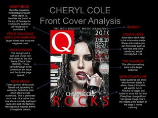
1. MASTHEAD
Identifies magazine.
Red background with
white capital Q.
CHERYL COLE
Identifies the brand; at
the top of the page as
it is how the audience
will recognise to
Front Cover Analysis HEADER
purchase it.
PRICE TAG/ISSUE COVER LINES
DATE AND BARCODE Small titles which refer
Buyer knows how much the to the information inside.
magazine costs. Shows information you
can find inside such as
new acts and some
BACKGROUND bands you would
The background is normally find in Q.
dark and shows rain;
this relates to the rock
theme ‘Cheryl Cole THE FLASHER
ROCKS’. This is This offers something
carried through to the extra to the target
contents of this issue audience.
and the double page
spread.
MAIN COVER LINE
Target audience will know
MAIN IMAGE who the main article is
Takes up most of the cover. about. Fans of this artist
Stands out; appealing to will want to buy it.
audience. Seductive pose ‘ROCKS’ is bigger and
which attracts male bolder to show the fact that
audiences. She is presented Cheryl has changed from
as a ‘rock chick’ rather than her typical image. It is in
how she is normally portrayed the middle at the bottom of
(quite girly and into fashion). the page; it is eye
Red lisp stick matches theme catching.
of magazine colours.
2. CHERYL COLE
Contents Analysis
MASTHEAD
The masthead is at the top of the page on
the contents; this reinforces the brand ISSUE DATE
identity.
HOUSE STYLE IMAGES
The house style from the front cover is The main image used on the contents
carried out through to the contents page. page relates to the artist on the front
The colour scheme of the magazine is cover; it implies that Cheryl is going to
following uses red, black, grey and white; I have the main article in the magazine. It
think these colours are used because they fit also shows off her style (rock) as her
with the rock theme. The article names are clothing follows that theme with dark
underlined in red so colours and rips in her leggings.
they stand out whilst the page Other images are also on the contents
Information and article descriptions are in page, they are smaller but they also follow
small, black font. the colour scheme of the magazine and
they illustrate the theme this issue is trying
to reinforce.
FONT
• All of the font on the contents page is LAYOUT
small other than the page numbers on the
The magazine is split in half with the
images and the masthead at the top of
main image taking up the right side
the page. However article names are
and the other smaller images and
slightly larger in some places; these are
information on the left side. The
the articles that are the most important.
masthead and ‘contents’ is at the top
• The font is classy looking and quite
so the audience know what they are
simple. It is spaced out on the word
reading and who the contents belongs
‘contents’ which fits with the fact that the
to.
whole contents page is quite spaced out
and not busy.
3. CHERYL COLE
Double Page Spread Analysis
TEXT/FONT
Drop capital is used on the C above
the image on the left hand side of the
page; this goes down 5 lines.
Pull Quote is on the bottom left hand
IMAGE
side of the page; this is in bold, red The image takes up the
writing so it is eye catching. ‘I don’t whole of the left side of the
know what I look like anymore, do double page spread; this
you know what I mean?’ – this is what shows the feisty image of
the pull quote reads and it is Cheryl Cole; the fact it takes
something that many readers could up so much space without
possibly relate to as there is a large any text overlapping pushes
amount of people who feel as though the point that she cannot be
they are not happy with their look etc. taken out of the limelight;
It also fits with the fact she has she is a star.
completely changed her image for Once again, the image
this magazine issue. reinforces the rock theme;
The font is small and simple which her clothing is the same as
explains that it doesn’t need to be what she is wearing on the
fancy to make the article good; it’s the contents page which shows
LAYOUT content that counts. the magazine carries it’s
The image takes up the whole of the right hand side of the ideas for this issue
double page spread; this could be used as a poster after the throughout.
reader has finished with the article. She has red lipstick and
The article is in small font and fits around the image at the EDITORIAL dark eyes: ‘rock’; she also
bottom of the page which relates to the overall rock theme The language used is quite formal
looks quite seductive which
that the magazine is carrying out. and not humorous or chatty. It sets
attracts certain
There is a big capital C in red (following colour scheme) the tone of the article as being
audiences, most likely
which is typed across the article; this stands for Cheryl. It is a serious and implies that more
males.
striking feature. important matters will be
The heading is simply ‘Cheryl COLE’ which implies that that discussed rather than just gossip.
is enough to get the readers attention.
4. TARGET AUDIENCE
Q MAGAZINE
TARGET AUDIENCE:
Q magazine appeals to both
male and female audiences. It is
for age groups ranging from HOW DOES Q APPEAL
teens and young adults to older TO IT’S TARGET
generations. This is because it AUDIENCE?
includes new artists but it has not •The colour schemes used appeal to
forgotten music from many years both males and females; red, black
before now. and white; plain and subtle.
•Artists on cover (in this case Cheryl
KEY FACTS: Cole) appeal to both genders.
PRICE: £3.90 •Language is used is more serious
FREQUENCY: Monthly in the UK which shows that the magazine is
CIRCULATION:103,017 serious and sophisticated which
LAUNCH DATE: 1986 appeals to older generations.
•Price is slightly more expensive than
other magazines, however this is okay
MUSICAL INTERESTS: as the target audience are older and
Many Q readers are looking for a more probably working, meaning they have
sophisticated approach to music. They spare cash to spend on the magazine.
are interested in older music which is
what the magazine provides. However it
also shows new artists which widens the
audience range. It’s target audience is
mainly for older people as it is less
gossip and more about actual music.
5. BACKGROUND INFO
TYPICAL CONTENT:
•Reviews
•Interviews
•Posters
•Tour dates
•Countdowns
•‘100 most…’
STARTED:
1986; appealed to it’s older target
audience.
Q also launched a radio station in
June 2008, however it is only
available on digital TV.
CIRCULATION:
103,017
EXTRA INFO:
It's publishing company is Bauer
Consumer Media (Emap).
Mark Ellen and David Hepworth
founded the magazine because they
felt it was a niche market as there
wasn’t a magazine for older
generations who were still interested in
buying and finding out about new
music.