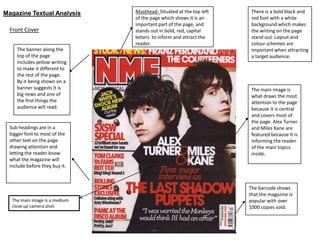
1. Magazine Textual Analysis Masthead- Situated at the top left There is a bold black and
of the page which shows it is an red font with a white
important part of the page, and background which makes
Front Cover stands out in bold, red, capital the writing on the page
letters to inform and attract the stand out. Layout and
reader. colour schemes are
The banner along the important when attracting
top of the page a target audience.
includes yellow writing
to make it different to
the rest of the page.
By it being shown on a
banner suggests it is The main image is
big news and one of what draws the most
the first things the attention to the page
audience will read. because it is central
and covers most of
the page. Alex Turner
Sub headings are in a and Miles Kane are
bigger font to most of the featured because it is
other text on the page informing the reader
drawing attention and of the main topics
letting the reader know inside.
what the magazine will
include before they buy it.
The barcode shows
that the magazine is
The main image is a medium popular with over
close up camera shot. 1000 copies sold.
2. Contents Page The contents page is an important part of a magazine as it will
tell the reader the rest of the content of the magazine the
majority look at this page before purchasing it.
The image on the contents page suggests that the magazine is
rock type music, because it is male based with a guitar and has
that ‘grunge’ look because of his long hair and beard. The
target audience seems to be males that are teenagers and also
early 20’s as the ‘rock’ genre is liked by a wide range of ages.
The colour scheme is the same as the front cover with
red, black and white, again making it more appealing to males.
This page includes what the reader should expect in the rest of
the magazine with bold headlines and subheadings
underneath. The white, bold writing is different to the rest of
the normal black font to draw attention to that first.
There is also an index included on this page with the text
written in red which will stand out, so that the reader has clear
access the rest of the magazine.
As the contents page is the most viewed, there is an advert at
the bottom of the page to subscribe to buying the magazine.
This would mean that the reader is more likely to notice the
advert, encouraging the sales of the magazine.
‘NME’ is popular for their information on festivals, so have
information in the centre of the page about ‘v fest’ with large
font.
The contents page goes with the front cover as the colour
scheme is the same and the information itself appeals to a
male audience, interested in indie/rock music.
3. The layout of this double page spread
Drop Capital
consists of the first page image based and
the second article based but also including
smaller images.
There is a lot going on which will entice
readers in, especially teen males as it would
go with the hectic lives they lead.
The colours used are slightly different from
the normal red, black and white and instead
of the red, blue has been used. This gives a
unique feel and may attract readers because
it looks different to what they’re used to.
The colour blue is again associated with the
male audience and would be most
appreciated by them.
The image of the band covers the whole
page, emphasising that most of the
information on that double page spread is
about them.
The images are placed well and the article
fits around the pictures, making it clear and
appealing to its audience.
The fact that the band are called ‘The
Teenagers’ appeal to the teenage target
audience as they can relate to them with
their own lives.
Central Image