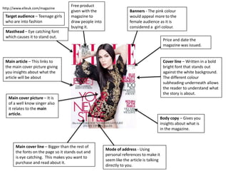
1. Free product
http://www.elleuk.com/magazine
given with the Banners - The pink colour
Target audience – Teenage girls magazine to would appeal more to the
who are into fashion draw people into female audience as it is
buying it. considered a girl colour.
Masthead – Eye catching font
which causes it to stand out.
Price and date the
magazine was issued.
Main article – This links to Cover line – Written in a bold
the main cover picture giving bright font that stands out
you insights about what the against the white background.
article will be about The different colour
subheading underneath allows
the reader to understand what
the story is about.
Main cover picture – It is
of a well know singer also
it relates to the main
article.
Body copy – Gives you
insights about what is
in the magazine.
Main cover line – Bigger than the rest of
Mode of address - Using
the fonts on the page so it stands out and
personal references to make it
is eye catching. This makes you want to
seem like the article is talking
purchase and read about it.
directly to you.
2. http://www.kerrang.com/
Target audience – Males
who are into rock/indie Body copy – gives you
Masthead – Eye catching font music insights into what else is
use and the colour stands out going to be featured
against the background within the magazine
Main cover picture – It The lead –
is a close up shot of a introduction into
singer from a band what the article is
about
Main article/Main
cover line – This also
links to the main cover Banner – Put on a
picture so you know coloured background to
what the article is make the writing stand
about before reading it. out from the page
Also it being in the
biggest font on the
page causes it to
attract the readers
attention as it stands
out and is eye catching
Giving away free
items to draw people
into getting it Sans serif font – Font that stands out to the rest
of the article to make it more noticeable
3. Target audience – The Masthead – The image or text
social class in which the represents the company Boxout – It is a
would read this is lower which is also the logo. It is there separate box that
class as it is very so you can recognize the paper doesn’t link to any
informal and consists of instantly story. Advertising
a lot of pictures. reality TV here will
make the paper appeal
to larger audience who
may be interested in it
making the readership
increase
Main headline – This is
normally shortened to
the main point of the
article telling the
reader exactly what it
is about or sometimes
a pun so it attracts the
reader. It usually in
black and bold writing
to make it stand out so Caption – This is a
this is the first thing small box which gives
the consumer will see you the insight on
when going to what the article is
purchase the about before you read
newspaper. Body copy – These are other important news which it in full. It is the start
can be found in the paper. It also has caption of the article which
introducing what the article is about. The text above it carries on to inside the
is also in bold so it stands out but it is not as big as the paper.
main headline
4. Masthead – Shown clearly at the top
of the page so the audience know
what news paper it is. The font is
formal and eye catching.
Banners – This
advertisement is
written on a coloured
background so I attracts
Strap line – A bit of text the reader.
introducing the main
article before the main
headline
Target audience - The
middle class as does
The lead – A small paragraph use formal language
about the article before however it still can be
going fully into it. Written in informal at times.
capitals to attract the reader
Box out – information
that is out the main
Byline – Stating who wrote
story. In a box in this
the article.
case it contains
another story.
5. The picture
Masthead – It shows the name
and logo of the magazine but
used of inside
this one is place in the bottom the of the
left hand corner. This is school is
effective as the top of the effective in the
magazine is too busy to place
this. fact the colours
within the
picture, also
matches the
colours used in
the masthead
Strengths Weaknesses
- Colour scheme - You cannot tell
matches with this is a school
background magazine as it has To improve
no features on the - Add body copies of content within
front. magazine
- Its plain not - More information/imagery
enough - Make it clearer of what the magazine is
information or about.
imagery.
6. Masthead – Clear and big at the
top of the page it immediately
grabs your attention due to the
Boxout – The text is red on the white.
written inside a coloured
box so the text is able to
stand out and be readable
Bodycopy – Refers to
other text which is
written within the
magazine.
Sell line –
‘AchievingSuccessTogether’
is the magazines sell line it
basically describes what the
magazine is about.
Strengths Weaknesses
To improve
- Colour scheme is - Contents on front cover - Change ‘In this issue’ into bodycopys across the page
effective and matches this should be included - Change the layout of the page
the school colours on the inside of the
- Clear masthead magazine not outside.
- Photo represents the
school and what it does
7. Masthead – Clear and big at the
top of the page it immediately
Sell line – ‘AchievingSuccessTogether’ grabs your attention due to the
is the magazines sell line. it basically red on the white.
describes what the magazine is
about.
Bodycopy – Text
introducing an article
within the magazine
Anchorage – The image relates
to the text as it says ‘Shooting
stars’ and the image is of a boy
holding a football this helps us
understand the meaning of the
text.
Strengths Weaknesses
To improve
- Images relates - Plain not much
- Link main cover
to the main information or
with school more.
article pictures
So it represents it
- Clear masthead
better
- Add more
information
Editor's Notes
Add website link- Kerrang- add target audience
Kerrang- add target audience
add target audience & social class
add target audience & social class
Strengths and weaknesses- what could be improved> photos, does it represent the school well?>
Strengths and weaknesses- what could be improved> photos, does it represent the school well?> colour scheme
Strengths and weaknesses- what could be improved> photos, does it represent the school well?>