Enhancing Worker Digital Experience: A Hands-on Workshop for Partners
Double page spread research indie
1. Double Page Spread Research-NME
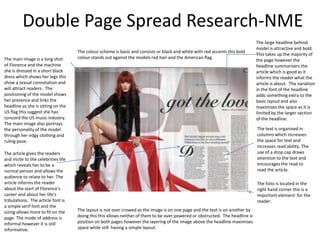
The large headline behind
model is attractive and bold.
The colour scheme is basic and consists or black and white with red accents this bold
This takes up the majority of
The main image is a long shot colour stands out against the models red hair and the American flag.
the page however the
of Florence and the machine headline summarisers the
she is dressed in a short black article which is good as it
dress which shows her legs this informs the reader what the
show a sexual connotation and article is about. The variation
will attract readers . The in the font of the headline
positioning of the model shows adds something extra to the
her presence and links the basic layout and also
headline as she is sitting on the maximises the space as it is
US flag this suggest she has limited by the larger section
concord the US music industry. of the headline.
The main image also portrays
the personality of the model The text is organised in
through her edgy clothing and columns which increases
ruling pose. the space for text and
increases read ability. The
The article gives the readers use of a drop cap draws
and incite to the celebrities life attention to the text and
which reveals her to be a encourages the read to
normal person and allows the read the article.
audience to relate to her. The
article informs the reader The folio is located in the
about the start of Florence's right hand corner this is a
career and about her life's important element for the
tribulations. The article font is reader.
a simple serif font and the
sizing allows more to fit on the The layout is not over crowed as the image is on one page and the text is on another by
page. The mode of address is doing this this allows neither of them to be over powered or obstructed. The headline is
informal however it is still position on both pages however the layering of the image above the headline maximises
informative. space while still having a simple layout.
2. Double Page Spread Research-THE FLY
The main image is an
animation of the White Lies
The animation has an indie
style which represents the
There is no headline for this
magazines genre and style.
double page spread this is
The mid shot of the animation
because this is a review page.
allows more of the drawing to
The title is large however it
be seen and more for the
does not take up a lot of
reader to look at.
space. Then font is modern
and the use of a outline gives
The layout of the spread is
the title and main image a
simple and organises the
similar look.
image takes up majority of
the spread. The text is
The article content in the
organised to the right of the
article is about the White Lies
page in to large paragraphs.
second album called the
As this is a album review
ritual and the process of
there is a picture of the album
writing it. The editors have a
at the start of the text this is
rating of the article which is
useful for the audience.
informative for the audience.
The colour scheme is black The pages folio is position in
and white the simple right hand corner and
colour scheme means allows the reader to
there are n colour clashes. navigate at ease when
There is an accent of light reading the magazine,
blue this is to highlight the A caption is added at the end of the article this is to credit the
release date of the album main images creator.
and the bands
achievements.
3. Double Page Spread Research-SPIN
Above the head line is a The main image is the
text graphic which stats The article is about the artist f the year and how she has got to where she is now. dominate element on
the artist as “Artist if the this double page
year” this would spread, this would
automatically prompt the prompt people to read
reader to look at the the article as it is about
article. the artist of the year .
The image has been
The headline for this made black and white
spread is the name of the this could be so the
band, this will draw readers page has a simple
in as they are a recognised colour scheme or to
band. The bold black text is give an old fashion feel
ins a modern font and is t the spread. The
very large which will attract image is a close up
readers. shot of the artist with
her mouth open this is
a good representation
The article starts with a drop of the artist and her
cap this is to draw the eye to love for singing.
the text section.
The colour scheme
uses black and white
The subhead is made
this gives a traditional
italics and is in capital
letters this corresponds The article is written with a traditional serif The folio and caption are placed in the look to the article
font and keeps with the traditional theme right hand corner the caption giving however it still remains
with the article and
keeps s the reader to portrayed by the black and white image. The credit to the photographer and the folio bold and attractive.
move through the text. text is organised by the use of two columns is there for easier navigation for the
The writers name is in this helps keep the reader engaged when reader
bold giving them credit. reading.
4. Double Page Spread Research
The headline is very The main images are very striking
grabbing the large text the close up and positioning of the
contrast the dark and models gives an intimate feeling
mysterious page. The and draws readers in . The image
headline “the secret is out” being translucent also adds to the
will urge the reader to mysterious fee to the article.
read on as they will be
intrigued by a secret. The colour scheme for this double
page uses shades of black and
white which although dark the
The subhead is uncommonly page stands out, this gives and
placed at the side of the indie feel as it has an alternative
article this may because style.
there Is till not disturb the
other elements of the
layout.
The article is about Darrin Huss
The use of columns and his lifestyle and career they
organises the text and highlight his interest in dance
improve the page and the range of music he
readability. produces. This will appeal to
their target audience and
The lay out is engaging as
readers are interested in the
there is a large image The folio is placed in The graphics used The photo caption. Is lives of artist.
which draws the eye, the the left hand corner. across the spread adds used here to emphasis
elements are evenly and urban and modern the enigmatic air to the
space and the spread is feel to the article it article and is reference
not over crowded by draws the eye in and to the article.
doing this the reader emphasis the article as
stays engages when the artist is still current
reading the article and loves bring out new
music.