More Related Content
Similar to Poster overview
Similar to Poster overview (20)
Poster overview
- 1. Poster Overview
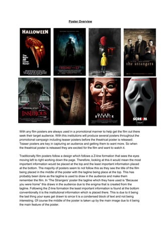
With any film posters are always used in a promotional manner to help get the film out there
seek their target audience. With this institutions will produce several posters throughout the
promotional campaign including teaser posters before the theatrical poster is released.
Teaser posters are key in capturing an audience and getting them to want more. So when
the theatrical poster is released they are excited for the film and want to watch it.
Traditionally film posters follow a design which follows a Z-line formation that sees the eyes
moving left to right working down the page. Therefore, looking at this it would mean the most
important information would be placed at the top and the least important information placed
at the bottom. The majority of posters seem to not follow this as they see the title of the film
being placed in the middle of the poster with the tagline being place at the top. This has
probably been done as the tagline is used to draw in the audience and make them
remember the film. In ‘The Strangers’ poster the tagline which they have used is “Because
you were home” this draws in the audience due to the enigma that is created from the
tagline. Following the Z-line formation the least important information is found at the bottom
conventionally it is the institutional information which is placed there. This is due to it being
the last thing your eyes get drawn to since it is a condensed block of text and not being
interesting. Of course the middle of the poster is taken up by the main image due to it being
the main feature of the poster.
- 2. The rule of thirds is when an image is divided up into nine equal sections that are made up
of two horizontal lines and two vertical lines that are equally spaced. These sections that are
formed are used to focus on the main elements of poster. In these posters they all show that
they follow the rule of thirds. An example of this is the ‘It’ poster as if you look at this poster
you can see that it can be split into thirds. As if you look vertically you can see its split into
the thirds with the fog/mist in the first third, the main image taking up the middle third and the
text taking up the final third. Then looking at this horizontally you can see at the top you have
one character, in the middle the text and the final third another character from the film.
Therefore, it shows that film posters follow the rule of thirds when laying out their poster.
Film posters are used to advertise the film by giving them an image from the film. This image
is an insight into the film as it allows the audience to see something from the film that is
relevant. In the majority of these posters they feature the villain of the film as the main
image. This is conventional for horror posters as it is a chance to scare the audience looking
at the poster. In the ‘Annabelle Creation’ poster it features the doll, ‘Annabelle’, on the
poster. Therefore, it is following conventions as the doll is the villain of the film and features
as the main image. Suggesting that it is showing the conventions of having the villain on the
film poster.
Mise-en-scene is anything that appears in the shot this can range from; setting; location;
props; lighting and costume. In film posters the mise-en-scene is used to give clues to the
audience about the film. For example the costume of a villain on a poster could hint who they
are and if you looked at the props and you can see a weapon it gives a clue to how they
might murder their victims. If you look at the ‘Friday the 13th’ poster the use of
mise-en-scene is done very effectively. In the shot you can see many of the content which
makes up mise-en-scene. The location which is shown in the shop seems to be a wood this
hints to the audience that an isolated setting, a convention of the slasher genre, is used in
the film. As well you can see a prop that is used is a machete, the prefered choice of
weapon by ‘Jason’ the villain, which is seen being held by the villain. This shot which has
been used also allows you to see the whole costume of the villain. ‘Jason’ is seen to be
wearing a mask which covers up his identity and causes the mystery around who he is and
what he looks like. The rest of his costume is very bulky this is again so they mystery around
who the character is can be kept as well it makes the character seem very intimidating due
to the size of him.
In any film poster the camera angle which is used is pivotal to showing the audience what
they need to know. For these film posters a variety of shots have been used; low angled long
shot; long shot; medium shot; medium-close up and close ups. These shots are conventional
as they all show detail of what the image is. In the ‘Insidious’ poster a medium-close up is
used to show the image of a young boy. This shot has been used to show the detail and
expression which he has on his face. As well it allows you to see part of the setting of the
film as in the background a house can be seen. This therefore, allows the audience to get a
glimpse at the boys emotion and see that he is possessed.
A tagline is a catchphrase or slogan that is used to advertise a film on the poster. When
used they are normally used they are very memorable and allows the audience to get a
- 3. small amount of information from the film. In the ‘Halloween’ poster the tagline which is used
is “The Night HE Came Home!”. This is an effective tagline as it makes you wonder who ‘HE’
is and makes you wonder what relevance he has to the story. Therefore, showing that it is
conventional to include in a film poster.
A main draw of to a film is if a certain actor or director is involved in the films brings fans to
watch the film. This is why they are included on the poster to attract a wider audience. If a
famous actor is in a film they may be predominantly used in the advertising of the film. For
example on ‘The Strangers’ poster the actress ‘Liv Tyler’ features on the poster of the film.
‘Liv Tyler’ is an American actress that is also the daughter of famous rock star Steven Tyler,
the lead singer for Aerosmith. This would draw in an audience due to her being well known
and having a famous connection. If it is a famous director used on the poster the fanbase of
the director will watch the film. In the ‘Insidious’ poster famous horror director ‘James Wan’ is
mentioned on the poster. ‘Wan’ has been involved in many successful horrors so it would
mean this film would be another success. Making more people watch the film due to the big
names who are in the film and those that are behind the camera.
Institutional information is a condensed block of text which is found at the bottom of a film
poster. Generally this information includes the institution that is producing the film, actors
and actresses who are in the film, director, producers, editors, composer, costume designer
and writer. The majority of film posters will include the institutional information on the front of
the film poster. Conventionally this information is found at the bottom of the page due to it
being the least important information on the poster. Showing that it follows the conventional
Z-line pattern which the readers eyes follow. However, on some of the posters (Scre4m, It
and Annabelle Creation) there is no institutional information at all on the poster. This is
because these poster are teaser posters which conventionally they do not have much on the
poster and only include important information about the film.
The release date for the film is one of the important pieces of information on the poster. This
is due to it telling the audience looking at the poster when the film will come out. Usually the
release date will be published in bold and clear font in order for it to be seen. Dependent on
whether the poster is a teaser or not they may include ‘coming soon’ rather than the exact
date. This is done to tease that the film is near its release but it is too early for the
promotional to include the actual release date. If you look at the ‘Scre4m’ poster it is very
clear and easy to see the release date of the film. With it being placed at the bottom of the
page it is very memorable as it’s the last thing you see.
One way a symbiotic link is created is using the same fonts throughout the promotional
campaign. On film posters fonts are normally the same throughout and the type of font which
is used relates to the genre of the film. If you look at the ‘Dead Silence’ poster you can see
the font for the title of the film has a glow around it. This relates to the genre of the film as it
is a supernatural horror. The eerie font relates to the genre due to it looking as if it was
supernatural. This use of font style to make it relate to the genre is a convention of horror
posters.