1. The Guttenberg Design Principle
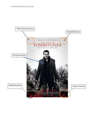
The primary optical area
Strong follow area
Weak follow area
The terminal area
Axis of orientation
2. The Guttenberg Design Principle
Primary Optical Area
In the primary optical area you see the main actors name ‘Liam Neeson’ I think they’ve put
his name in that area because he’s a famous star and they’ve used a sort of tactic so that
when you see this poster and you look in that place the first thing you should see is his
name and be instantly keen to go and see whatever this film is because he’s a really good
actor and he’s known to be in the best movies for a big range of age groups. You also see
the title of the movie ‘A walk among the tombstones’ so straight away we know what the
movie is called and have a gist of what genre it is because the name is a dead giveaway.
Strong Follow Area
The strong following area is also the same as the Primary Optical Area they’re just trying to
say it is a strong following area as well as a Primary Optical Area, it is a strong area because
that is where you find mostly everything out that will fascinate you or intrigue you because
it has the name of the movie, the star’s name and a title saying ‘people are afraid of all the
wrong things’ which puts you into thought about what it could mean and how it is related to
the movie.
Weak Follow Area
There isn’t anything really useful or desirable in the weak following area, there isn’t
anything for us to see that will make people think oh my god! But what you don’t notice is a
small river at the bottom in this area and it is blood red with the reflection of the trees
on(how you know it’s a river) which is pretty spooky because we question could it be blood?
What else could it be, also it’s the only thing in colour on this poster (Key colouring) and it’s
also black and white (the whole poster) so that symbolises death and danger.
The Terminal Area
In the terminal area there is a date placed and it is the release date for the movie, also a
cross has been placed in this area to make is know that this movie is related to death and a
graveyard. We of course need to know the release date and although that isn’t a thing we’d
think of straight away, we would want to know eventually and instead of finding out
elsewhere we get to find out almost immediately on the poster in the terminal area. Then it
has the name of all the actors in this movie which 5/10 people will read because of interest
but most people won’t, it is still handy and useful to have there though.
3. The Guttenberg Design Principle
Genre Codes Conventions
The back ground, the theme, and the props all relate to the genre of the movie. You can see he is
stood in a graveyard – thriller, he is holding a gun – action, he is holding a briefcase – action because
most people in films that hold briefcases are known as important or dangerous, so he’s superior.
Then when you see the girl with the red coat with her hood up holding a dog on a lead and a man
walking behind her in all relate to little red riding hood which is a hidden message but are all
connected.
Anchorage
The thing that most attracts me on this poster is Liam Nelson because he’s such a good
actor and has been in Taken and Taken 2 so he’s a well-known actor as everyone has
watched these films, he’s popular and he attracts all sorts of viewers so he’s hard to miss
and hard to say no to watching a film with him in because you know it’s going to be 5*.
Secondly the headline comes attention to me because it says ‘people are afraid of all the
wrong things’ and because me as an individual is interested in interesting quotes like this
one will look into it deeply, like what does it mean and why is it related to the movie, so that
anchored me straight away.
Motive Address
In this poster Liam Neeson is looking straight at us, at the audience, at the viewers of the poster, it
makes us feel like we’re under his power and it attracts us to him because he’s being direct and
that’s unusual to see, even though we know he’s not looking at us physically (we’re not that daft) i t
still holds power.