The document discusses the media creator's movie poster, movie trailer, and magazine cover created to promote their film "Defiance".
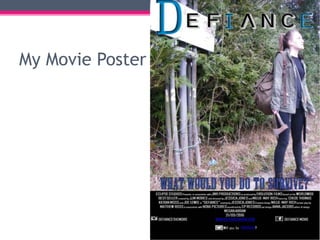
For the movie poster, the creator used conventional elements like featuring the main female character in a strong stance holding a weapon to challenge stereotypes. They also included a conventional call to action tagline and consistent title billing.
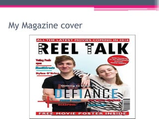
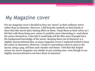
The magazine cover featured the actors as their ordinary selves rather than in character, challenging the convention of depicting actors in costume. However, layout elements like headlines and images were conventionally designed.
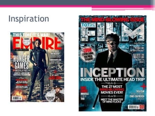
In both works, the creator was inspired by existing real movie marketing but made some unconventional choices to develop new interpretations while still using standard forms.
4. My Movie Poster
For my Movie poster I wanted to created a strong female character who looked
vulnerable at the same time. I created my Defiance Poster using our main
character Olivia at her strongest position in the film. I gave her a weapon to
show she is not the stereotypical vulnerable female and positioned her in a
stance so that she is perhaps ready to fight if necessary. Also the way she is
positioned with the light on her face shows she is looking toward the light, so
perhaps some light in the darkness. I feel this is a conventional image to use
when looking at the posters I have analysed. I also added a conventional tag
line “what would you do to survive” as I felt this would intrigue the audience as
it suggests that my character would perhaps do anything to survive. Finally I
added a conventional title and Billing block, which also features in my traile, I
did this to ensure there was continuity throughout my products, which again is
a conventional method to use.
6. Inspiration
These two posters were the main inspiration for my movie poster for Defiance.
Both these posters are within the Post-apocalyptic genre we had chosen for our
trailer. I liked these designs as they both showed the female lead in a strong
stance but still quite vulnerable. I decided to use these two posters in the
creation of mine as I felt it would appeal to my target audience. I feel that by
doing this I have in some ways followed conventions set out by existing movie
posters. Therefore I feel my movie poster for Defiance is a conventional poster,
with traditional ideas from the post-apocalyptic genre.
8. My Magazine cover
For my magazine cover I decided to have my ‘actors’ as their ordinary selves
rather than in character. However, I did keep the symbols on their hands to
show that this movie had a lasting effect on them. I kept them as their selves as I
felt that with them being new actors it would be more interesting to read about
the actors themselves, I also felt it would help sell the film more if people have
the background knowledge of the actors. Keeping them out of character is a
slightly unconventional idea, as many magazine covers I analysed tended to keep
the actors in characters. However, I stuck to conventions when it came to the
layout, using a pug, sell lines and a header and footer. I felt that this helped
ensure my movie magazine was similar to pre-existing ones even though it was
slightly unconventional to not have them in character.
10. Inspiration
It was difficult to find movie magazine covers with the actors as themselves as
there are not many which have been made. The majority of magazine covers I
found were with the characters. However, I liked the layout of the previous
covers for Empire and Total Film as I felt they we effective. So I tried to follow
these layouts and add some conventional elements to my cover. I used these
covers to enhance my own. Overall, I feel that I have challenged conventions
slightly by having my actors as themselves, but I have stuck to conventions in
other ways. I feel that my magazine cover is a good promotional tool for
Defiance.