
Recommended
More Related Content
What's hot
What's hot (18)
Viewers also liked
Viewers also liked (20)
Similar to Film Poster Evaluation
Similar to Film Poster Evaluation (20)
Recently uploaded
Recently uploaded (20)
Film Poster Evaluation
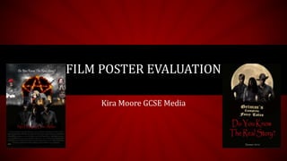
- 1. Kira Moore GCSE Media FILM POSTER EVALUATION
- 2. RESEARCH My research allowed me to look at the different genres of films and how they generally looked. From this I could use the conventions when creating my own poster. I found that throughout all of the styles of film poster a general rule was three colours with the title central and at the bottom. However this did vary. Generally it was a mid shot of the main actor with a background behind them. If it was a group franchise then you had the main supporting roles’ faces towards the background with the main characters more central and larger. I found this out through my research and analysing several posters pulling bits from each to make my own poster. The teaser research I did was to a lesser extent as there was a lot less to include. Enough to suggest what the film could be about but not enough to give anything away. So , in summary, my research was very useful as it allowed me to pull sections and conventions from different posters and use them in my own to make a professional looking piece.
- 3. MARKET RESEARCH After researching my target audience I created a audience profile that detailed the audience I was aiming my film at. Much of my idea behind the general plot is pulled from different books and films so my research was on people who would like these kinds of things. Namely, paranormal and supernatural films such as the mortal instruments in particular. One of my main ideas for the poster came from the cloud atlas poster as it represented not only my target audience but also many of the conventions I wanted to use as, like my film, it contains many different stories within one. It uses subtle mise-en-scene to suggest the different stories apparent from the use of costume. This is reflected in my poster. Other market research I did was ask some people about what they though made a good supernatural/action and from the answers I was able to derive some of the main trends people like to see within my chosen genre.
- 4. While making my poster I realised the effects I wanted to use weren’t available on Photoshop so I had to work around it. The lighting I needed was also difficult to find but I did eventually find images that reflected the lighting on my main characters. The background characters didn’t matter as much as I blended them into the background to show they weren’t a huge part of the story. Another thing I changed was the amount of images I was originally going to use. When I put the poster together it looked too busy and chaotic so I cut the images back and included only the important ones that worked. I also change some of the original images such as the apple becoming a hand holding one so that it looked more natural. I replaced the missing images with character images which I thought would clarify the plot more. They looked better and more organized than just the random, unordered pictures of random objects. However I was going for a busy look to reflect the films nature. CREATIVE DECISIONS As I added the new images of characters I found a certain blending tool which took only parts of their faces out and used this as it made the images look as though they were disappearing into the background. The font I used was to reflect the base on the plot with a story font. Handwritten fairy-tale font. I looked on dafont.com for inspiration but was able to find what I was looking for readily available on PhotoShop. If I was going to change anything it would probable be to make the images in the background wither all grey or more grey so that they blended more and fit with the 3 colour convention of most film posters.
- 5. CODES AND CONVENTIONS Three Colours (Red, Black and White) Film name central and at the bottom of the posterMid-Shots of main characters central Small printed credits that don’t stand out Age Certificate at the bottom corner Supporting roles characters at the sides in the background See research for detailed analysis on conventions. Background links to settings in the film Costumes links to time period settings I didn’t include film companies or actors names as I think it would take away from the main plot I’m trying to convey and that it is eye-catching enough without having to draw in an audience with ‘big names’. I have included them in the credits and believe that to be enough. Plus some people will recognise famous faces just from their appearance on the poster. Catchy slogan central along the top. Iconic images relating to genre and the plot of the film
- 6. COMPARISON TO ONE IN MY CHOSEN GENRE Similarities: • Multiple characters • Different backgrounds on top of each other to show different elements of the film • Title and credits central at the bottom • Costumes reflect different time periods • Props and icon used to show different eras and storylines • Characters central • Age restriction listed • Main characters have mid-shots • Layers blended to form one image • All characters are shown in the same or similar lighting Differences: • No actors listed • Mine has a slogan • All characters are separate • Darker colour scheme • Not original font • Darker lighting on characters • Not all characters central • No sun glare or source of light evident • No release date • No company logo • Credits stand out more on the Cloud Atlas poster • All my supporting characters are blended to the background not central
- 7. RELATION TO TARGET AUDIENCE Due to my popular theme the main audience would consist of people that had already seen films similar. My film is aimed at both male and females of the age 13 and up. This means that to draw their eye sex appeal and the promise of something supernatural has to be employed. By using attractive males and females on the poster it appeals to both males and females and by having the wolf silhouette, pentagram and castle it shows a supernatural element. The pentagram is also used in the popular TV show Supernatural so people that watch that will look at the poster even though it isn’t about that TV show. The dark colouring leaves mystery and sinister connotations. This draws my chosen audience in as they would have to look twice to properly see the poster and piece together what it was about. Using the costumes from different time eras also adds mystery as well as hinting again to the plot. By placing the girl in the centre of the two boys we create the sense of her not only being the main character (and so appealing to girls as the protagonist is a girl) but also knowing the two dark and brooding figures behind her. At the minute every successful book or film has had one cheery good guy and one dark bad boy both vying for a girl’s affections. It creates tension and means that the girl must choose. When looking at this poster that subconscious message is conveyed and so draw in the target audience of teenagers. By having the different settings it hints to action which appeals to males as well as all of the pretty girls included in the poster. By using a question as the slogan it creates curiosity which adds to the mystery. Alongside this the promise of something paranormal (the wolf and the apple) creates curiosity. Overall, without the audience even being aware of it, the poster will leave the onlooker curious, drawing links between the characters and looking for a plot which explains the variety of costumes and settings. It draws them in with the bold colours in contrast to the dark background and hints to just enough of the plot to leave them interested even without the big names. This all related to the target audience as things that are light are often related to comedies but this is more of a sci-fi/fantasy action thriller so the dark colours reflect this and draw in people who are interested in darker films. The age of the actors reflects the age of the target audience making it more relatable and interests them as they are all attractive. See audience profile for target audience analysis.
- 8. SUCCESS I think my poster were successful as I was able to achieve a semi- professional finish on them and (as show previously) they fit with most of what I was trying to achieve through the codes and conventions of my chosen genre and fitting with my target audience. Some things I would change if I did this again would probably be the lighting on the main characters as, while effective to create and air of mystery, they are supposed to draw the eye but I find they blend slightly too much with the background. It is clear that they are there just not that they are as important as they should appear. I am pleased with the overall aesthetic of the posters as the message of mystery and supernatural parts is put across clearly without them looking overly amateurish or too disjointed. The teaser shows the main theory behind the plot and the main characters without giving too much away about the actual film. The poster gives just enough to leave the audience interested and curious. It was the first time I used Photoshop making these posters and I thing that I have done an overall good job making them look realistic as one image and not lots of separate ones layered over each other. I wanted to include a sun glare off of the title but was unable to due to restrictions on photoshop and the time limit. I think that if I had it would’ve made it look too busy anyway. I like the effect created with the different fonts and colours along with the different shots of the characters included. Given more resources I would have made it look completely professional by refining the edges on things and having actual models in period clothes instead of layering the clothes over the models. I would also have included more than just one original image so I could get all of the lighting to match making it more realistic again. However, I think give the time and resource I have done a good job and created two posters that I am proud of and reflect my initial ideas.