Presentation by Andreas Schleicher Tackling the School Absenteeism Crisis 30 ...
Fonts design
1. Fonts Design/ Research
Digipak:
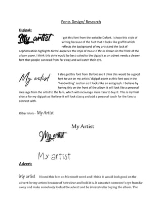
I got this font from the website Dafont. I chose this style of
writing because of the fact that it looks like graffiti which
reflects the background of my artist and the lack of
sophistication highlights to the audience the style of music if this is shown on the front of the
album cover. I think this style would be best suited to the digipak as an advert needs a clearer
font that people can read from far away and will catch their eye.
I also got this font from Dafont and I think this would be a good
font to use on my artists’ digipak cover as this font was in the
‘handwriting’ section so it looks like an autograph. I believe by
having this on the front of the album it will look like a personal
message from the artist to the fans, which will encourage more fans to buy it. This is my final
choice for my digipak as I believe it will look classy and add a personal touch for the fans to
connect with.
Other trials - MyArtist
My Artist
Advert:
My artist I found this font on Microsoft word and I think it would look good on the
advert for my artists because of how clear and bold it is. It can catch someone’s eye from far
away and make somebody look at the advert and be interested in buying the album. The
2. style of this font is also very similar to a ‘Wanted’ poster used to try and catch criminals
which is also used to gain the attention of passersby.
This font was in the ‘Chinese/Japanese’ section on Dafont. I
chose a font from this section because in my duo both artists are
of Asian ethnicity so the font reflects the routes of my duo which is something that will fit in
with the style and design of the advert. Also the fact that it looks best in capitals will also
grab the attention of people who will potentially see the advert, which is why this is my
final choice.
Other trials – My Artist