
Recommended
More Related Content
What's hot
What's hot (20)
Similar to Unit 14: Digital Magazine-pt.1
Similar to Unit 14: Digital Magazine-pt.1 (20)
More from MayankKumar398
More from MayankKumar398 (20)
Recently uploaded
Recently uploaded (20)
Unit 14: Digital Magazine-pt.1
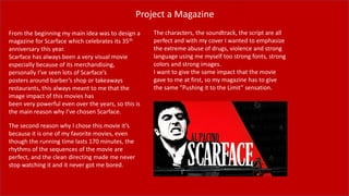
- 1. Project a Magazine From the beginning my main idea was to design a magazine for Scarface which celebrates its 35th anniversary this year. Scarface has always been a very visual movie especially because of its merchandising, personally I’ve seen lots of Scarface’s posters around barber’s shop or takeaways restaurants, this always meant to me that the image impact of this movies has been very powerful even over the years, so this is the main reason why I’ve chosen Scarface. The second reason why I chose this movie it’s because it is one of my favorite movies, even though the running time lasts 170 minutes, the rhythms of the sequences of the movie are perfect, and the clean directing made me never stop watching it and it never got me bored. The characters, the soundtrack, the script are all perfect and with my cover I wanted to emphasize the extreme abuse of drugs, violence and strong language using me myself too strong fonts, strong colors and strong images. I want to give the same impact that the movie gave to me at first, so my magazine has to give the same ”Pushing it to the Limit” sensation.
- 2. Market Research First I searched for some trending movies magazines cover, just for have a look about what works in the market and what people usually buy and what the audience is ok with. Then because Scarface was my first choice from the beginning, I searched for some gangster movies magazine covers where it’s obvious the clear visibility of the face and the weapon(where there is) of the main character.
- 3. ”Blvck Mag” is the name of my magazine, which will be digital on its own website linked with a main Instagram page. The target of the magazine has a 17 to 25 years old audience, this because the magazine genre will be a mix of teen movie and music kind. Blvck it’s pronounced Black, this because in the trap music for slang the letter A is usually written as a v, that explains immediately which type of communication will be used. The name ‘blvck’, the thematic and the language used it’s really close to the Afro- American culture, all the music articles will be pointed on the Hip Hop, RnB, Blues and Soul kind and all the movies will be related to Gangster, Mafia and Ghetto imaginary or will the ‘Big Pieces’ in the Afro-American Hollywood industry; For Example: Denzel Washington, Samuel L. Jackson, O’Shea Jackson, etc. Even if the magazine will be available online to anyone, the main target is the street- imaginary close youth. The original logo doesn’t have anything special, it just has to be perfectly readable and clear to everyone, it is very simple as most of the magazine logos and it works on positive and on negative.
- 4. Why Digital? The main link to the website will be the Instagram page which with the swipe up and IGTV is becoming more and more comfortable. Instagram also is related to Facebook and all the Zuckerberg’s social media so this make the magazine compatible on more media platforms. The magazine will also have his website with the advertisement collaborations and every article will be linked to his Instagram post and highlighted story with the swipe up link. Every Instagram user will be able to see the post with the highlights but to access the whole article it will have to be paid on the official website
- 5. Layout roughs The first thing I did for the project was thinking about a setting layout of the main element of the magazine cover so I started drawing roughly some drafts on paper so I could have a basic idea of how I was going to set my elements. For example:
- 6. Personally I’m more familiar with the ”on field” work so I challenged myself as I always do approach a project. I just downloaded the images and imported them on Photoshop and started working. This is the very first picture I downloaded-from the amazon page of ”Scarface 4k Gold Edition DVD & Blu-Ray”- and imported on Photoshop and the first thing I did was crop the image in an A4 size, actually I didn’t even stayed there thinking about where and how I was going to crop it, I left myself think about how it was going to look “cool” so luckily I really had a very good crop. I think that my experience on working with illustrator setting elements on posters or leaflets makes me crop “good”(I would say workable) shots automatically and in my mind the dominant image had Tony’s face and the shotgun clearly on view. This because all the elements I wanted to add later during the production, they didn’t have to cover this two main visual catches. After being sure to have a working dominant image the really second thing was choosing the font and the position of the main heading/movie title. After various tries the size and the position came by themselves but for the font I used ‘Javanese Texts’ because when stretched it really recalls the original font used for the movie poster of Scarface. I overlie twice the same text box for the final result, the first in white(#ffffff) and the second in red(#ff0000),both of them surrounded by a Drop Shadow effect.
- 7. ”Say Hello To My Little Friend” is the catch-phrase of the whole project as is one of the most famous quotes from the movie and it’s very often used for fan-made or professional realizations of posters and merchandising for the movie. The text is in capital ‘Cambria Math’ font (like most of the text boxes of the magazine) surrounded by a Drop Shadow effect. The biggest challenge was the positioning of the text box after changing size and position the quote seemed to me suiting very good on Tony’s shoulder, just a little bit lower than his head. Zapping on web searching for information about the movie I found out that the movie had just nearly celebrated its 35th anniversary of release in the theatres. So it really looked fine to me if I could market-press on this point. The text is in regular ‘Cambria Math’ font and finally stretched in vertical, in the end I addeda Bevel & Emboss effect.
- 8. The movie has always been very liked from the critics and from the public so if anyone sees the magazine but never heard of the movie has to be attracted by and has to be convinced to buy the ticket for the cinema and go watch it. I used one of the often used market strategy, which is quoting the best reviews about the movie and print it for the big audience. So I scrolled through various websites and I chose the two that convinced me more, I read through two big movie review websites, which are Empire and The Guardian, who voted 5 and 4 stars for the movie, I also copied and pasted the 2 quotes that could convince more the target and paged all a little higher than the shotgun without going too much over it Adding some secondary images was already present in my plan but even if I did some on paper drafts, actually I didn’t follow entirely any of them. During the work it was impossible to not notice that there was too much space in the right top of the page so that was the perfect place where to place the secondary images with a little white border did with the brush tool
- 9. After all the main texts and images it was fair to talk effectively about the movie so on the bottom of the secondary images I wrote some little subheading catch-phrases that could describe the ambient and the genre of the movie that I am trying to promote. And in a bigger typographic points I clearly advised that the movie is not recommended to anyone who’s under 17 years old because of the strong drug, violence and language abuse All of that in a regular ‘Cambria Maths’ font added with a Drop Shadow effect Just before the very last thing, I added was the selling line which is not big as anyone would do it but it’s in a clear white on the top left, all this because in the Latin alphabet our eyes are used to read from left to right, from the top to the bottom so every one would anyway pay attention to the line which is in one of the most recognizable font ever. It is in a regular Arial, white color with the only variation of a pantone with the worlds ”Gold Edition”-Gold(#dba80b) and “Scarface”-Red(#ff0000).
- 10. After everything, I added my magazine’s logo, as the biggest text on the page because when the product will be known to the big audience, anyone who sees it can recognize it even without spending time in reading it. For the shotgun-through effect I highlighted with the quick selection tool on the image layer, then I moved the selection on the text and erased the letter L, V & K with the brush on the masked layer. I didn’t keep the full text box because the face and the shotgun were the two elements that I wanted to cover les than any other.
- 11. FINAL RESULT This is the main idea that I want to purpose to the market. I really feel proud of my work because showing it to various people that I know and I don’t know, it really seems working even on people that have never seen the movie and they felt attracted by the kind and the film itself. I feel some uniformity in the whole setting of elements and colors and I also think that the font and the text boxes are light and well placed