
Recommended
More Related Content
What's hot
What's hot (20)
Viewers also liked
Viewers also liked (16)
Similar to Double page spread feedback
Similar to Double page spread feedback (20)
More from Leanne Pyne
More from Leanne Pyne (20)
Recently uploaded
Recently uploaded (20)
Double page spread feedback
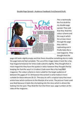
- 1. Double Page Spread – Audience Feedback First/Second Draft. This is technically the firstdraftfor my double page spread. They said that they liked the colour scheme and the way in which the arrows move through the page they said it is captivating and it finally looks like a real magazine. They thought that the page still looks slightly empty and that there should be something else to make the page look and feel complete. The use of the image makes it look like a hip hop magazinehowever her dress code subverts slightly. They thoughtthat in most magazines they have the quotes in italics however they thought that by keeping the fontthe way it is it makes it look more like a hip hop/R&B magazine. The colour scheme is more suited for the target audience of between the gages of 15-18 however thecontent is what makes it more suitable for those who are 18-21. Thestory its self is a typical story that most artists have which conforms to the lifestyle of an artist. The picture I have used was liked because it looks like she looking into the story which is almost like looking into her past. They liked the fact that there was page numbers at the sides of the magazine.