TataKelola dan KamSiber Kecerdasan Buatan v022.pdf
Magazine article analysis
1. Article analyse #1
Main Article This is the main factual piece of writing on a single subject/topic. It is the one
advertised more on the front cover and also takes up more space inside the magazine. The
font used is Serif which contrasts with the article title but gives the main body a more
formal feel to it. It is split up into four paragraphs as to make the audience feel more
inclined to read it, rather than it being just one big unattractive block of text. Drop cap has
also been used to keep the article looking entertaining as it adds a bit of variety to the page.
The mode of address used in the main article is very relevant to the target audience. Words
such as “melancholy” are used which would not be appropriate for a younger audience as
they would not be expected to understand what it means. Whereas the audience for this
magazine would have a general understanding of the meaning of the word.
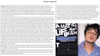
Heading-“Matter of Life and Death” This is relevant to the genre and audience of the magazine. The genre is
Indie/Rock so by putting a quite dark, mysterious article title will make the audience think and relate to the genre,
due to the music that is produced. “Life and Death” is quite a dark topic which is related to the type of music
associated with the Indie/Rock genre. The never edgy faded font signifies to the image, looking very scruffy,
matching a theme or layout in the article, a code and convention of magazine articles is creative mastheads of some
form, and Kerrang don’t disappoint, the titles use of hyperbole really stands out, the audience would be interested
as the title really contrasts with the image, with an expression of kissing on his face signifying that the article may be
funny and interesting to read.
Main Image This is the main focal point of the double page and is the used as a quick and incisive way to grab the
audience’s attention. Usually, the main image is a well-known icon of the genre of the magazine in order to relate to
fans of the genre and the target audience. This takes up one whole page of the double page spread so it is obvious
that this is the main image of the pages. Despite the model is facing the camera, his eyes are closed which means
direct address is not used. The style of the model is relevant to the theme and genre of the magazine. His messy hair
and unbuttoned shirt suggests the grungy, informal design of the magazine. This will keep the targeted audience
interested in the magazine as their preferred style is consistent throughout the magazine. The contrast of the image
being joking is a good marketing tactic, as human instinct kicks in and people want to know what is happening.
Layout This is how the elements of the double page spread have been put onto the pages. I can see that a grid has
been used in order to create an organised layout across the two pages. It is better to keep an organised layout to
the pages in order to keep the audience willing to read it. If there was no logical structure, then the audience would
become confused and would just give up trying to read it. It is sectioned off so we have the article title top left, then
directly underneath is the main body of text. On the right is the main image. This contrasts with the overall style of
the magazine as it is quite informal and grungy so to have some form of organisation keeps a professional feel to it.
In magazine articles it is usually set out in ordered columns so it’s easy for the reader to read and get the key
information on the article, the article copies the codes and conventions of a magazine as all magazines, regardless
of genre, will have these characteristics, even newspapers present this code and convention . Also it will be
generally informal so the reader feels comfortable reading the information and wants to read more as they don’t
feel like they’re being forced to.
New media – This is usually on magazines so that their audience can see new information on Twitter/Facebook
before magazine releases or to get new information. However in this issue Q doesn’t have new media information
but is likely to have it in other issues.
Pull quotes- The pull quotes would usually be from the most exciting parts of the interview. The use of this key
code and convention signifies the article is exciting, the format of the pull quote is also very interesting, making it
look like it have been ripped off a piece of paper.
2. Article analyse #2
New media – This is usually on magazines so that their audience can see new information on Twitter/Facebook before
magazine releases or to get new information. However in this issue Q doesn’t have new media information but is likely
to have it in other issues.
Layout – In magazine articles it is usually set out in ordered columns so it’s easy for the
reader to read and get the key information on the article, the article copies the codes
and conventions of a magazine as all magazines, regardless of genre, will have these
characteristics, even newspapers present this code and convention . Also it will be
generally informal so the reader feels comfortable reading the information and wants to
read more as they don’t feel like they’re being forced to. Moreover double page spreads
will almost always have a capital letter/bold figure at the beginning of the article;
however not only does Q have one at the beginning of the article but also at the
beginning of a new paragraph with the letters ‘S’ and ‘IThe code and convention of red is
present in the article, as music magazines use red and it is popular in almost every
magazine, the red doesn’t clash with the text but is used to stand out the article even
more. This signifies that they know their audience knows who lady Gaga is, so only
advertising the L is still enough to get the audience interested in her work.
Image- Lady Gaga is shown sporting wacky and unique clothes, which is the code and
convention of her, always wearing unique and weird clothing which signifies to her
music videos/album covers. She looks very sexualised in this image, the convention of a
female with her mouth slightly open looking at the camera is very common as it is very
seductive and advertising to a male or homosexual audience to read the article. Her
expression represents her promiscuous attitude and personality. This engages an
aspiring audience to be like her because she is well known individualistic. The
background colour of this main image is white which helps to highlight Gaga and to look
bold, and make the image memorable, the sepia effect which helps her to stand out
from the background as her skin is more of a shadowed colour. sepia has connotations
of sultry, sexual and classy individuals which shows Q is not only sticking to their house
style but is very clever in how they used colours to portray Gaga’s personality without
the reader having to read the article, which is the main thing, the image is meant to
convey the article, contrasting to the ABC1 target audience, being educated and not
dependent on images, the use of a whole page for the image signifies that younger ABC1
audiences would be attracted to this article, as younger audiences might not be as
interested in the article, why they have used a large image to advertise and sample what
the article might be about. The image fits the conventions of the article by matching
with the feel of the article, being black and white except for the “L”, as the L is there to
stand out further.
Large heading- This is of the quote ‘Lady Gaga’. ‘Gaga’ is in block capitals in black which adheres to the colour scheme,
and matching the typography of the article. This makes the reader want to read on and find out about Gaga.
Page numbers - The page numbers adhere to the codes and conventions of magazines
as they have the numbers at the bottom corner of the page with the word ‘page’ next to
it. They are there to show the reader what the pages listed contain and what number
they have to go to, to find it. The colour of the numbers follow the colour scheme and
house style of Q as they are in white in front of a black background and are in bold font.
Pull quotes- This article does not have any pull quotes however they would usually be seen in double page spreads to
grab the readers information. The pull quotes would usually be from the most exciting parts of the interview. The miss
of this key code and convention signifies negative ideas, making the audience think that the article is boring and not
worth reading.
Footer- The footer shows the Q logo, this is a normal code and convention of Q magazine, but other magazines don’t do this,
signifying that their articles may be different from the theme of the magazine, as a rock and pop magazine covers a lot of music, the
logo is used as a reminder that this is a high quality and reliable magazine
3. Article analyse #3
Images -There are a variety of images in this article, this makes the article more interesting and more
visual as we can see the artists journey (Pictures of the past up to now) as well as the artists story from
Ariana's point of view. This is the main image in the article. It shows the artist in a natural pose, standing
in a confident position, making eye contact with the audience. The images are all relevant to the story
shown in the article. All these images look exciting, fun and show Ariana is having a good time through
those series of events. The images are aligned in an interesting way which makes the layout of the article
look a lot nicer than having the images the same size and set out in a straight line for example. The face
of the artist is very clear as lightning was used which makes the artist stand out from the background
significantly and reveals all the face makeup (Pink lips, white eye shadow).
pull quote- Large text pull quote from the article; this quote makes the audience intrigued and
interested to read the article and for them to come to a conclusion why Ariana's mum thought she might
grow up to a serial killer. (The most interesting quote is picked out from the article to catch the most
attention. It's also a sans serif font which differs from the serif font of the article. The pull quotes would
usually be from the most exciting parts of the interview. The use of this key code and convention
signifies Positive ideas, making the audience think that the article exciting, advertising to a younger ABC1
audience that isn’t as interested in reading but can still afford 1st rate magazine prices.
Footer- A page number, the date of the magazine article and the name of the magazine is featured at
the bottom left of the page in small font, the uses and gratifications theory states we use media for
information, the use of bold text for the page number, which is the information needed out of the footer
proves this, the editor made this text bold as the audience needs this information.
The colour scheme The colours used in the article are very simple and plain; the background is white so
that the text can be easily read. A darker background is placed when the artist is so that the artist stands
out from the page and so that it adds a bit more colour to the article. There are small captions for the
images in the article explaining briefly about the images(date and place of the image taken etc. It
informs the reader where the artist had been and what they have been doing to inform the reader
where the artist goes so that if they are her fans ,they can see the places she had visited. There are four
columns in the article for the text .The text is in a small font however it is spaced out to make it easier
for the audience to read which makes the layout look more tidy so it is more pleasant to read. In
magazine articles it is usually set out in ordered columns so it’s easy for the reader to read and get the
key information on the article, the article copies the codes and conventions of a magazine as all
magazines, regardless of genre, will have these characteristics, even newspapers present this code and
convention . Also it will be generally informal so the reader feels comfortable reading the information
and wants to read more as they don’t feel like they’re being forced to.
New media – This is usually on magazines so that their audience can see new information on
Twitter/Facebook before magazine releases or to get new information. However in this issue it doesn’t
have new media information but is likely to have it in other issues.
heading- A code and convention of any article is the heading but this article ignores this, signifying the
editor feels they have represented the article perfectly through other features like the image, Ariana
Grande is so recognizable that it is almost futile, the audience get the same gratification out of the
picture than they do text, signifying that this is for a younger audience that may not be as interested in
reading, the closest thing from a heading we get is the first letter of the article is large and in a slightly
bold font with a blue font to bring an eye to the start of the article; so that it is different from the article
itself.