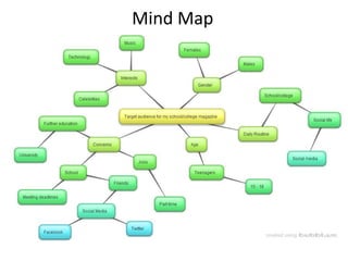
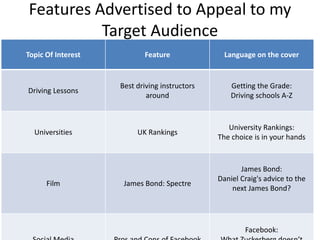
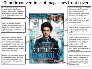
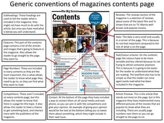
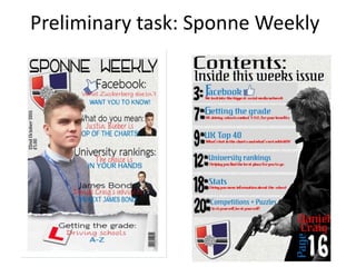
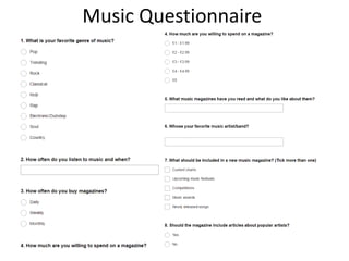
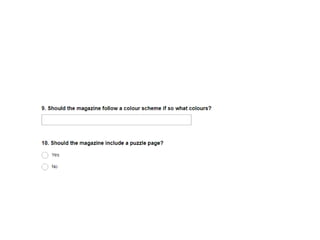
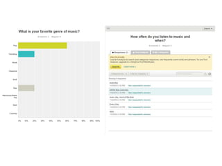
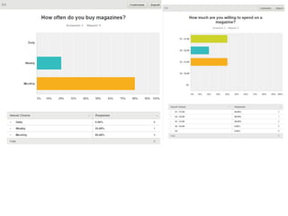
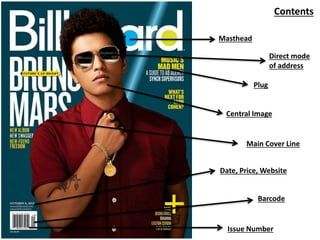
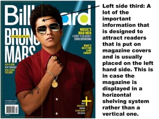
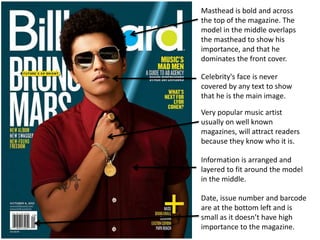
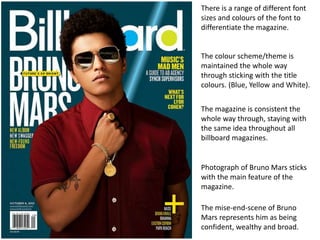
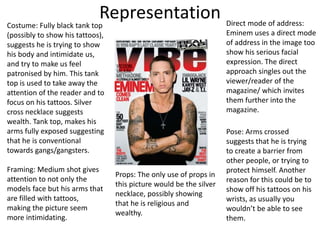
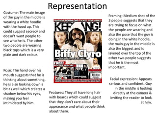
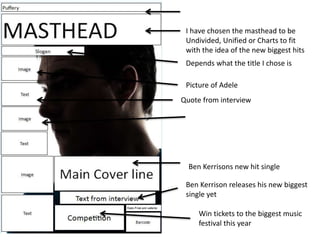
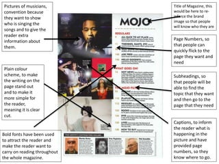
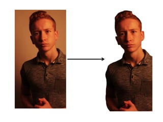
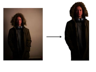
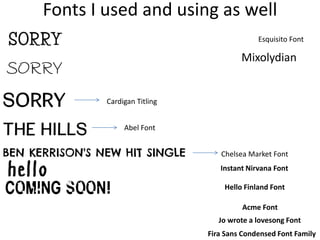
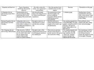
G321: Foundation Portfolio in Media
Nathan Paul Edser
Candidate number: 2068
Centre number: 27258
Chosen Set Brief
• Print – Preliminary exercise: using DTP and an image manipulation programme, produce the front page of
a new School/college magazine, featuring a photograph of a student in a medium close-up plus some
appropriately laid-out text and a masthead. Additionally, produce a DTP mock-up of the layout of the
contents page. https://www.surveymonkey.com/r/M39HRG9
Target Audience
Results
Mind Map
Features Advertised to Appeal to my
Target Audience
Topic Of Interest Feature Language on the cover
Driving Lessons
Best driving instructors
around
Getting the Grade:
Driving schools A-Z
Universities UK Rankings
University Rankings:
The choice is in your hands
Film James Bond: Spectre
James Bond:
Daniel Craig's advice to the
next James Bond?
Facebook:
Generic conventions of magazines front cover
The masthead is usually the name
of the magazine, in bold to be
made to stand out. But because it is
a big American magazine the title
can be hidden a bit and still wont
be a problem.
Price: The price has also been
included on this magazine. But is in
a small font to hide it because it
might be to expensive compared to
other magazines.
Barcode: The barcode has been put
to the side and out the way of the
main image because it isn't to
important to the film but to the
magazine it is.
Main Image: There has been a
picture included of the main actor
in the film, and because he is
famous they probably think that he
might get more people to buy the
magazine. The character also covers
the masthead which could show his
importance in the movie.
Slogan: On this slogan we see that
they have included information
about what is inside the
magazine, which is going to draw
the reader in to want to buy it.
Sky Line: This is the line that runs
across the top of the page, this is
basically the slogan.
Colour Scheme: It is simple, and is
trying to relate to the film and
bring out the main image in the
middle.
Layout: Usually quite formal and
professional. As we can see from
this magazine it gets straight to
the point with an image in the
middle, and then more
information around the edge
about the rest of the magazine, to
attract the reader.
Sell line: This is what attracts the
target audience, they always go
along with what is on the page
and giveaway some information
about the rest of the magazine,
attracting buyers.
Generic conventions of magazines contents page
Subheadings: These headings are
used to tell the reader what is
included in the magazine, they
might not have much to do with the
article, but once you have read what
is below you will understand.
Reviews: The reviews section of the
magazine is a selection of reviews
about some of the latest film and Tv
shows that are on TV. Mainly well-
known and popular movies.
Date: The date is very small and usually
in a corner of the page. This is because
its not that important compared to the
rest of what is on the page.
Text/Colour scheme: On the contents
page the colours have to be more
sensible and less vibrant because its not
trying to attract someone anymore.
This is because it is going to be easier
for the reader to understand what they
are reading. The text/font also has to be
simple so that the reader can once
again easily read what has been
included in the magazine.
Features: This part of the contents
page contains a list of the articles
and images that’s going to feature in
the magazine. Also allows the
reader to go straight to the page
they want to.
Page Numbers: These are included
in every contents as they are the
most important, this is what allows
the reader to know what page they
need to go to, so they can find what
they want to read.
Competitions: These aren't included
on every contents page, but this
allows the reader to know that
there is a page for this topic. It also
allows the reader to have a chance
to get something back, and interact
more with the publishers of the
magazine.
Article Preview: This is the article that
stands out most on the page, but in this
magazine they have implemented many
different pictures of the movies that are
popular to show what they are
including. There are usually page
numbers near them so you can go
straight to the page its on.
Contact: At the bottom of the page they have included
a way to contact them on all social media and over
phone, so you can join in with the competitions and
give your opinion. An example of giving your opinion
would be the text at the bottom telling you to tweet
them about something, which they might include in
their next issue.
Preliminary task: Sponne Weekly
Music Questionnaire
Contents
Masthead
Direct mode
of address
Central Image
Main Cover Line
Date, Price, Website
Barcode
Plug
Issue Number
Left side third: A
lot of the
important
information that
is designed to
attract readers
that is put on
magazine covers
and is usually
placed on the left
hand side. This is
in case the
magazine is
displayed in a
horizontal
shelving system
rather than a
vertical one.
Date, issue number and barcode
are at the bottom left and is
small as it doesn’t have high
importance to the magazine.
Masthead is bold and across
the top of the magazine. The
model in the middle overlaps
the masthead to show his
importance, and that he
dominates the front cover.
Celebrity's face is never
covered by any text to show
that he is the main image.
Very popular music artist
usually on well known
magazines, will attract readers
because they know who it is.
Information is arranged and
layered to fit around the model
in the middle.
There is a range of different font
sizes and colours of the font to
differentiate the magazine.
The colour scheme/theme is
maintained the whole way
through sticking with the title
colours. (Blue, Yellow and White).
The magazine is consistent the
whole way through, staying with
the same idea throughout all
billboard magazines.
Photograph of Bruno Mars sticks
with the main feature of the
magazine.
The mise-end-scene of Bruno
Mars represents him as being
confident, wealthy and broad.
RepresentationCostume: Fully black tank top
(possibly to show his tattoos),
suggests he is trying to show
his body and intimidate us,
and try to make us feel
patronised by him. This tank
top is used to take away the
attention of the reader and to
focus on his tattoos. Silver
cross necklace suggests
wealth. Tank top, makes his
arms fully exposed suggesting
that he is conventional
towards gangs/gangsters.
Direct mode of address:
Eminem uses a direct mode
of address in the image too
show his serious facial
expression. The direct
approach singles out the
viewer/reader of the
magazine/ which invites
them further into the
magazine.
Framing: Medium shot gives
attention to not only the
models face but his arms that
are filled with tattoos,
making the picture seem
more intimidating.
Pose: Arms crossed
suggests that he is trying
to create a barrier from
other people, or trying to
protect himself. Another
reason for this could be to
show off his tattoos on his
wrists, as usually you
wouldn’t be able to see
them.
Props: The only use of props in
this picture would be the silver
necklace, possibly showing
that he is religious and
wealthy.
Representation
Costume: The main image
of the guy in the middle is
wearing a white hoodie
with the hood up. This
could suggest secrecy and
doesn’t want people to
see who he is. The other
two people are wearing
black tops which is a very
plain and dark colour.
Framing: Medium shot of the
3 people suggests that they
are trying to focus on what
the people are wearing and
also the pose that the guy is
doing in the white hoodie,
the main guy in the middle is
also the biggest and is
layered over the top of the
other two people suggests
that he is the most
important.
Pose: The hand over his
mouth suggests that he is
thinking about something,
he is also looking down a
bit as well which creates a
shadow below his eyes,
making you feel
intimidated by him.
Facial expression: Appears
serious and confident. Guy
in the middle is looking
directly at the camera &
inviting the reader to look
at him.
Features: They all have long hair
with beards which could suggest
that they don’t care about their
appearance and what people think
about them.
I have chosen the masthead to be
Undivided, Unified or Charts to fit
with the idea of the new biggest hits
Depends what the title I chose is
Win tickets to the biggest music
festival this year
Ben Kerrison releases his new biggest
single yet
Picture of Adele
Ben Kerrisons new hit single
Quote from interview
Jersey m54
Deadhead
rough font
Life Savers Font Family
Mandatory Font
Page Numbers, so
that people can
quickly flick to the
page they want and
need
Subheadings, so
that people will be
able to find the
topic that they want
and then go to the
page that they need
Pictures of musicians,
convention because
they want to show
who is singing the
songs and to give the
reader extra
information about
them.
Plain colour
scheme, to make
the writing on the
page stand out
and to make it
more simple for
the reader,
meaning it is clear
cut.
Title of Magazine, this
would be here to re-
inforce the brand
image so that people
will know who they are
Bold fonts have been used
to attract the reader and
make the reader want to
carry on reading throughout
the whole magazine.
Captions, to inform
the reader what is
happening in the
picture and have
provided page
numbers, so they
know where to go.
Fonts I used and using as well
Cardigan Titling
Abel Font
Chelsea Market Font
Esquisito Font
Mixolydian
Instant Nirvana Font
Hello Finland Font
Acme Font
Jo wrote a lovesong Font
Fira Sans Condensed Font Family
G321 portfolio
G321 portfolio
G321 portfolio
G321 portfolio
G321 portfolio
G321 portfolio

G321 portfolio

  • 1.
    G321: Foundation Portfolioin Media Nathan Paul Edser Candidate number: 2068 Centre number: 27258
  • 2.
    Chosen Set Brief •Print – Preliminary exercise: using DTP and an image manipulation programme, produce the front page of a new School/college magazine, featuring a photograph of a student in a medium close-up plus some appropriately laid-out text and a masthead. Additionally, produce a DTP mock-up of the layout of the contents page. https://www.surveymonkey.com/r/M39HRG9
  • 3.
  • 5.
  • 10.
  • 11.
    Features Advertised toAppeal to my Target Audience Topic Of Interest Feature Language on the cover Driving Lessons Best driving instructors around Getting the Grade: Driving schools A-Z Universities UK Rankings University Rankings: The choice is in your hands Film James Bond: Spectre James Bond: Daniel Craig's advice to the next James Bond? Facebook:
  • 12.
    Generic conventions ofmagazines front cover The masthead is usually the name of the magazine, in bold to be made to stand out. But because it is a big American magazine the title can be hidden a bit and still wont be a problem. Price: The price has also been included on this magazine. But is in a small font to hide it because it might be to expensive compared to other magazines. Barcode: The barcode has been put to the side and out the way of the main image because it isn't to important to the film but to the magazine it is. Main Image: There has been a picture included of the main actor in the film, and because he is famous they probably think that he might get more people to buy the magazine. The character also covers the masthead which could show his importance in the movie. Slogan: On this slogan we see that they have included information about what is inside the magazine, which is going to draw the reader in to want to buy it. Sky Line: This is the line that runs across the top of the page, this is basically the slogan. Colour Scheme: It is simple, and is trying to relate to the film and bring out the main image in the middle. Layout: Usually quite formal and professional. As we can see from this magazine it gets straight to the point with an image in the middle, and then more information around the edge about the rest of the magazine, to attract the reader. Sell line: This is what attracts the target audience, they always go along with what is on the page and giveaway some information about the rest of the magazine, attracting buyers.
  • 13.
    Generic conventions ofmagazines contents page Subheadings: These headings are used to tell the reader what is included in the magazine, they might not have much to do with the article, but once you have read what is below you will understand. Reviews: The reviews section of the magazine is a selection of reviews about some of the latest film and Tv shows that are on TV. Mainly well- known and popular movies. Date: The date is very small and usually in a corner of the page. This is because its not that important compared to the rest of what is on the page. Text/Colour scheme: On the contents page the colours have to be more sensible and less vibrant because its not trying to attract someone anymore. This is because it is going to be easier for the reader to understand what they are reading. The text/font also has to be simple so that the reader can once again easily read what has been included in the magazine. Features: This part of the contents page contains a list of the articles and images that’s going to feature in the magazine. Also allows the reader to go straight to the page they want to. Page Numbers: These are included in every contents as they are the most important, this is what allows the reader to know what page they need to go to, so they can find what they want to read. Competitions: These aren't included on every contents page, but this allows the reader to know that there is a page for this topic. It also allows the reader to have a chance to get something back, and interact more with the publishers of the magazine. Article Preview: This is the article that stands out most on the page, but in this magazine they have implemented many different pictures of the movies that are popular to show what they are including. There are usually page numbers near them so you can go straight to the page its on. Contact: At the bottom of the page they have included a way to contact them on all social media and over phone, so you can join in with the competitions and give your opinion. An example of giving your opinion would be the text at the bottom telling you to tweet them about something, which they might include in their next issue.
  • 14.
  • 15.
  • 22.
    Contents Masthead Direct mode of address CentralImage Main Cover Line Date, Price, Website Barcode Plug Issue Number
  • 23.
    Left side third:A lot of the important information that is designed to attract readers that is put on magazine covers and is usually placed on the left hand side. This is in case the magazine is displayed in a horizontal shelving system rather than a vertical one.
  • 24.
    Date, issue numberand barcode are at the bottom left and is small as it doesn’t have high importance to the magazine. Masthead is bold and across the top of the magazine. The model in the middle overlaps the masthead to show his importance, and that he dominates the front cover. Celebrity's face is never covered by any text to show that he is the main image. Very popular music artist usually on well known magazines, will attract readers because they know who it is. Information is arranged and layered to fit around the model in the middle.
  • 25.
    There is arange of different font sizes and colours of the font to differentiate the magazine. The colour scheme/theme is maintained the whole way through sticking with the title colours. (Blue, Yellow and White). The magazine is consistent the whole way through, staying with the same idea throughout all billboard magazines. Photograph of Bruno Mars sticks with the main feature of the magazine. The mise-end-scene of Bruno Mars represents him as being confident, wealthy and broad.
  • 26.
    RepresentationCostume: Fully blacktank top (possibly to show his tattoos), suggests he is trying to show his body and intimidate us, and try to make us feel patronised by him. This tank top is used to take away the attention of the reader and to focus on his tattoos. Silver cross necklace suggests wealth. Tank top, makes his arms fully exposed suggesting that he is conventional towards gangs/gangsters. Direct mode of address: Eminem uses a direct mode of address in the image too show his serious facial expression. The direct approach singles out the viewer/reader of the magazine/ which invites them further into the magazine. Framing: Medium shot gives attention to not only the models face but his arms that are filled with tattoos, making the picture seem more intimidating. Pose: Arms crossed suggests that he is trying to create a barrier from other people, or trying to protect himself. Another reason for this could be to show off his tattoos on his wrists, as usually you wouldn’t be able to see them. Props: The only use of props in this picture would be the silver necklace, possibly showing that he is religious and wealthy.
  • 27.
    Representation Costume: The mainimage of the guy in the middle is wearing a white hoodie with the hood up. This could suggest secrecy and doesn’t want people to see who he is. The other two people are wearing black tops which is a very plain and dark colour. Framing: Medium shot of the 3 people suggests that they are trying to focus on what the people are wearing and also the pose that the guy is doing in the white hoodie, the main guy in the middle is also the biggest and is layered over the top of the other two people suggests that he is the most important. Pose: The hand over his mouth suggests that he is thinking about something, he is also looking down a bit as well which creates a shadow below his eyes, making you feel intimidated by him. Facial expression: Appears serious and confident. Guy in the middle is looking directly at the camera & inviting the reader to look at him. Features: They all have long hair with beards which could suggest that they don’t care about their appearance and what people think about them.
  • 28.
    I have chosenthe masthead to be Undivided, Unified or Charts to fit with the idea of the new biggest hits Depends what the title I chose is Win tickets to the biggest music festival this year Ben Kerrison releases his new biggest single yet Picture of Adele Ben Kerrisons new hit single Quote from interview
  • 29.
    Jersey m54 Deadhead rough font LifeSavers Font Family Mandatory Font
  • 30.
    Page Numbers, so thatpeople can quickly flick to the page they want and need Subheadings, so that people will be able to find the topic that they want and then go to the page that they need Pictures of musicians, convention because they want to show who is singing the songs and to give the reader extra information about them. Plain colour scheme, to make the writing on the page stand out and to make it more simple for the reader, meaning it is clear cut. Title of Magazine, this would be here to re- inforce the brand image so that people will know who they are Bold fonts have been used to attract the reader and make the reader want to carry on reading throughout the whole magazine. Captions, to inform the reader what is happening in the picture and have provided page numbers, so they know where to go.
  • 33.
    Fonts I usedand using as well Cardigan Titling Abel Font Chelsea Market Font Esquisito Font Mixolydian Instant Nirvana Font Hello Finland Font Acme Font Jo wrote a lovesong Font Fira Sans Condensed Font Family