
Recommended
More Related Content
What's hot
What's hot (20)
Viewers also liked
Viewers also liked (14)
Similar to 3 x double page spread
Similar to 3 x double page spread (20)
Recently uploaded
Recently uploaded (20)
3 x double page spread
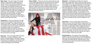
- 1. Main Image – The main image is the model sitting on a block with the USA Flag. She is sitting in a stance that would be desired by women. This is a stereotypical body for a female and therefore she would be someone that younger women would look up to and aspire to be. She takes up the majority of the space. This would then make the page more interesting and exciting as it Isn't all writing. Th image links to the text that has been written and would therefore spark an interest for a reader as by seeing the image, they would be encouraged to read the article about that artist. Masthead – The Masthead is faded and is placed behind the image of the model. It also over laps and the font changes from thick, bold writing that would stand out at first sight, to very elegant writing that is a lot smaller and overlapping the initial text. It is placed over the top half of the page and is straight across the middle, which would be expected. It is unusual that it covers half of the page but it would be a section of the magazine that would be noticeable instantly. This would show to the reader that most of the reading will be based around the USA. Her hair stands out the most and red represents danger which could portray her personality as she could be a fiery character and this could be explained in the text. Colour Palette – There are not many colours that are used in this double page spread but the colours that are used do contrast very well and help the image to stand out a lot more. The background uses a variety of greys and the only distinctive colour comes from the black dress that she is wearing and the colour from her Country’s flag. The light grey contrasts very well with the brighter colours and it becomes more eye catching. Overall Text – The text is placed on the right hand side of the page and only takes up one quarter of the page. This makes the article very minimal with not a lot of detail. The article goes on to explain about how the artists is taking over the USA and it goes on to explain her professional career and what she has been doing in the media and music industry recently. The target audience of this magazine would be fans of the artist on the page Stand First – This is a small section of text that is placed at the top of the article before it begins which is a summary and would engage a reader to read the rest of the article. It would help a reader to gage what they are about to read and whether it is something that would interest them. It is only brief and would only be an outline and not a summary. In this case, there are 3 lines and they are about Paloma Faith and how she has risen to fame and begun “taking over the USA” Drop Cap – This is the bigger letter that starts off the text. It is there to introduce a new section. The black design of the letter matches the theme of the magazine. It can also be used in other things such as books and novels. It matches the writing of the masthead. Design Balance – The design of this double page spread is very formal as the text is all placed together a lined, and all of the writing and titles are in a formal font. The greys and whites that are used also back up this point as they are colours that would be associated with formal representations.
- 2. Images – There are 2 images that are used on these pages and these are both following the same theme and are used in the same way. They are both in black and white colour and they have the artist looking away from the camera in both pictures. They are both medium shots as well which would show continuity. The image covers almost half of the pages so it is clear that these pages are about this one particular artist. They are quite mysterious images as they have shadows and she seems to be in the dark so therefore it could portray what kind of article this is and what they are going to explain about her within the article. Colour Palette – There are minimal colours used in this article as there are only: Black, white and a small section of orange and pink. The minimal colours make the magazine look very boring but by adding the extra pink and orange it makes certain texts stand out and would draw an audience into reading this section first which would then intrigue them to read the rest of the article in black. Overall Text – The text in the article varies very differently. There is text on the left and that is written in a pink colour and the text on the right is in a black colour. There is a lot of text and the article explains about the Artist and her contribution to the music industry. It is written in a very formal way. The text being separated would help the reader to proceed with what they are reading easily and help them to understand and read the article thoroughly. Design Balance – The design is very formal and could be portrayed as quite dull. It contrasts well with each page though as it follows the same theme and there isn’t any articular section that stands out the most, besides the pink text. The white background allows the black text to stand out more and therefore make the article easier to read. Layout - The text is all a lined closely together down the right hand side of the page. The writing so close together could put a reader off as there is little space between section and there is no clear paragraphing. However, by keeping all of the text together it makes the magazine a lot simpler for an audience to read and it means that there is more detail in the text that is there as they have a lot more room to write the article. Quote – The double page spread does include a quote that Rihanna has said herself which would attract their target audience as it is something that would have been spoken by the artist that the article is focused upon. It is also in pink writing which shows that it is not on the subject or topic of what the text is on and that is can be distinguished as something that she has said herself and not been written someone else.
- 3. Main Image – The main image is a close up of an artists face and she is looking away from the camera. Her hair takes up most of the shot and carries through onto the second half of the page. Her facial expression is very serious which could suggest that the article is to do with her music career and can also express her emotion and raw talent within the words that are spoken in the article. By having the shot as a close up shot and not a medium shot would show that she is the main focus of this article and the text that is written is all based around her. By having Adele on the cover as well it also shows what genre of magazine this is likely to be. Headline – The headline in this article is “The Triumph of Adele”. This is used as a short summary and to describe briefly what the article is about and what should be expected by an audience. Through the headline, an audience would be able to realise that the article is about Adele’s music career and how she has worked tirelessly to achieve what she has now. With the writing being so large and in a very formal font, and audience would recognise, then the article would stand out and be ne that an audience would be interesting in reading into further. Colour Palette – There are very minimal colours on this double page spread as everything is coloured in black and white. This is done to match Adele’s facial expressions of how serious she is and how she stands out as much as what this article would like to. The colours could also connote how intimate this magazine is to her emotion and her life as a whole once she joined the music industry. Stand First – The first opening paragraph in this article is a stand first and is only 3 lines short The font is new and is very elegant, which matches Adele’s personality and lifestyle. This would then also gave an audience an insight into what she has achieved and is carrying onto achieve in the future. Overall Text – The overall text is centred around Adele and it explains about her career in the music industry. It is placed in columns to make it look neater and ore professional which matches Adele’s personality as she always remains professional. By doing it in this manner it also matches the feature cover of the magazine and the image that is placed across half of the double page spread. Drop Cap – There is a drop cap used, the I, and this starts off the article and also makes the article seem more professional as it is in an elegant font and is very large. This also draws attention to the article and the beginning paragraph. Design Balance – The design is very intimate and dark with not much life or colour to it but this matches her albums and the theme of her albums that she has released and will go on to release. This would have been thought about a lot as the target audience for Adele would expect an article that would be related to her and everything would be centred around her and what she likes.