
Recommended
More Related Content
What's hot
What's hot (16)
Viewers also liked
Viewers also liked (13)
Similar to Magazine analysis
Similar to Magazine analysis (20)
Recently uploaded
Recently uploaded (20)
Magazine analysis
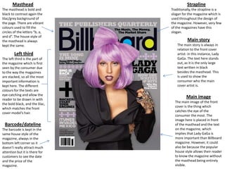
- 1. Masthead Strapline The masthead is bold and black to contrast again the lilac/grey background of the page. There are vibrant colours used to fill the circles of the letters “b, a, and d”. The house style of the masthead is always kept the same. Traditionally, the strapline is a slogan for the magazine which is used throughout the design of the magazine. However, very few of the magazines have this slogan. Left third The left third is the part of the magazine which is first seen by the consumer due to the way the magazines are stacked, so all the most important information is kept here. The different colours for the texts are eye-catching and allow the reader to be drawn in with the bold black, and the lilac, which matches the front cover model’s hair. Barcode/dateline The barcode is kept in the same house style of the magazine, always in the bottom left corner so it doesn’t really attract much attention but it is there for customers to see the date and the price of the magazine. Main story The main story is always in relation to the front cover artist- in this instance, Lady GaGa. The text here stands out, as it is the only large text written in black besides the masthead. This is used to show the consumer who the main cover artist is. Main image The main image of the front cover is the thing which catches the eye of the consumer the most. The image here is placed in front of the masthead and the text on the magazine, which implies that Lady GaGa is more important than Billboard magazine. However, it could also be because the popular house style allows their reader to know the magazine without the masthead being entirely visible.
- 2. The logo in the top left corner of the page gives consistency so the consumer is constantly reminded of what they are reading. Specific subheadings so the consumer knows exactly where to find what they want. Also, it gives an organized layout to the contents page. Short headings with long descriptions. Seem to be more important than the subheadings on the side, as they have no description at all. Inserts of images which are relevant to the magazine. Due to the lack of images on the page as there is far more text, the images stand out much easier and pull the reader into these page numbers. “On the charts” to let the consumer know what music is most popular at the time. The main image against all the text is the most eye catching thing on the page. Instantly, the consumer is drawn to this part of the page, which traditionally has a great deal to do with the main cover artist. The image is a long shot, posed with the artist not looking at the camera.
- 3. The main image is behind the title of Rita’s name, because of her being well known the full image doesn’t have to be shown in order for the consumer to know who she is. She is dressed in an urban style, quite street influenced and posed fairly casually. Main title is in bold red letters and stands out against the brick wall background. Instead of being an actual title, it is the artists name and also her logo as she is a popular artist, so the consumer may be likely to pick the magazine up mainly for this article. The article is split into two columns around the image. As the article is an interview, the colour scheme of red and black text helps the consumer to know when the interviewer is talking, and when Rita Ora is talking.
- 4. Masthead The masthead is kept plain and simple, with a red background to contrast the white background of the magazine, and also the white title in the box. Pug The pugs on magazines are used to advertise extra information, usually a competition etc. but in this instance, this is not the case. Here, the XXL Awards are being announced. Left third The left third of this magazine only includes artists names, not stories to show which artists are featured within the magazine. Main story The main story is in colours which stand out from the magazine, a bold text and are also positioned over the artists face to introduce who he is. The words “young fly and flashy” relate to the main image, which envisions A$AP Rocky with a gold grill to deploy he is in fact young, fly and flashy, and will more than likely elaborate on this further in the magazine. Main image The main image takes up traditionally more space than what a main image usually should, so there is less room for text on this cover. Barcode/dateline The barcode here is placed in the bottom corner, the same as on Billboard, again to not draw attention but so it can still be seen for the consumer to know the date and price.
- 5. Slang term “billin’”. Colloquial language makes the magazine seem more casual and is used to relate to the target audience of hip hop fans Majority of the page is taken up by a large image of the rapper who is on the front cover of this edition of XXL. The image is a midshot, with a posed artist. Logo printed at the top right corner again to show consistency and to remind the reader what they are reading. Very few articles, but they all have a lengthy description. Contents does not begin from 1, so this can be confusing to the reader. The headline of the magazine has its own section to show the consumer where to find all of the page features.
- 6. Main image takes up one page of the double pages, this shows the consumer the article is about this artist. This also gives more relevance and publicity to the artist as it is the only image on the page. Large, bold red title contrasts the black and white on the page to attract the attention of the consumer. Subheading to introduce further information about the article and the artist. Main article takes up half the page and is presented in two columns so it is easily readable.
- 7. Masthead The masthead is kept the same throughout the house style of “NME”bold, red, and lined with black and white so consumers know the brand and are familiar with it. Pug The pug in this case is used to advertise a new album. It is used in the left third so it is what consumers will be attracted to first. Header The header is used to advertise additional information in the same way as a pug, however more important information. It contrasts the white background so it can be easily seen. Main image The main image here is of two artists, as usually opposed to one. Their image is slightly covering the masthead, but the main story is placed over them. Main story Left third The text within the left third is kept fairly standard, with the titles in bold red capitals, and the additional information in black lower case. The information here is used to draw the reader in and make them want to read on, as it is what the consumer first sees when looking at the magazine on a shelf. The main story is in a large text and placed over the main image. The artists names are in white, which is almost the only white text on the page, so it stands out to the consumer who the artists are. Barcode/dateline The barcode is rotated and in the bottom right corner, a little difficult to see but still visible to the consumer.
- 8. “Band index” tells the reader which specific page they can find the latest information on a band. The biggest story is displayed briefly, positioned central on the page to give the reader more incentive to read on. The colour scheme for the magazine subscription is different, which makes it stand out to the reader so that they subscribe, which is what NME are aiming to do. Dateline so the consumer knows whether or not it is the most recent issue published. Bold subheadings, eye catching so the consumer knows what they are looking for. Smaller subheadings within larger subheadings to make it easier to look for specific things within the subheading category.
- 9. Attention grabbing title. The letters are contrasted against the white background and sizes, so it stands out from the normal black and white background and text on the page. The article is presented in columns again so it is able to be easily followed by the consumer. The main image again, takes up half the double page spread. The pose and outfit this artist is wearing are fairly traditional to the house style of this magazine, and also fit in with the title of the article as she is not presented femininely.