
Recommended
More Related Content
What's hot
What's hot (20)
Similar to Drafting
Similar to Drafting (20)
More from JessDruett
Recently uploaded
Recently uploaded (20)
Drafting
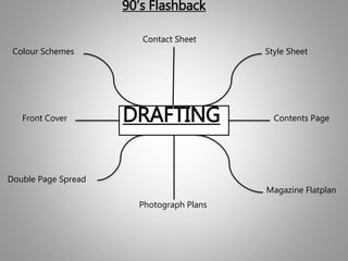
- 1. DRAFTING 90’s Flashback Style SheetColour Schemes Front Cover Contents Page Double Page Spread Magazine Flatplan Photograph Plans Contact Sheet
- 2. Style Sheet Switch is an effective font that is eye-catching and will be recognisable to the readers who are going to purchase this magazine. It is clear and very presentable which I can edit easily. Ransom notes is a very old fashioned but can be modern with the right editing. It emphasises the title largely which will attract the readers. It is fun, funky and clear. Funkrocker has a faded look to it in places, it gives the title an old feeling but is catchy to the eye. It is bold and would look great in a range of colours. Have nothing to do with is a powerful font that will be remembered and can be edited to have a whole different style. It is clear and bold which is effective to the eye. Riffic font is very bold and effective. I like how it curves at the edges to give it a clear and concise look. It certainly has the effect you need for a magazine masthead. Body texts Aspex font is my favourite one it is clear, effective and concise. It would work very well in my magazine. Red Velvet is bold and eye-catching. However, I’m not sure this will work with this type of genre. KG piece by piece is a fun font, it is clear and provides a certain edge to the font. Liniga is my second favourite as it is funky and is vibrant with its curves. Very memorising and has a neat layout.
- 3. Colour Schemes I like this colour scheme as it will contrast very well with the type of magazine I’m doing. It is bright, bold and eye-catching, I’ll be able to play around with the colours and see what works. It appeals to both genders as the colours are on a broad spectrum. This colour scheme is a bit more brighter but only offers similar shades although I love the blue/green colours. I would need to know what images I’m using before deciding what colours I’d need from here. The colours are very neutral towards both genders. I like the bright turquoise colour in this palette but the other colours are too neutral for the type of magazine I’m doing. I usually associate bright colours with a pop magazine as it stands out on a magazine stand. The peacock palette is a perfect combination of bright colours that are bold and attractive. These are the type of colours I aim to use on my magazine as I want it to stand out from the rest. The colours are vibrant and vivid which leaves a memorable image on the readers mind.
- 4. Front Cover I will be placing my tagline at the top of the magazine. I decided on this because I want to use the space wisely and it will catch the readers eye. I will be plugging a competition here that will feature in my magazine and is a good selling point. My main splash image will feature here either of a band or solo artist. It will take up the majority of the space and I would like the artists to have a direct address to the audience. This is a common convention amongst all magazines and needs to be include so the readers can purchase my magazine. This will feature either bands or artists names that are In the magazine. Or may promote posters. This is where my masthead will be, on a slant possibly may include a border around it to emphasise the title. This is the type of image I aim to have on the front cover. Long shot, smiling and a fun pose. I will take in a studio to get the right lighting and so I can edit The background to how I want. My main articles will be promoted here as this is the side that tends to be shown on a magazine stand. It will include Images, sub headings and a pull quote to entice the audience. I will use my main colour scheme to contrast it with the main image and heading colours. Puff will promote a live review of a band of artists. I’ve put It on the third left as it promotes the artist. Layout of my front cover is clear, concise and not too conflicting. I have tried to include as much information that would entice an audience] to purchase my magazine.
- 5. Contents Page Contents page heading will be bold and bright so it emphasises the importance of needing to start here before you read anything. It’s the pinnacle to any magazine. Sub image of the main article on the front cover provides another snippet of the interview and exclusive image from the studio shoot. Sub headings that will separate all the sections in the magazine so the reader can easily access what they want to read first. Layout will be fun & funky with vibrant colours to make it eye-catching. It has all the areas a contents page has, it will be clear and easy to understand. Editors briefing provides an statement of the editors highlights of the month. I will be including favourite articles and reviews from the magazine. I will add a few pictures with the stars to make it more authentic. Sub images of the other main articles gives an indication to the reader what to expect in the magazine. The list of contents with little sub headings & page numbers gives an insight to the reader what’s inside their magazine.
- 6. Double Page Spread Layout is a bit unusual as I’m doing a 90’s flashback theme. I have a main heading, with pictures going round the outside of the main article. I really like my design and if I get it right it will work. Sub image of artist unseen studio picture here makes the reader feel more involved seeing behind the scenes. Sub heading gives an introduction to the artist and indicates the type of interview the reader is getting. Main heading will be big, bold and loud. I want it to be eye-catching and emphasise the type of artist that is being interviewed. Main interview of the artist will include of the details the reader is looking for. I will use declarative, interrogative and exclamatory sentences. Direct mode is important as the reader can get in contact with their favourite artists. It also lets them know where to get the latest news and tour dates. Images will be a mix of studio and live shows, I wanted to do a montage of their live shows. I decided that doing the montage around the interview would be effective and will be vivid to the reader. I am pleased with this design so far.
- 7. Magazine Flatplan This is the template of my full magazine. My cover feature will be located in this area of the magazine. My magazine will only be a quarterly edition and will be jam packed full of exclusives, newer high quality images and interviews. Pop horoscopes, 10 ways to…, reviews, next months issue and subscriptions will be regular parts of the magazine every 3 months.
- 8. Photograph Plans – Front Cover Shot – Medium shot. Angle – Looking towards camera. Mise-en-scene: A 90’s inspired female protagonist wearing 90’s popstar attire possibly. Fun posed shoot. Character: A female protagonist from the 90’s. Costume: Blue Jeans, Black turtle neck and black boots. Simple, natural make up. Jewellery. Location: A studio. Props: Possibly a microphone.
- 9. Photograph Plans – Contents Page Shot: Medium shot, Long Shot & Close Up. Angle: Looking towards camera, a couple of photos looking away. Mise-en-scene: Studio surroundings in 2 photos & the other 3 photos in concert surroundings. Character: A female protagonist from the 90’s. Costume: Blue Jeans, Chequered Shirt and Black boots, jewellery. Simple, Natural make-up. Location: Studio location, concert surroundings. Props: Microphones, jewellery.
- 10. Photograph Plans – Double Page Spread Shot: Medium shot, Long shot, concert shots. Angle: Eye level, looking away. Mise-en-scene: A 90’s inspired female protagonist, wearing similar 90’s fashion and make-up. Fun posed shoot. Character: A female protagonist singer from the 90’s. Costume: Blue Jeans, turtle neck, denim shirt with black boots. Jewellery and simple, natural make-up. Location: A studio setting and concert setting. Props: Jewellery, microphone.