
Recommended
More Related Content
What's hot
What's hot (20)
Viewers also liked
Similar to Powerpoint articles
Similar to Powerpoint articles (20)
Recently uploaded
Recently uploaded (20)
Powerpoint articles
- 2. Article Analysis of Q Magazine
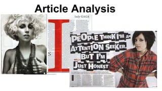
- 3. HEADING As seen the headline is at the top right corner, the surname of the artist, lady gaga is captial letter “GAGA”, this results in catching the reader's attention this may imply that she is well known as “GAGA” and that most of her audience and the media recognise her as that as well. In filipino translation “GAGA” means foolish women and this may imply that she is she liked to be seen in the media as crazy and foolish and this is clearly seen in the article. The name Gaga was chosen thoughtfully and it is short and easy to remember. The headline is quite simple and is quite unique compared to most article pages. This may suggest that article is special because of its simplicity, for it does not need a subheading and lean in to attract the reader.
- 4. IMAGE The photo that has been used is medium shot of Lady Gaga, she is topless and has a chain-like necklace. Her facial express is quite captivating by the way she makes eye contact with the camera and how she has a mouth partly open in a enticing way. The photograph was captured in black and white. The chain-like necklace may imply that she doesn’t wear any ordinary or mainstream necklaces that would normally be worn by women, but instead she likes to think outside the box. The necklace may reflect the nature of herself, in the way that she likes to give people different taste or perspective of the world. The photograph of Lady Gaga is quite sexucal seductive; the way she is topless and covers her breast with her hands, may suggest that it is aimed at a male audience because it catches the reader’s attention. The complete eye contact to the camera, gives the illusion of her look at the reader resulting in building a relationship with the reader and and making them want to read the article. The use of grayscale makes the image look older and more classy, which fits with the Q magazine’s target audience who are the ages of 20 - 40 years old.
- 5. TEXT AND LAYOUT The article has three columns which is full of informational text about the artist who is the main attraction. Plus by having three columns it makes it look less like long essay which has text from end to end; by doing this it may attract the audience to actually take their time and reader the article page. The use of left alignment makes the text look clean and well structured. There is also pull quotes featured to make the reader have a better understanding of the story and to make them feel more part of the magazine. The use of the footer at the bottom right of the article is vital for the reader, as it not used to attract attention but there to help the reader navigate the magazine and ensuring them they are reading the right magazine, as you can see Q has their logo next to the number page. The article goes into deep depth about the nature of Lady Gaga and who she is as a person, its use of quotes make the article that much more interesting and makes the reader feel in the centre of this knowledge. Q magazine uses formal language but also a mature use of language to really engage the reader and links to their target audience of older people. The well structured and interesting contents of the article makes it worthwhile and therefore makes the reader recommend it to others and therefore increasing income profit of the company.
- 6. TEXT AND LAYOUT The enlarged red "L", which is featured behind the text links; may be a tribute to her absurdness and melodramatic behaviour, this gives the reader a chance to see her real nature. It may also be a drop cap, which may be used to emphasis a new chapter or a different section in the text ; Q magazine have also done this with letters S and I on much smaller scale. The text links not only to lady gaga's nature but also the colour red which is a famous house style that Q uses throughout their magazine, especially the fact their masthead is well known because of its colour. The colour scheme of the article uses three main colours red, black and white and you can see throughout the magazine and this maybe some of the factors why Q magazine is so well known and successful because its consistent and is well layouted. Overall the layout of the text and the digital editing on the image is well established; plus the enlarged red "L" is quite a clever feature which results in makes the article page that more special and enticing for the reader. However other may disagree and suggest that the "L" is quite a distraction and may put the reader off.
- 7. Article analysis of NME magazine
- 8. HEADING AND LEAN IN The headline is extremely disjoined, it is all capitals letters and abnormally large for a headline; this may link to the nature of the artist, Lily Allen who seen by the media as crazy, never consistent, uniquely great artist. The use of different sized fonts really catches the reader’s attention and it also relates to the text “attention seeker”. The colours black and white are used efficiently on the headline, the white font on the black background really makes the headline standout. The headline comes as if it is authentic and arty as if was done by hand, which is quite an unusual font for a headline but by doing so it may catch the reader’s attention The lean in gives the reader a quick summary of the article, in way that would persuade the reader into reading the article. As you can see it uses a similar font to the headline but a much smaller scale and uses the colour red to emphasise the name of the artist “Lily Allen”
- 9. IMAGE The main image of Lily Allen show a visual image of who they are reading about. Her clothing and hair links with the colour scheme of the article black, red and white are kept consistent throughout the magazine. The photograph captured is mid shot which allows the reader see her upper body and the way she has turned her wrists and hands against her hips which portrays a reckless and powerful attuid. The mid shot also displays her tattoo and gives you a clear shot of mascara and eyeliner, also the reckless rough hair, which conveys her as dangerous and rebellious. In which many of the reader may be able to relate to. The eye contact that she makes with the camera gives the illusion as if she is looking directly at the reader which results in making a connection between the reader and her.
- 10. TEXT AND LAYOUT The layout of this article is one that isn’t very commonly used, as it focuses on the image and the headline takes up a third of the page, resulting a lot less text. The colour scheme of the article uses red, black and white which are simple colours and effective colour that are used to draw the reader. The colour red is used effectively as it highlights the name of the artists “Lily Allen” and this links to the colour of the shirt Lily Allen is wearing. The colours black and white are used efficiently on the headline as well. The language used is quite easy to understand and read in some certain parts slang is involved, this may be because NME’s target audience is targeted at young adults and teenagers. The text captures what the artist is like and how the paparazzi is obsessed by her lifestyle and growing success. This may interest the reader if they more interested about the artist instead of their music. Stylish feature of the magazine industry, the use of drop cap and with the text wrapped around it makes the article look well structured; the use of drop cap is to stand out and show the reader where the article starts.
- 11. TEXT AND LAYOUT The article has four small columns which makes it look less like long essay which has text from end to end; by doing this it may attract the audience to actually take their time and reader the article page. The use of left alignment makes the text look clean and well structured. There is also pull quotes featured to make the reader have a better understanding of the story and to make them feel more part of the magazine. The use of the footer at the bottom right of the article is vital for the reader, as it does not used to attract attention but there to help the reader navigate the magazine and ensuring them they are reading the right magazine, as you can see NME has their logo next to the number page. Overall the article is edgy and quite outside the box, it uses colours to highlight areas of importance to draw the reader’s eye. The unusualness may make the reader want to stop and examine the article and therefore after reading the article they may have a better understanding of who Lily Allen is or a deeper understand and different perspective of who she is as portrayed in the article.