
Recommended
More Related Content
What's hot
What's hot (17)
Viewers also liked
Viewers also liked (17)
Similar to Mumford and Sons - Babel
Similar to Mumford and Sons - Babel (20)
Recently uploaded
Recently uploaded (20)
Mumford and Sons - Babel
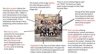
- 1. Having all the other people blurred with the band in focus draws the attention immediately to them and creates a binary opposition where they are given prevalence. Typography is the same as all their album covers and is associated with the band. This gives the covers more of a professional appearance and makes it easily recognisable to fans. Dyer’s paradox of being simultaneously present and absent can be applied here as there is use of extra-diegetitic gaze which breaks the 4th wall causing them to appear present to the viewers. However, this is not the case for all the members as one is looking away. This absence means the band as a whole do not appear present creating an incoherence. The mise-en-scene represents the music genre, for example, the urban vintage fashion connotes the indie folk genre of music allowing people to gain an insight to their meta narrative prior to listening to the album. The album artwork reflects the meaning of the song they chose to name the album after – Babel. A main interpretation of the song is that they’re leaving society behind as it crumbles down. This is reflected by them being in focus, progressing, while everyone else is blurred. The location of the image signifies the indie folk genre which is commonly associated with a village feel. There is use of maritime flags to spell out ‘TOUR’. The band use cryptic codes to give messages to their loyal fan base often.