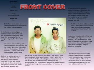
SYMON AGUILAR
Album Name :
Stereo Typical
Artist :
Rizzle Kicks
Release : 2011
Genre :
British Hip Hop/ Pop
Record Label :
Island
On the front cover we can see very
clear the two Artists, this is something
that you see in a typical album.
On the front cover of this Digipak we
see the two actors sitting down and
they are slouched in their chairs and it
shows their stereotypical view of
teenagers being scruffy and not stylish
at all.
We can see on their clothing style is
very street looking, out going look and
not elegant, we can see that they are
showing the stereotype clothing of
teens and it is ironic as the album
cover is called ‘ Stereo Typical’
On Cover we see the name of the
artists which is Rizzle Kicks and
they style of writing is a pale
colour and a graffiti type writing
which is to say that a conventional
teenagers is associated with graffiti
and anti social behaviour acts.
We see that the two artists are slouched in a chair and it is to say
that most people at that age is lazy and it is also a typical style of
teenagers/ school rebels to be sitting down in a class room also we
can see that their facial expressions is that they are very
uninterested as their mouth is open, and their eye lids are about to
drop looking as though they are very tired and unresponsive to
anyone.
The whole background colour of the
cover is a pale colour and usually you
would associate this type of colour as
it connotes as being dull and but
usually you would not relate this type
of colour with teenagers as they are
seen to be energetic and wild.
The title of the album is Stereotypical
and it is in a style that looks as though
it was written on a notebook and
ripped out and this is to imply their
youthism.
The genre of this album is British hip hop
and with this type of genre you would
associate it with being a bit crazy, living
life to its fullest and partying, going crazy
and this album shows the total opposite
sitting down looking dull and going
against the stereotype.
On this album we can see them
dressed in hats and a jumper and both
artist have not sorted their jumpers
out and just shows the type of person
they are which is being untidy, like
they had just jut up from bed and
which shows a clear portrait for
people at their age.
On the spine of the album cover we can see
the logo of the record label which is a white
tree within a green circle located at the very
top of the spin album. And the logo is called
Island Records. This is a key aspect of the
spine as it allows the audience to see who
promoted the artists.
Another aspect we can see on the spine of
the album is the artists name Which is Rizzle
Kicks, and again very similar to the front
cover which they have a graffiti style writing
and again this is a vision that they are a rebel
and like to terrorise things.
Also another item that we see is the name of
the album which is very school student like.
Also it is very clear which the audience can
see and be attracted to. The colour of the spine is pale, and green like
and I would not relate this sort of colour you
would relate and connect with these types of
artist as you can see on their music videos
they are very outgoing and party like and you
would suggest that they would have a
different type of colour for album.
An very obvious aspect which
we can see on this album back
cover is that you have the
album song list on the back
cover but it is small and not
very clear as it looks like it is all
squished into one space which
may find it hard for the
audience to see and be pulled
into, so this would mean that
they would have to pick up the
album to actually read what
behind it and it has left this
large amount of space in the
album and there is a lot of
unused and possible wasted
space in the album and also it
looks as though it is made very
sophisticated and a lot of effort
was put into making it and not
very relatable to the
personalities of the characters.
On the back cover a very necessary part to the album is a bar code
and this allows to identify the album. Also an feature which is
included in this album is an website and this is a feature which allows
the audience to find further information about the artists and acts as
an bonus feature to the audience as they may not be aware of this
option and allows them to know this.
Another feature that we can see on the album is the industries
that were a major factor to making the album and the most
important you have the record labels logo but it is smaller than
usual so you would have to look deeper into the album to
actually see the logo and information close. Except this is an
information that the target audience may not be widely
interested so must be the reason to why it is so small.
With the back cover song lists
we can see that most of the
songs are childish like such as
Learn my lesson which implies
that they are young and yet to
be more taught and need to
grow up also the song titles are
rebellious such as one of the
song is called trouble and home
wrecker and this is to imply
their personalities as being
childish. Also fits in with the
stereotype. Ironically the same
name as their album cover
The background cover does not
portrait the actual British hip
hop rapper and shows a total
opposite of the actual
personalities of the artists.
An very obvious aspect
which we can see on
this album inside cover
is the dvd disc, and this
disc has the title of the
album and again it is
repeated on the child
like; school like writing
on a note book which is
to show they are
childish way also it has
the similar graffiti of
the artist name. On the
dvd we have an image
of shoes that are very
dirty and it seems as
though it is with other
rubbish such as a
empty sandwich box
and a leaf. And this
would be associated
with the child like
image and is very clear
on what they are like
and this portraits them
as being very scruffy
and dirty and this is
also shown on the
front cover of the
album that they are
scruffy and do not care
about anything.
Also this inside cover of the dvd is a total
opposite of the colouring on the outside
cover as on the front cover it is one dull
colour but on the inside it is full of bright
colours and shows that on the outside their
personalities are dull but when you get to
know them they are actually quite wild.
Inside of the booklet it actually
has images that are much more
bright than the actual front
cover and it includes more
images and another factor is
that most of the booklet is
filled and no gaps that are
unused and compared with the
back cover it has a large
amounts of spaces which are
unused..
Also as an feature on the booklet
it has given the audiences is that it
has all of the lyrics to all of their
songs on the booklet and allows
the audiences to learn them. Also
another feature that it has is that
it has messages from the artist
itself telling the audience as
though they are speaking directly
to them thanking them for
purchasing the album and
thanking them for their support
and which is a different outlook
on them as you would expect
them to be a bit more rebellious
and mean personalities showing
that they is another side to them
other than this stereotype being
given to them.
Also in the booklet you get information
about the industry that helped the artist in
making them into them music industry and
also has further information about where
they are located and who they are., so this
booklet shows that this is audience friendly
and like to e very interactive with the
audiences
Another aspect to this disc is that it has the information of the record label around
the disc and it is very small and it might be because the audiences may not be too
interested into finding this out. Also in the booklet it includes ways to be
interactive and be a part of the rizzle kicks artists by giving them an option to go
on their websites
Alternative Rock Is also known as alternative music it is
rock music that has emerged from the independent
music underground of the 1980s. It was first started in
the late 1970s and early 1980s, it was mostly only
listened to and heard undergrounds of stations as it was
not so popular at the time compared to other types of
genres. This type of music then passed on worldwide and
one popular band which added this to the music industry
to be recognised as a genre was Nirvana. It’s related to a
group of people as a form of a band, main instruments
would be such as electric guitars, bass, drums keyboards
and vocals.
• Biffy Clyro
• Muse
• The 1975
• Fall Out Boy
• 30 seconds to Mars
• The Killers
Atlernative rock videos usually have the artists
singing whilst everything around them in the
background is completely random and not
associated to the actual lyrics of the song. For
example one is vampire weekend they created a
music video Diana young of a car burning which
had no relevance to the song lyrics.

Music Album Digipak Analysis

  • 1.
  • 2.
    Album Name : StereoTypical Artist : Rizzle Kicks Release : 2011 Genre : British Hip Hop/ Pop Record Label : Island On the front cover we can see very clear the two Artists, this is something that you see in a typical album. On the front cover of this Digipak we see the two actors sitting down and they are slouched in their chairs and it shows their stereotypical view of teenagers being scruffy and not stylish at all. We can see on their clothing style is very street looking, out going look and not elegant, we can see that they are showing the stereotype clothing of teens and it is ironic as the album cover is called ‘ Stereo Typical’ On Cover we see the name of the artists which is Rizzle Kicks and they style of writing is a pale colour and a graffiti type writing which is to say that a conventional teenagers is associated with graffiti and anti social behaviour acts. We see that the two artists are slouched in a chair and it is to say that most people at that age is lazy and it is also a typical style of teenagers/ school rebels to be sitting down in a class room also we can see that their facial expressions is that they are very uninterested as their mouth is open, and their eye lids are about to drop looking as though they are very tired and unresponsive to anyone. The whole background colour of the cover is a pale colour and usually you would associate this type of colour as it connotes as being dull and but usually you would not relate this type of colour with teenagers as they are seen to be energetic and wild. The title of the album is Stereotypical and it is in a style that looks as though it was written on a notebook and ripped out and this is to imply their youthism. The genre of this album is British hip hop and with this type of genre you would associate it with being a bit crazy, living life to its fullest and partying, going crazy and this album shows the total opposite sitting down looking dull and going against the stereotype. On this album we can see them dressed in hats and a jumper and both artist have not sorted their jumpers out and just shows the type of person they are which is being untidy, like they had just jut up from bed and which shows a clear portrait for people at their age.
  • 3.
    On the spineof the album cover we can see the logo of the record label which is a white tree within a green circle located at the very top of the spin album. And the logo is called Island Records. This is a key aspect of the spine as it allows the audience to see who promoted the artists. Another aspect we can see on the spine of the album is the artists name Which is Rizzle Kicks, and again very similar to the front cover which they have a graffiti style writing and again this is a vision that they are a rebel and like to terrorise things. Also another item that we see is the name of the album which is very school student like. Also it is very clear which the audience can see and be attracted to. The colour of the spine is pale, and green like and I would not relate this sort of colour you would relate and connect with these types of artist as you can see on their music videos they are very outgoing and party like and you would suggest that they would have a different type of colour for album.
  • 4.
    An very obviousaspect which we can see on this album back cover is that you have the album song list on the back cover but it is small and not very clear as it looks like it is all squished into one space which may find it hard for the audience to see and be pulled into, so this would mean that they would have to pick up the album to actually read what behind it and it has left this large amount of space in the album and there is a lot of unused and possible wasted space in the album and also it looks as though it is made very sophisticated and a lot of effort was put into making it and not very relatable to the personalities of the characters. On the back cover a very necessary part to the album is a bar code and this allows to identify the album. Also an feature which is included in this album is an website and this is a feature which allows the audience to find further information about the artists and acts as an bonus feature to the audience as they may not be aware of this option and allows them to know this. Another feature that we can see on the album is the industries that were a major factor to making the album and the most important you have the record labels logo but it is smaller than usual so you would have to look deeper into the album to actually see the logo and information close. Except this is an information that the target audience may not be widely interested so must be the reason to why it is so small. With the back cover song lists we can see that most of the songs are childish like such as Learn my lesson which implies that they are young and yet to be more taught and need to grow up also the song titles are rebellious such as one of the song is called trouble and home wrecker and this is to imply their personalities as being childish. Also fits in with the stereotype. Ironically the same name as their album cover The background cover does not portrait the actual British hip hop rapper and shows a total opposite of the actual personalities of the artists.
  • 5.
    An very obviousaspect which we can see on this album inside cover is the dvd disc, and this disc has the title of the album and again it is repeated on the child like; school like writing on a note book which is to show they are childish way also it has the similar graffiti of the artist name. On the dvd we have an image of shoes that are very dirty and it seems as though it is with other rubbish such as a empty sandwich box and a leaf. And this would be associated with the child like image and is very clear on what they are like and this portraits them as being very scruffy and dirty and this is also shown on the front cover of the album that they are scruffy and do not care about anything. Also this inside cover of the dvd is a total opposite of the colouring on the outside cover as on the front cover it is one dull colour but on the inside it is full of bright colours and shows that on the outside their personalities are dull but when you get to know them they are actually quite wild. Inside of the booklet it actually has images that are much more bright than the actual front cover and it includes more images and another factor is that most of the booklet is filled and no gaps that are unused and compared with the back cover it has a large amounts of spaces which are unused.. Also as an feature on the booklet it has given the audiences is that it has all of the lyrics to all of their songs on the booklet and allows the audiences to learn them. Also another feature that it has is that it has messages from the artist itself telling the audience as though they are speaking directly to them thanking them for purchasing the album and thanking them for their support and which is a different outlook on them as you would expect them to be a bit more rebellious and mean personalities showing that they is another side to them other than this stereotype being given to them. Also in the booklet you get information about the industry that helped the artist in making them into them music industry and also has further information about where they are located and who they are., so this booklet shows that this is audience friendly and like to e very interactive with the audiences Another aspect to this disc is that it has the information of the record label around the disc and it is very small and it might be because the audiences may not be too interested into finding this out. Also in the booklet it includes ways to be interactive and be a part of the rizzle kicks artists by giving them an option to go on their websites
  • 6.
    Alternative Rock Isalso known as alternative music it is rock music that has emerged from the independent music underground of the 1980s. It was first started in the late 1970s and early 1980s, it was mostly only listened to and heard undergrounds of stations as it was not so popular at the time compared to other types of genres. This type of music then passed on worldwide and one popular band which added this to the music industry to be recognised as a genre was Nirvana. It’s related to a group of people as a form of a band, main instruments would be such as electric guitars, bass, drums keyboards and vocals.
  • 7.
    • Biffy Clyro •Muse • The 1975 • Fall Out Boy • 30 seconds to Mars • The Killers
  • 8.
    Atlernative rock videosusually have the artists singing whilst everything around them in the background is completely random and not associated to the actual lyrics of the song. For example one is vampire weekend they created a music video Diana young of a car burning which had no relevance to the song lyrics.