1. Daniella Johnston
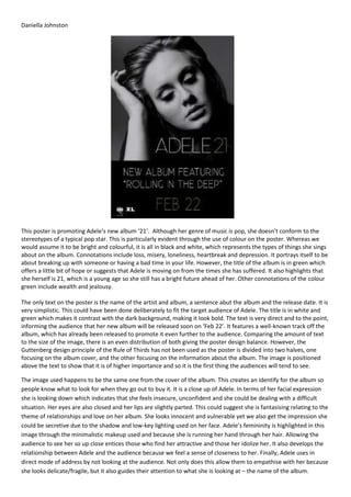
This poster is promoting Adele’s new album ‘21’. Although her genre of music is pop, she doesn’t conform to the
stereotypes of a typical pop star. This is particularly evident through the use of colour on the poster. Whereas we
would assume it to be bright and colourful, it is all in black and white, which represents the types of things she sings
about on the album. Connotations include loss, misery, loneliness, heartbreak and depression. It portrays itself to be
about breaking up with someone or having a bad time in your life. However, the title of the album is in green which
offers a little bit of hope or suggests that Adele is moving on from the times she has suffered. It also highlights that
she herself is 21, which is a young age so she still has a bright future ahead of her. Other connotations of the colour
green include wealth and jealousy.
The only text on the poster is the name of the artist and album, a sentence abut the album and the release date. It is
very simplistic. This could have been done deliberately to fit the target audience of Adele. The title is in white and
green which makes it contrast with the dark background, making it look bold. The text is very direct and to the point,
informing the audience that her new album will be released soon on ‘Feb 22’. It features a well-known track off the
album, which has already been released to promote it even further to the audience. Comparing the amount of text
to the size of the image, there is an even distribution of both giving the poster design balance. However, the
Guttenberg design principle of the Rule of Thirds has not been used as the poster is divided into two halves, one
focusing on the album cover, and the other focusing on the information about the album. The image is positioned
above the text to show that it is of higher importance and so it is the first thing the audiences will tend to see.
The image used happens to be the same one from the cover of the album. This creates an identify for the album so
people know what to look for when they go out to buy it. It is a close up of Adele. In terms of her facial expression
she is looking down which indicates that she feels insecure, unconfident and she could be dealing with a difficult
situation. Her eyes are also closed and her lips are slightly parted. This could suggest she is fantasising relating to the
theme of relationships and love on her album. She looks innocent and vulnerable yet we also get the impression she
could be secretive due to the shadow and low-key lighting used on her face. Adele’s femininity is highlighted in this
image through the minimalistic makeup used and because she is running her hand through her hair. Allowing the
audience to see her so up close entices those who find her attractive and those her idolize her. It also develops the
relationship between Adele and the audience because we feel a sense of closeness to her. Finally, Adele uses in
direct mode of address by not looking at the audience. Not only does this allow them to empathise with her because
she looks delicate/fragile, but it also guides their attention to what she is looking at – the name of the album.
2. Daniella Johnston
This poster is promoting the album ‘Recovery’ by Eminem. This album was made exactly ten years since Eminem
released an album most would consider his best work to date. Since then he has led himself down a dark path, in
and out of dysfunctional relationships and drug use, sending the quality of his material spiralling down. Therefore, he
has given this album an ambiguous meaning of ‘Recovery’ referring to not just recovering his health but reclaiming
himself as an artist. The name of the album is positioned directly under his name to show there is a link between him
and the word ‘Recovery’. Eminem’s name is spelt with the second ‘E’ backwards giving him a recognisable signature
and creating an identity for him as an artist. This grabs the audience’s attention because when people see it, they
can be instantly familiar with whom it is. The title itself is very large making it hard to miss. The ‘O’ has been replaced
by a first aid symbol, which has significance to the title of the album. It represents the time in Eminem’s life that he
has spent in hospital and rehab. The next piece of text on the poster includes the date the album is due to be
released. ‘Available 6.22’ is short and direct. Underneath this, similarly to Adele’s album poster, it mentions how
Recovery includes the single ‘Not Afraid’, which is a track that has already been released and therefore is already
familiar to the public. This, along with displaying all of the collaborations on the album with other big artists grabs
the audience’s attention and makes it more appealing and intriguing to purchase, promoting it even further. The
bottom corner consists of record labels names and Eminem’s personal website. This allows the audience to go
beyond the poster to find the latest news and information on Eminem, creating a sense of exclusiveness.
The colour scheme consists of grey, white and black. This integrates with the themes showing that there is a dark
personal feel to the album focusing on Eminem’s past. ‘Eminem’ is in back whereas the title ‘Recovery’ is in white
creating binary opposition. The black is used to represent that Eminem has been down a dark path in his life and also
connotes death, depression and anger. However, the rest of the text being in white reflects his innocence, and how
he has taken a positive turn in bringing out a new album and putting the past behind him. The white contrasts with
the dark background, making it more likely to grab the audience’s attention.
In terms of the image, a long shot has been used of Eminem walking away from the camera/with his back to it. The
image almost acts as a metaphor for the pun ‘road to recovery’ as he is walking down a road in the image and the
name of the album is Recovery. This creates irony and adds humour to the poster. The image could also reflect the
dark path Eminem has took in his life, represented through the shadow and low key lighting used. This poster is an
enlarged image of the actual artwork on the album. This is effective as it manages to promote the album with a
recognisable image. The Guttenberg design principle can be applied to this poster as it uses the rule of thirds.
Eminem is in the primary optical area showing he is the centre of attention/main focus, followed by album
information, which is also of high importance. There is an even distribution of image and texts making it look eye
catching yet professional.
3. Daniella Johnston
This poster is advertising the British Indie/Rock band, Arctic Monkeys’ album ‘Whatever people say I am, that’s what
I’m not’. Like most other promotional posters, the album cover is enlarged on the poster to ensure audiences can
easily recognize it and find it easier in shops or online if they decide to purchase it. The album image does not
feature the artist unlike most mainstream artists where they’d be the main focus point e.g. on the Adele and
Eminem posters. This shows that the album is more about the music rather than the persona created for the artist. It
is more typical for a band of this genre to have this viewpoint. Instead of using an image of the artist, the poster uses
a close up of Chris McClure who is a member of the band Violet May. This could relate to the name of the album, as
even though another artist is on the cover, it doesn’t necessarily mean it is their album. The photography uses direct
mode of address as he is looking directly at the audience to establish a relationship with them. The fact that he is
sweating, smoking and looking rather drunk portrays him as cocky and creates a relaxed, carefree vibe. Not only
does this image depict a typical convention of rock/indie music by conforming to the stereotype of audiences being
heavily influenced by smoking and drugs and being ‘rebellious’ but we also get the impression that the image is
trying to glamourize something which we usually see as something people shouldn’t do. This creates controversy and
shocks the audience, perhaps making it entice a more niche audience who find it appealing – like indie music tends
to do anyway. Smoking can sometimes be associated with depression. This along with the name of the album
suggests it contains deep and honest material, contrasting with mainstream artists who instead tend to sing about
things audiences want to hear.
Bland greyscale colours are used on the entire poster to add depth within the photograph and make it relate more
to the content of the album. It also highlights the name of the band by making it stand out against the white t-shirt
in the photograph, making it more clear to audiences whose album it is. The lack of colour makes it look simple,
almost like a quick snapshot that has been taken showing the band too are just normal people, who like to do
normal things. This allows the audience to relate to the band. It also shows that the band want as little distraction
from the music as possible and don’t need gimmicks to sell their music. The colours represent the genre of their
music, which is indie rock, as we would associate darker colours with bands that are not as much in the public eye in
comparison to mainstream artists.
4. Daniella Johnston
Little text has been used on this poster. The effect of this is that it is short and direct, and straight to the point. We
see the bands logo and the date the album is due to be released. The name of the album is not revealed on the
poster, perhaps to intrigue audiences to go and find out what it is. Audiences will tend to see this image and it will
shock them and create controversy, which can relate to the name of the album ‘Whatever people say I am, that’s
what I’m not’. Not including this on the poster creates the concept of not judging things as soon as you see them.
The logo being placed at an angle makes it look like it has casually been stamped on representing the bands
recklessness. The curviness of the text is almost symbolic of a monkeys tail, making it relate to the name of the band
creating an identity for them. The font is relatively small so we are not distracted from the photograph and rest of
the poster, which should be our main focus. The size shows that they are already a well-known band of this genre.
The Guttenberg Design Principle of the Rule of Thirds has been used, with the image in the strong fallow area so it id
the first thing audiences will notice. Overall, the poster is very minimalistic compared to others but still portrays the
message that the band are soon to be releasing a new album.