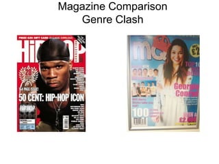
2. The top strip has an offer
of free stuff, working as
an incentive for readers to
buy the magazine.
The masthead is in a bold contrasting
colour to the background so it stands out,
but the main image partially covers it. This
is because it’s a well established magazine
and people know it’s Hip Hop Connection.
The main article image has a well known artist
taking up the majority of the page. This is because
people will instantly recognize 50 Cent and will
be interested as to the contents of the magazine.
The outfit he’s wearing also matches that of the
simple red, white and black colour scheme.
The main article’s title is fairly short but
instantly recognize what it will be about. As it
isn’t an up and coming artist readers can
assume this will consist of his career
highlights, therefore attracting fans of 50
Cent. Also, the font is the same as the
masthead, linking it to the style of the
magazine.
As it’s a special issue, the flash highlights the anniversary so people will be more
interested by this particular issue, as well as the freebies included because of it.
3. As a less known magazine, the
masthead is right at the foreground of
the magazine. It’s bold colour and
different design helps to stand out
amongst other magazines. Unlike the hip-hop magazine, this pop styled
one uses bright colours like pink and yellow
because they’re more bubbly colours.
They’re calm nature is more relevant to pop
than other genres.
As a relatively unknown artist, they’ve been
placed in the background of the magazine
amongst the other elements of this magazine.
This is because an smaller magazine wouldn’t
have as well known artists as 50 Cent, and
therefore need to highlight all the things in the
magazine to attract readers.
The secondary images overlap
the main one, so they still get
noticed without obscuring the
bigger article.
4. Both magazine appeal to their respective
genres. The colour schemes for a hip-hop
magazine are a lot more in your face
and violent when compared to a pop
one. The pinkish colours wouldn’t be
seen in a hip-hop magazine because it’s
more cheerful and less in your face. I do
like the use of a larger image obscuring
the masthead, I wouldn’t be able to do
that in my magazine because it isn’t a
known brand and wouldn’t be recognized
in the same way Hip-Hop Connection is.
The mastheads themselves are very
different, the pop one being more
appealing to feminine audiences
because of the crown on the letters.
The other one is in a sans-serif font in
bold white colours, much like the rest of
the front cover, as this is the more
serious style used by the magazine.