The document provides information about music magazines, including:
- The first music magazine was founded in 1894 called Billboard. Music magazines grew in popularity in the 1950s-1960s with magazines like NME and Rolling Stone.
- The biggest music magazine publishers currently are Rolling Stone, NME, Smash Hits, Kerrang!, and Billboard.
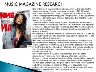
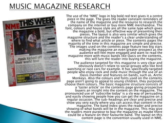
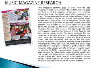
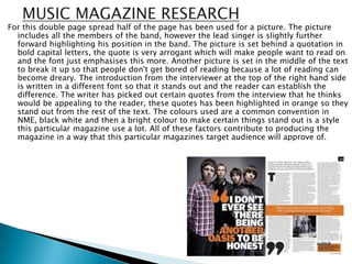
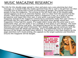
- Sample pages from magazines like NME and Smash Hits show conventions like layout, colors, pictures, and writing styles used to appeal to different target audiences.