1. Masthead
Price Tag,
Barcode, date
Layered ,Background
Cover Lines
Button
Main image in the centre/
direct address to the
audience
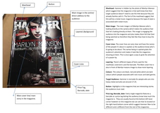
Masthead- Hammer is hidden by the photo of Marilyn Manson
which suggest that the magazine is that well know that their
target audience doesn’t need to see the title because they are
already familiar with it. The font of the masthead suggest that
this will be a metal music magazine because this type of style is
associated with metal music.
Main image- The main image is of Marilyn Manson who’s
looking directly at the camera which makes the audience feel
that he’s looking directly at them. The image is engaging the
audience into the magazine and also makes them fell that their
being watched so therefore they feel like they have to buy the
magazine.
Cover Lines- The cover lines are very clear and have the names
of the people it’s about in capitals so the audience know who’s
its going to be about. The names being in capitals grabs the
audience’s attention and makes it look like the magazines
shouting at them. This is once again a way to grab the attention
of a passer-by.
Layering- There’s different types of fonts used for the
masthead, coversine’s and the barcode. The Main cover line is
also in front of Marilyn masons image to show more layering.
Colours- The colours are black, red and white which are dark
colours which people associate with rock music and dark genres.
Target Audience- Hammer is normally for people who are into
heavy metal and who are around 17-25.
Button- Highlights in the magazine that are interesting stories
the audience must read.
Price tag, Barcode, date- Every single magazine features a
barcode or a price tag letting the audience know how much the
magazine is. They are usually found at the bottom left hand
corner however on this magazine we can see that its located on
the right hand bottom corner which suggest Hammer likes to be
different and is different from the rest of the magazines.
Main cover line/ main
story in the magazine.