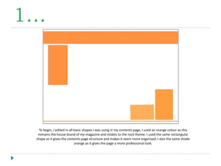
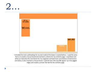
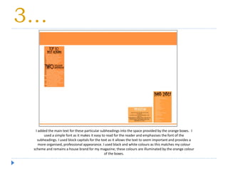
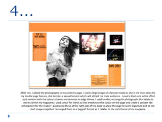
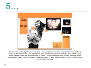
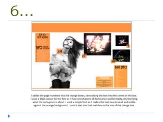
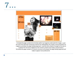
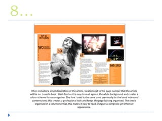
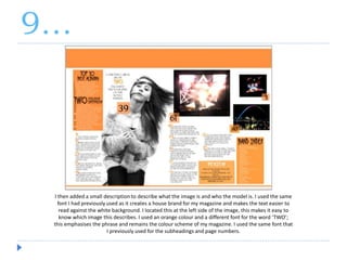
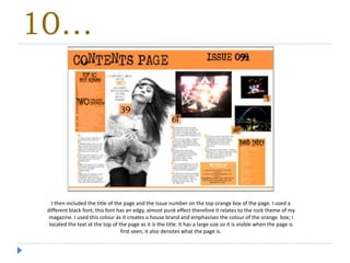
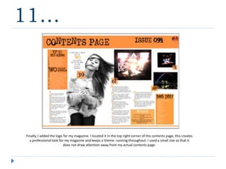
The document describes the process of creating a contents page for a magazine with a rock theme. Rectangular orange boxes were used to structure the page and contain subheadings in a consistent font. Black and white text and images relate to the rock theme and color scheme. Larger images of models were used to promote stories, while smaller colored photos were arranged on the right side. Transparent orange boxes with page numbers were placed overlapping the images. Consistent fonts and an organized layout create a cohesive brand identity and professional appearance for the contents page.