
Recommended
More Related Content
What's hot
What's hot (20)
Viewers also liked
Similar to Music magazine article analysis
Similar to Music magazine article analysis (20)
Recently uploaded
Recently uploaded (20)
Music magazine article analysis
- 1. MUSIC MAGAZINE ARTICLE ANALYSIS
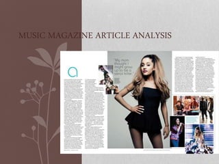
- 2. Images There are a variety of images in this article, this makes the article more interesting and more visual as we can see the artists journey (Pictures of the past up to now) as well as the artists story from Ariana's point of view. This is the main image in the article. It shows the artist in a natural pose, standing in a confident position ,making eye contact with the audience. The images are all relevant to the story shown in the article. All these images look exciting, fun and show Ariana is having an good time through those series of events. The images are aligned in an interesting way which makes the layout of the article look a lot nicer than having the images the same size and setout in a straight line for example. The face of the artist is very clear as lightning was used which makes the artist stand out from the background significantly and reveals all the face makeup (Pink lips, white eye shadow).
- 3. Large text pull quote from the article; this quote makes the audience intrigued and interested to read the article and for them to come to a conclusion why Ariana's mum thought she might grow up to a serial killer. (The most interesting quote is picked out from the article to catch the most attention. It's also a sans serif font which differs from the serif font of the article. A page number, the date of the magazine article and the name of the magazine is featured at the bottom left of the page in small font This double page spread is about Ariana Grande’s life; Almost like a short biography highlighting the artists most important events- with funny and shocking stories. The first letter of the article is large and in a slightly bold font with a blue font to bring an eye to the start of the article; so that it is different from the article itself.
- 4. The colour scheme The colours used in the article are very simple and plain; the background is white so that the text can be easily read. A darker background is placed when the artist is so that the artist stands out from the page and so that it adds a bit more colour to the article. There are small captions for the images in the article explaining briefly about the images(date and place of the image taken etc. It informs the reader where the artist had been and what they have been doing to inform the reader where the artist goes so that if they are her fans ,they can see the places she had visited. There are four columns in the article for the text .The text is in a small font however it is spaced out to make it easier for the audience to read which makes the layout look more tidy so it is more pleasant to read.
- 5. Overall I think this article was targeted for any Ariana Grande’s fans however the amount of the text indicates that the article is also targeted for an older audience (Ages 15-20’s) as the younger audience prefer less text in an article. This article would be mainly targeted for dedicated fans who would like to find out more about her life or just an audience who would like to read how she achieved what she is doing now to get inspiration from the artist.