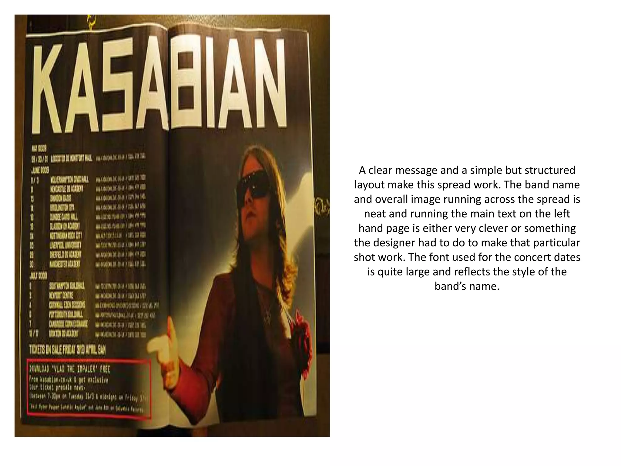
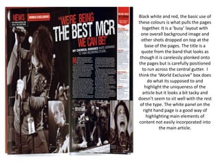
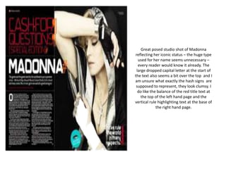
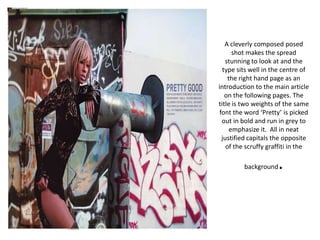
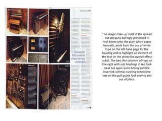
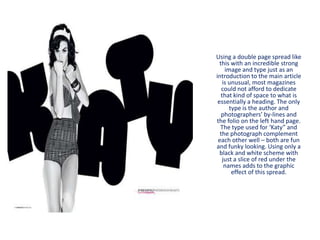
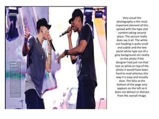
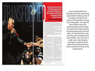
The document discusses the layout and design of magazine spreads, analyzing aspects like photography, typography, color schemes, and how well various elements work together. Key points analyzed include the use of a full bleed image across a spread, simple yet striking typography that doesn't detract from photos, and how elements like titles, bylines and intro text are positioned in relation to images and each other. Overall impressions consider whether designs are cleverly composed or look tacky, neat or boring, and how effectively the visuals and text gel together.
