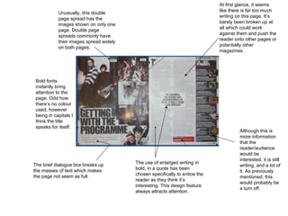
1. Unusually, this double page spread has the images shown on only one page. Double page spreads commonly have their images spread widely on both pages. The use of enlarged writing in bold, in a quote has been chosen specifically to entice the reader as they think it’s interesting. This design feature always attracts attention. Bold fonts instantly bring attention to the page. Odd how there’s no colour used, however being in capitals I think the title speaks for itself. At first glance, it seems like there is far too much writing on this page. It’s barely been broken up at all which could work against them and push the reader onto other pages or potentially other magazines. Although this is more information that the reader/audience would be interested, it is still writing, and a lot of it. As previously mentioned, this would probably be a turn off. The brief dialogue box breaks up the masses of text which makes the page not seem as full.
2. The warm colours used on this spread like the reds, browns and orange tones make the magazine seem mature and romantic. The audience for this magazine is probably women of an older age which could also be guessed by the magazine having a male being featured. The male is being represented as being a calm and sophisticated. The mood is very nostalgic. This is achieved by the composition The white writing against the dark back ground makes it stand out, however having the writing in the small font could work against what the magazine are trying to make you do. The overall appearance of this double page spread is, in my opinion, extremely dull. There’s nothing that stands out and although the desired mood is achieved, it’s not attention grabbing. The Mise-en-scene of this page consists of a white male in his late 20’s sat amongst guitar cases. His costume is casual, he’s wearing a undone shirt with jeans and boots with the laces un done. This creates a connotation of the male being in the indie genre and quite relaxed. As this is an inside page, the copy is laid out in a two column layout. At the top there is a much larger headline in a serif font. The serif font is used to mix well with the theme and feeling of this page.
3. Having a little caption before the paragraph gives a quick insight as to what is going to be mentioned. The colour theme tells the reader that this magazine is probably aimed to males. The quote at the top of the double page spread is almost the main attraction of this page. What's been said is very alpha-male which increases it’s appeal to males. This amount of writing is ideal. Although the writing is small it doesn’t seem like much of it is there which, unlike most magazines, doesn’t turn their reader away. The band ‘All Time Low’ are being represented to be normal people. Having them being pictured in a road with nothing glam could make the reader be able to relate to the band even though they have two completely different life styles. The colour scheme is random. None of the colours mix and the overall appearance is dark and a bit grim.