Dynamics of Destructive Polarisation in Mainstream and Social Media: The Case...
Analysis of my own magazine
1. Sophie Clarke
Analysis of my own magazine
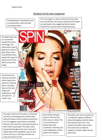
The Masthead is in bold letters and
in red and white, which are bold
contrasting colours.
The main image is a close up shot of the main cover
star; Lana Del Rey. Her eyes are closed and her fingers
are touching her lips, suggesting that she seems
innocent but may have done something wrong.
The Main Cover Line
is in a pink font,
towards the centre
of the page. The
colour pink is used
because it is seen as
girly, which is how
Lana Del Rey seems,
despite the rings and
tattoos on her hand
which contrast this
image.
The Sell Lines are
small, yet colourful,
which makes them
stand out. However
they’re not big to
focus on the main
image and
emphasise it, but
still catch the
reader’s eye.
The colour scheme of this cover is mainly pink
and red, as the background is a floral colour
with pink colours and her clothes are pink and
red. This suggests a girly theme, or possibly
that the main cover star is quite girly herself, or
that’s how it’s portrayed. The colour red is
pinpointed throughout the cover, because it
relates back to the masthead, as we can see
she has red nails, a red ring, and there are
cover lines which are red.
Also another thing we
notice is that Lana Del
Rey’s eyes are closed. This
is unusual because it
breaks away from
conventions. Normally, the
cover image gives a direct
gaze to the audience.
The other cover lines are small, but
in a bold font, against a different
coloured background which makes
the stand out even more. This
catches the reader’s eye so they
know what else is inside the
magazine, of which might interest
them more.
2. Sophie Clarke
Analysis of Contents Page
The logo of the magazine remains in the top left
corner of the page. This reminds the reader what
they’re reading, and the date, showing the reader
that the magazine is recent so the information is
new.
The Headings of
the Contents tell
the reader what
will be inside the
magazine. This
makes it easier for
the reader to find
what they’re
looking for,
because the
headings are in
bold and match
the numbers
which are clear to
see.
The Mise-En-Scene of the main image,
firstly their clothing is quite retro and
similar despite the gender difference. This
would be seen as quite alternative which
links with the music genre which is mainly
indie.
Quotations tell us the sort of things the articles may
tell us about. This draws the reader in as they get an
idea of what the article contains. It also possibly
suggests romance between Zooey Deschannel and M.
Ward which is intriguing because reader’s like gossip.
Underneath the
headings are a
summary of the
band and what the
article is going to be
about. In which, they
use rhetorical
questions and words
like “most popular”
and “exclusive” to
grab the reader’s eye
and make them
want to read more.
3. Sophie Clarke
Analysis of Double Page Spread
In this double page spread for Spin Magazine,
Florence Welch is the main article. The main
Image is Florence, which takes up three
quarters of the page, emphasising her
popularity, and possibly indicating the
personality of the interview. She is giving a
direct gaze, which invites the reader into the
article.
The drop capital at the start of the
article follows magazine
conventions, as it’s normal to start
an article like that. It also tells the
reader where to start reading.
The title of the double page spread is in a
large bold font which takes up half the page.
This clearly tells the reader who the main
article is about and links in with the article, as
it talks about Florence being the being the
artist of the year.
The layout of the article is also is in columns, which
follows the conventions of a double spread; this is
also linked to the target audience as they are
usually young adults but could be for older readers
because it’s quite a formal layout.
The main image is a close up of Florence’s face,
which keeps us concentrated on her facial
features. Her hair is being blown or flipped
back, which adds a dramatic effect to the
image, and could suggest her personality. Also
the style of the image is black and white; it
gives it a more retro/indie feeling, which relates
to the type of music Florence produces.