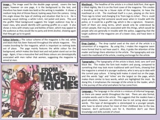
Personalisation of Education by AI and Big Data - Lourdes Guàrdia
Nme double page spread
1. Image – The image used for the double page spread, covers the two
pages, however on one page, it is the background to the text, and
therefore has been made less bold so the writing is readable. It shows a
medium long shot of Dizzee Rascal, looking away from the camera. Using
this angle shows the type of clothing and situation that he is in. He is
wearing casual clothing; a white t-shirt, red jacket and jeans. This and
the graffiti filled background suggests the target audience may be a
lower class, who would identify with painting graffiti on a wall. It also
shows a mess with empty cups and bottles of beer, which may appeal to
the audience as they would like to party and drink alcohol, showing again
that they get up to no good.
Masthead - The headline of the article is in a black bold font, that again
is tilted slightly, like it is on the front cover of the magazine. This creates
a branding, and may be a house style of the magazine, to have the
masthead at a tilt. The masthead itself is a pun, playing on the term
‘from rags to riches’ and changing it to ‘from tags to riches’. This is could
imply an ankle tag that someone would wear when in trouble with the
police, or it could be a graffiti tag, which is like a signature. However,
both of them are slang terms, which would only be understood by
certain people, that may be associated with this things, which would be
people who are generally in trouble with the police, suggesting that the
target audience of the magazine are of a lower class, and have been in
trouble.
Drop Capital - The drop capital used at the start of the article is a
convention of a magazine. By using this, I makes the magazine seem
more formal that to not have used it. Also, it grabs the attention of the
reader and brings there attention to the article. The typography and size
match the masthead of the article, creating anchorage for the article.
Colour Scheme – The colour scheme of the magazine is the red, white
and black that has been featured throughout the whole magazine. This
creates branding for the magazine, which is important so nothing looks
out of place. The page mainly features the white colour for the
background, which makes the black text and red jacket stand out on the
page. Again, it has a masculine feel and these colours are stereotypically
associated with men rather that women, suggesting the magazine is
aimed at men.
Typography – The typography of the article is black, bold, sans serif and
block like. This makes the font look modern and young, compared to
something that may look more traditional with serif fonts, showing that
the magazine is aimed at a younger audience, who is very up to date with
the current pop culture. It being bold makes it stand out on the page,
and the words ‘tags’ and ‘riches’ are the largest on the page, which
makes them similar to buzz words, which are highlighted the most. By
doing this, it emphasises the message of the article to the reader, which
is the journey of the artist and where he has come from.
Language – The language in the article is a mixture of informal language,
as there are swear words throughout the text. There are also formal,
complex words used in the article. This suggests that the readers have a
good education, however, are informal due to not caring about swear
words. This type of demographic is stereotyped to a younger people,
who have to attend school for most of their childhood due to the law,
however, don’t particularly care for it, therefore don’t use there
knowledge and skills outside of school.