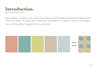
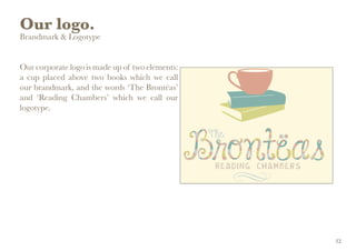
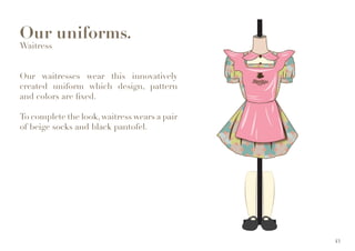
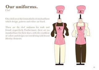
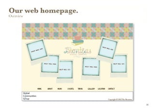
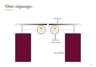
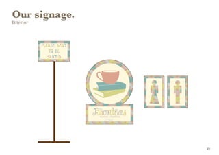
All organizations have a brand or corporate identity and the way in which it is perceived is often vital to the way in which clients and employees respond to that organization. The key to good brand identity design is the simple communication of the client's public image. Brand should reflect the company, and the products or services that company provides. A good brand identity enables a company to position itself visually in the market alongside its competitors.
My overall task is to create such a brand identity and brand identity program - from the logo through appropriate design applications, such as stationery, menus, napkins, uniforms, web home page and signage. I must choose one of the particular culturally-based themes to reflect the bistro's personality - give it a name and design a brand identity (logo) and set of brand guidelines. It is important to have an idea of how the concept of a particular country and culture will work as a space where people will be spending some time eating and drinking. The brand identity for the chosen bistro must reflect this concept. Each of these bistros should also reflect the area they are located in, basing on my demographic and style research.
Of all the options, I chose British Colonial themed bistro of which will be located in the area of Bangsar, Kuala Lumpur. Designed in Adobe InDesign and Adobe Illustrator, this is the brand identity manual for the bistro, showing a set of consistent and flexible guidelines and rules so that future items can be designed using these guidelines and rules and remain part of a growing consistent brand identity.
2. 2
Welcome.
Welcome to The Brontëas brand book.
We have created this document as a guidebook and inspiration for anyone
who is writing, designing, or participating in The Brontëas communications.
This document contains an outline of the basic elements that conveys our
company’s identity and personality.
Jessica Anandajoo
110022321
Ms. Sherina Shahnaz Fauzi
Brand Identity 271
2
3. Contents.
Introduction
Our inspiration 5
Our objectives 6
Our values 7
Our brand expression 8
How to use manual guidelines 9
Our brand elements 10
Our logo
Brandmark & Logotype 12
Typeface 13
Brand variations 14
Positioning & Clear Space 15
Usage 16
Color Specifications 17
Don’t 18
Our Color
Primary 20
Secondary 21
Our Typography
Overview 24
Primary 25
Secondary 27
Business Applications
Letterhead 29
Business Card 30
Envelope 32
Napkin 34
Menu 35
Merchandise 38
Newsprint Publication &
Ambient Advertisement 39
Our uniforms
Overview 41
Waiter 42
Waitress 43
Chef 44
Our Web Home Page
Overview 46
Our Signage
Exterior 48
Interior 49
3
5. Introduction.
Our inspiration
The Brontës were a nineteenth-century literary family from England. The sisters, Charlotte
(born 21 April 1816), Emily (born 30 July 1818), and Anne (born 17 January 1820), are well
known as poets and novelists. They originally published their poems and novels under masculine
pseudonyms. Charlotte’s Jane Eyre, Emily’s Wuthering Heights, and Anne’s The Tenant of
Wildfell Hall and other works were considered as masterpieces of literature.
5
6. Introduction.
Our objectives
The Brontëas is a highly conceptualized bistro that thoroughly reflects the lifestyle in British-
Colonial era.
The Brontëas inspires you to cherish books, to fancy teas, and to explore the world around you
from a reading room.
The Brontëas, innovatively modified from the surname of the literary sisters to match the
activity of tea-drinking, is expected to be original, creative, educational, and inspiring.
6
7. Introduction.
Our values
The Brontëas is expected to inspire. We have the spirit to improve life, everyday. This is our
philosophy.
Ourvaluessetourmannersineverythingwedeliverforthebestof ourcustomersandconsumers.
Our values should be honesty, educational, and caring.
7
8. Introduction.
Our brand expression
Each person is born with an identity. Likewise, The Brontëas needs an identity to achieve the
objectives.
Our brand concept celebrates both colonial and contemporary era. Our logo is lovely, our
behavior is warm, our setting is tropical, our dream is simple and our message is straightforward.
We deliver everything with quality.
8
9. Introduction.
How to use manual guidelines
Our branding is crucial to The Brontëas experience. The main focus of our identity is playful
simplicity.
We have created this document to help our vendors to communicate our identity in order to
achieve our objectives in unity. We need to assure that our brand nourishes a constant look
wherever it is presented. This guide is provided to keep the brand focused.
9
10. Introduction.
Our brand elements
Our company’s design uses five main colors that are used throughout the whole design process.
These are shades of pastel colors which are developed into a pattern. These color palettes
below will be further explained later on this book.
10
11. Our logo.
Brandmark & Logotype
Typeface
Brand variations
Positioning & Clear Space
Usage
Color Specifications
Don’t
11
12. Our logo.
Brandmark & Logotype
Our corporate logo is made up of two elements:
a cup placed above two books which we call
our brandmark, and the words ‘The Brontëas’
and ‘Reading Chambers’ which we call our
logotype.
12
13. Our logo.
Typeface
Our corporate logo is made up of two typefaces.
The name of the bistro ‘The Brontëas’ uses the typeface Janda Happy Day.
The tagline of the bistro ‘Reading Chambers’ uses the typeface Cordelina.
13
14. Our logo.
Brand Variatons
Our logo has few alternatives of color versions
according to which conditions it is applied on.
We have created a special versions of our logo
(for both symbol and logotype). These diverse
colors help our brand feel vibrant and fresh.
They will give us the variety we need across all
our communications to make them engaging
and relevant. These variations of logo will be
applied to the design process of merchandise as
well (see page 38).
Notes:
1. Corporate version
2. Stationery and garment version
3. Christmas event version
4. Kids version
5. Chinese new year event version
6. New year event version
7. Newsprint publication version
8. Envorinment day version
14
15. Our logo.
Positioning & Clear Space
Our logo appears in a fixed relationship. It has an area of minimum clear space around it.
Do not let any text or grapics intrude into this space. This will ensure that the logo stands out
wherever it appears.
15
16. Our logo.
Usage
Our logo has few alternatives of sizes according
to which conditions it is applied on.
The minimum size of our logo for usage is 6 cm.
Although there is no limit size for maximum
usage, there are some simple rules to follow:
1. Our logo should be scaled proportionately;
2. Our logo should still look adorable and
appealing.
16
17. Our logo.
Color Specifications
Our corporate logo is fixed with these pastel colors (see page 10).
Note: Pantone® is a registered trademark of Pantone, Inc. The color shown on this page are not intended to visually match the pantone color standards. Please refer to the current edition of the Color Formula Guide.
CMYK:
12.55/38.82/40.39/0
RGB:
220/164/144
HEX:
#dca490
PMS:
Pantone 500C
CMYK:
49.8/16.47/33.73/0
RGB:
133/178/171
HEX:
#85b2ab
PMS:
Pantone 8281C
CMYK:
17.65/9.02/57.65/0
RGB:
214/211/135
HEX:
#d6d387
PMS:
Pantone 617C
CMYK:
18.04/21.96/27.45/0
RGB:
209/192/178
HEX:
#d1c0b2
PMS:
Pantone 401C
CMYK:
21.96/8.63/15.69/0
RGB:
198/213/209
HEX:
#c6d5d1
PMS:
Pantone 5517C
17
18. Our logo.
Don’t
To maintain a unique brand, it is important to
use our logo in a consistent way.
1. Don’t create new symbol colors
2. Don’t apply effects to our logo
3. Don’t add a gradient to our logo
4. Don’t add a gradient to the background
5. Don’t create background patterns
6. Don’t change our logo’s orientation
7. Don’t scale our logo disproportionately
8. Don’t change our logo’s position
9. Don’t pair logo and background that are
not from the approved combinations
18
20. Our color.
Primary
These colors are developed for use of brand identity elements.
Note: Pantone® is a registered trademark of Pantone, Inc. The color shown on this page are not intended to visually match the pantone color standards. Please refer to the current edition of the Color Formula Guide.
CMYK:
12.55/38.82/40.39/0
RGB:
220/164/144
HEX:
#dca490
PMS:
Pantone 500C
CMYK:
49.8/16.47/33.73/0
RGB:
133/178/171
HEX:
#85b2ab
PMS:
Pantone 8281C
CMYK:
17.65/9.02/57.65/0
RGB:
214/211/135
HEX:
#d6d387
PMS:
Pantone 617C
CMYK:
18.04/21.96/27.45/0
RGB:
209/192/178
HEX:
#d1c0b2
PMS:
Pantone 401C
CMYK:
21.96/8.63/15.69/0
RGB:
198/213/209
HEX:
#c6d5d1
PMS:
Pantone 5517C
20
24. Our typography.
Overview
We have four typefaces altogether which are
used in different situations.
The common typeface for numerical characters
which is used throughout the whole design
process will be Baskerville, except the one for
postal code of the bistro.
FontUsage Logo Font Stationery Font Promotional Font
Janda Happy Day Yes - -
Cordellina - Yes -
Baskerville - Yes Yes
Joy Like Sunshine Through
My Windowpanel
- Yes -
24
25. Our typography.
Primary
We have three primary typefaces which are
used in different situations.
Our first primary typeface is Janda Happy
Day. It will give our communications a warm,
welcome, and caring tone.
Our second primary typeface is Cordellina. It
will give our communications a playful, creative,
and lovely tone.
Janda Happy Day, Regular
AaBbCcDdEeFfGgHhIiJ jK kLlMmNnOoPpQqRrSsTtUuVvWwXxYyZz
1234567890
Cordellina, Regular
AaBbCcDdEeFfGgHhIiJjKkLlMmNnOoPpQqRrSsTtUuVvWwXxYyZz
1234567890
Notes: Cordellina is available on www.dafont.com.
25
26. Our typography.
Primary
We have three primary typefaces which are
used in different situations.
Our third primary typeface is Baskerville.
It will give our communications a simple,
straightforward, and educational tone.
Baskerville is classified as transitional typeface
designed in Birmingham, England, positioned
between the old style typefaces of William
Caslon, and the modern styles of Bodoni
and Didot. Baskerville is the best typeface
to represent the theme of our brand, which
juxtaposes British colonial and contemporary
style.
Baskerville, Regular
AaBbCcDdEeFfGgHhIiJjKkLlMmNnOoPpQqRrSsTtUuVvWwXxYyZz
1234567890 (.,:;?!£$&@*)
Baskerville, Bold
AaBbCcDdEeFfGgHhIiJjKkLlMmNnOoPpQqRrSsTtUuVvWwXxYyZz
1234567890 (.,:;?!£$&@*)
Baskerville, Italic
AaBbCcDdEeFfGgHhIiJjKkLlMmNnOoPpQqRrSsTtUuVvWwXxYyZz
1234567890 (.,:;?!£$&@*)
26
27. Our typography.
Secondary
We have a secondary typeface which is used in
different situations.
Our secondary typeface is Joy Like Sunshine
Through My Windowpanel. It is used only on
menu for the written culinary names.
Joy Like Sunshine Through My
Windowpanel, Regular
AaBbCcDdEeFfGgHhIiJjKkLlMmNnOo
PpQqRrSsTtUuVvWwXxYyZz
Notes: JoyThrough MyWindowpanel is available on www.dafont.com
27
29. Our business
applications.
Letterhead
Our letter (A4 paper sizes: 210mm x 297mm)
uses this fixed template.
Text Setting:
Baskerville 16 pt (Bold) for date
Baskerville 14 pt (Bold) for salutation and sender’s
behalf
Baskerville 12 pt (Regular) for the body of the letter
and complimentary close
Alignment:
Justified with last line aligned left
29
30. Our business
applications.
Business Card
(Outside of Card)
Our business card uses this fixed design and
colors.
Our business card is bilingual which uses the
size of a 10 cm diameter for each circle.
On the back of our business card will have
inspiring quotes from literary individuals
sharing thoughts about making friends.
30
32. Our business
applications.
Envelope
(Front)
Our envelope uses this fixed design and colors.
Our common envelope uses the size of a
standard #10 envelope (4.125"x 9.5").
In the case where our envelope is needed for use
of otherpurposes,thesizeis(9"x12")forsending
magazines and catalogs and (4.75"x6.5") for
sending formal announcements and invitations.
32
34. Our business
applications.
Napkin
Our napkin uses the brand identity pattern as
the garment and the special edition of logo
developed only for garments and business
applications which is placed on bottom right
corner. The manner of the napkin folded
dependsontheoccassions,events,anddurations
of the day.
34
35. Our business
applications.
Menu
(Cover Page)
Our menu uses this fixed design and colors.
Our menu is a mock-up of a book.
Our menu is available for purchase.
On the back of our menu book will have
inspiring quotes from literary individuals
sharing thoughts about foods.
35
41. Our uniforms.
Overview
As we have mentioned before, the design,
pattern, and color for the uniforms are fixed.
In the case where the textiles of the pattern and
color we expect do not meet with the availability
in the public market, we create our own fabrics
based on our desired pattern and color.
41
42. Our uniforms.
Waiter
Our waiters wear this innovatively created
uniform which design, pattern and colors are
fixed.
To complete the look, waiter wears a pair of
beige socks and black pantofel.
42
43. Our uniforms.
Waitress
Our waitresses wear this innovatively
created uniform which design, pattern
and colors are fixed.
To complete the look, waitress wears a pair
of beige socks and black pantofel.
43
44. Our uniforms.
Chef
Ourchefswearthisinnovativelycreateduniform
which design, pattern and colors are fixed.
These are the chef uniforms for male and
female respectively. Furthermore, there are no
standard laws for their shoes, with the condition
of colors and designs not interfering with brand
identity elements.
44