Downloaded 219 times
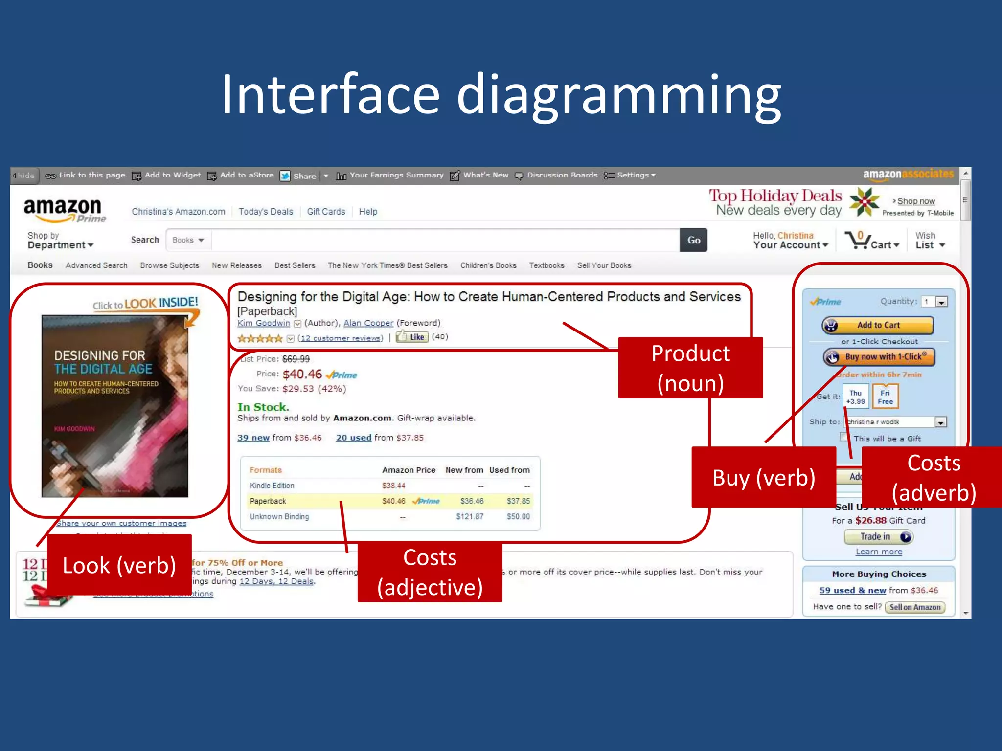
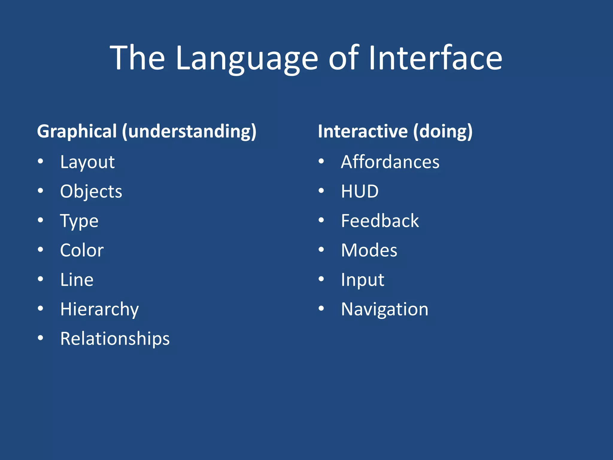

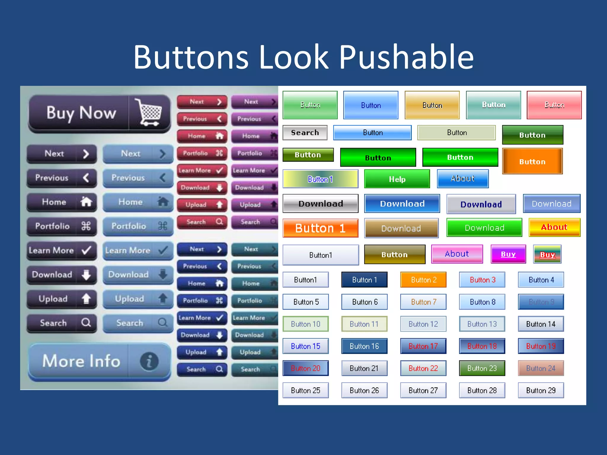
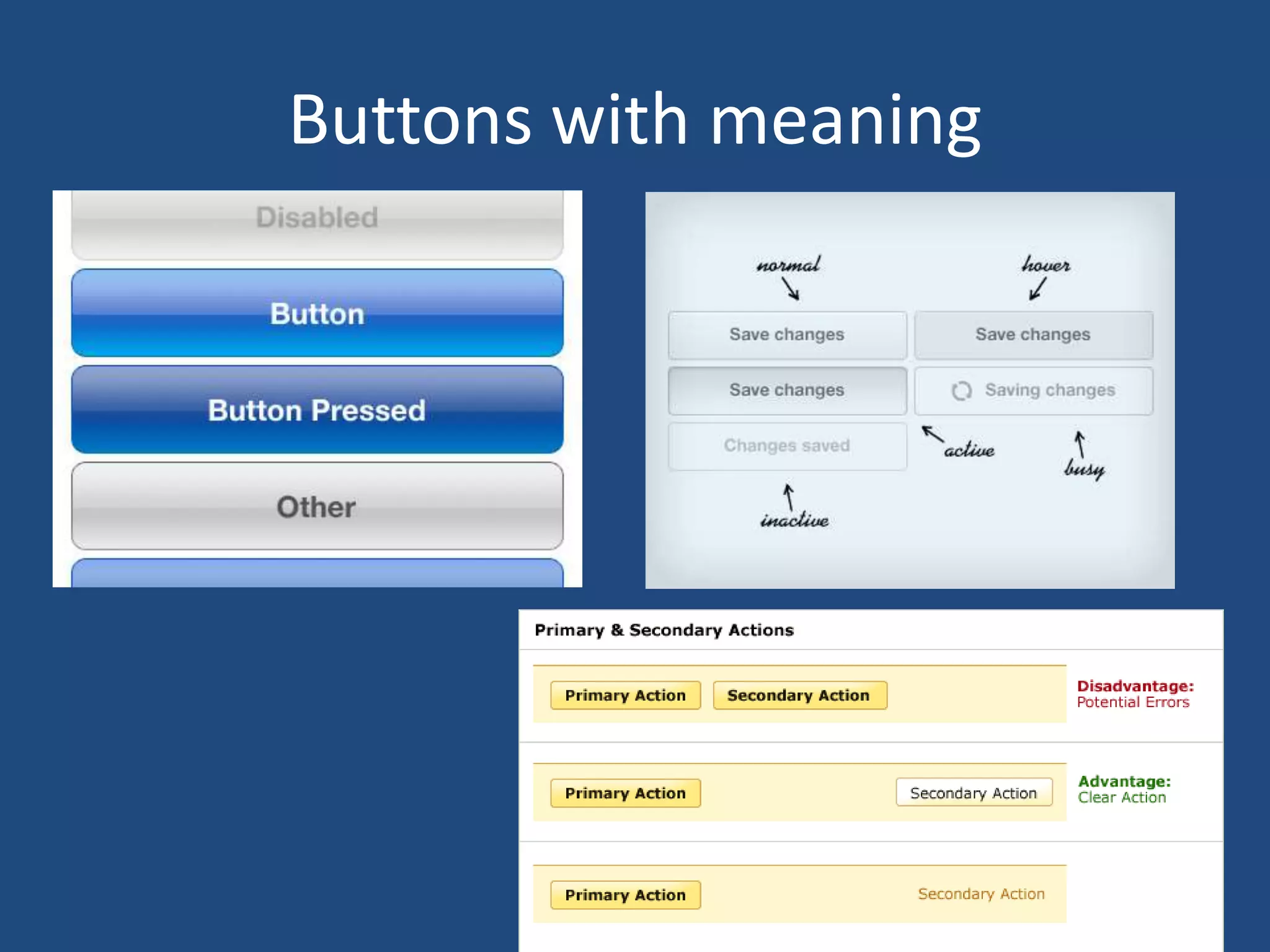
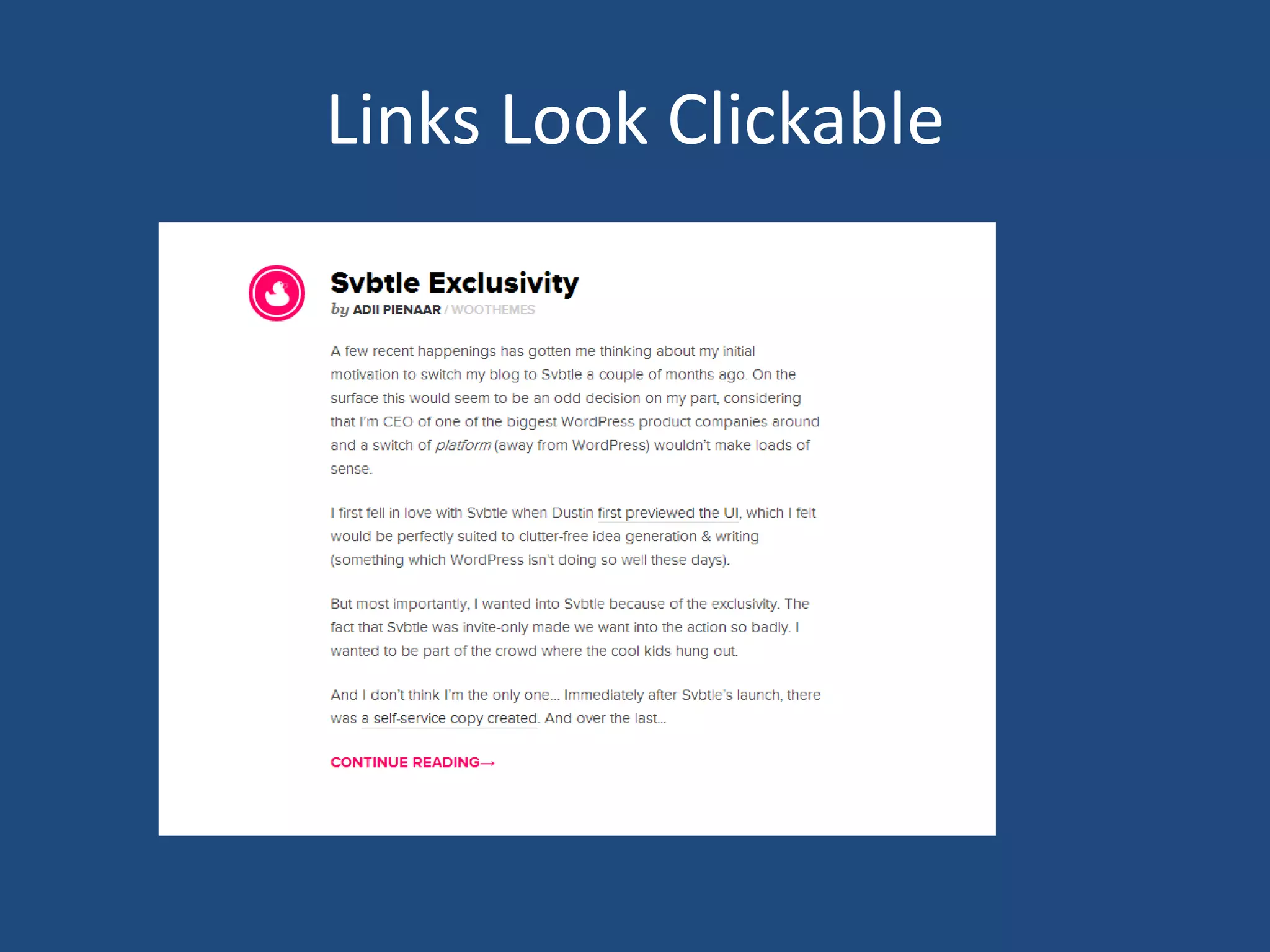
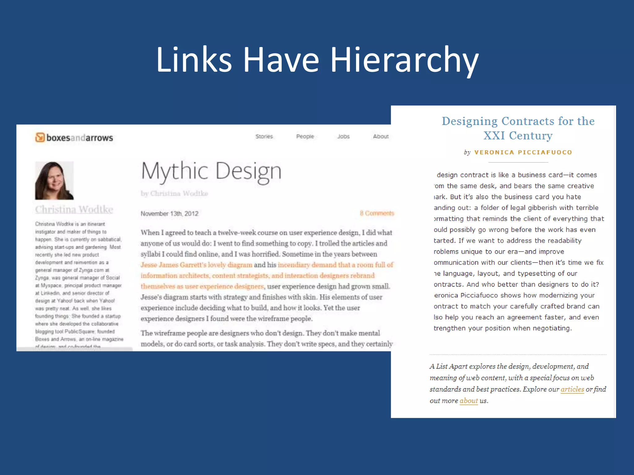
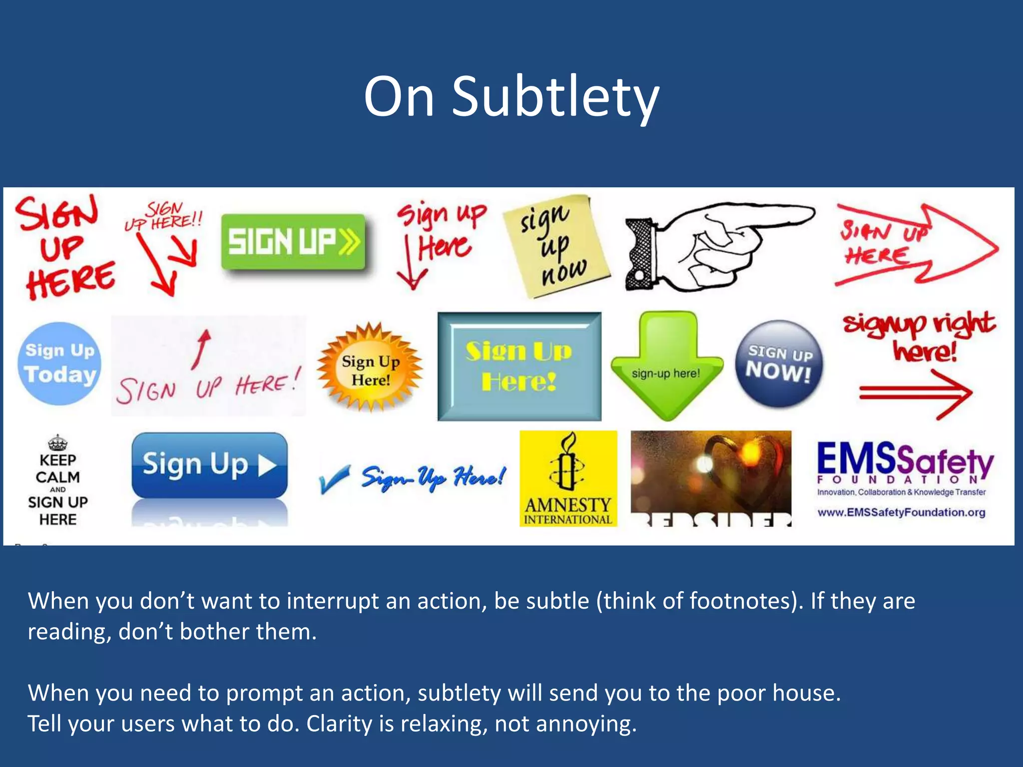
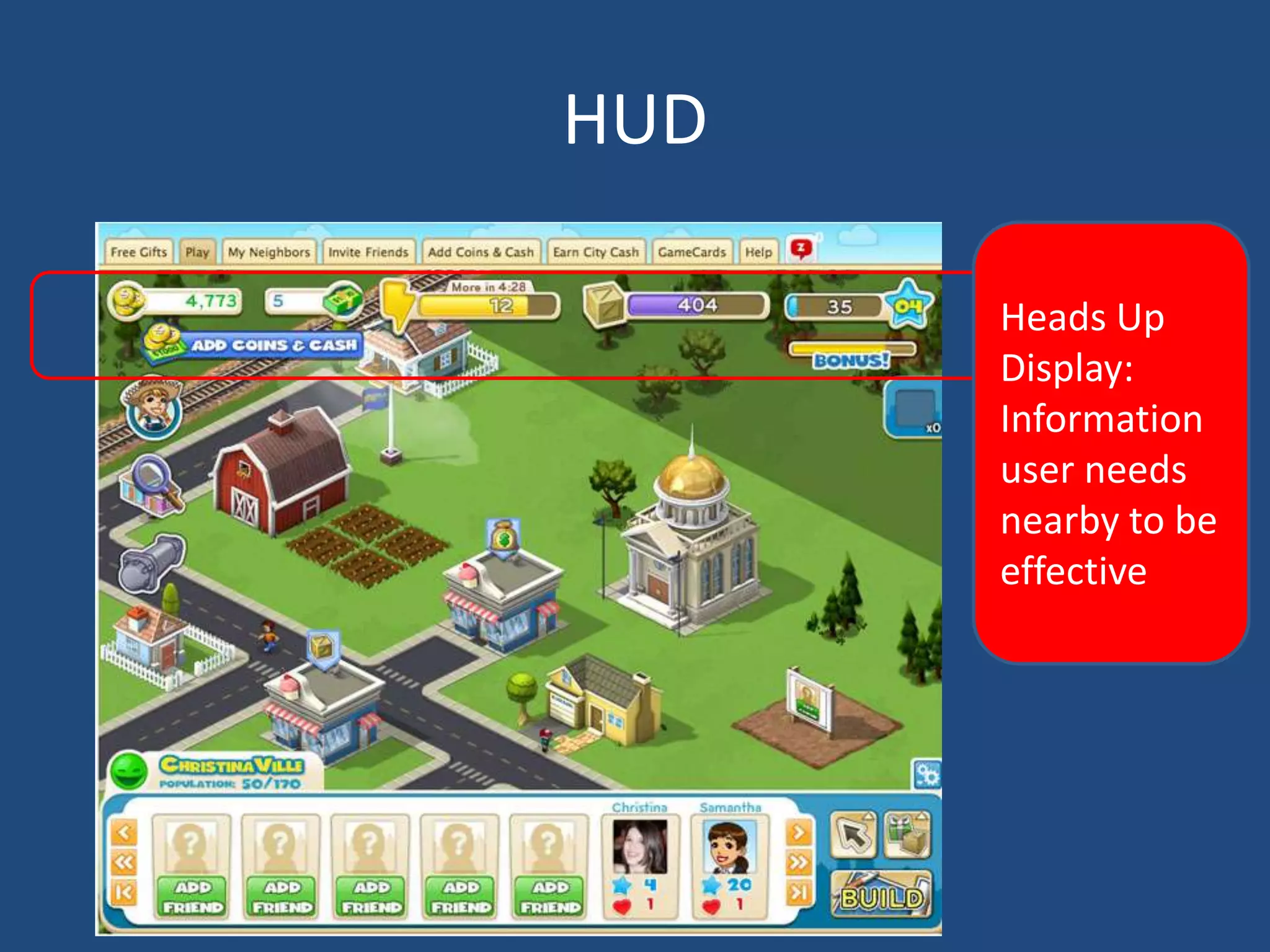


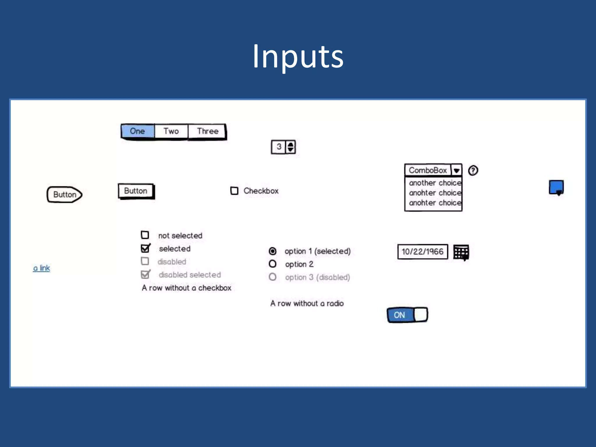
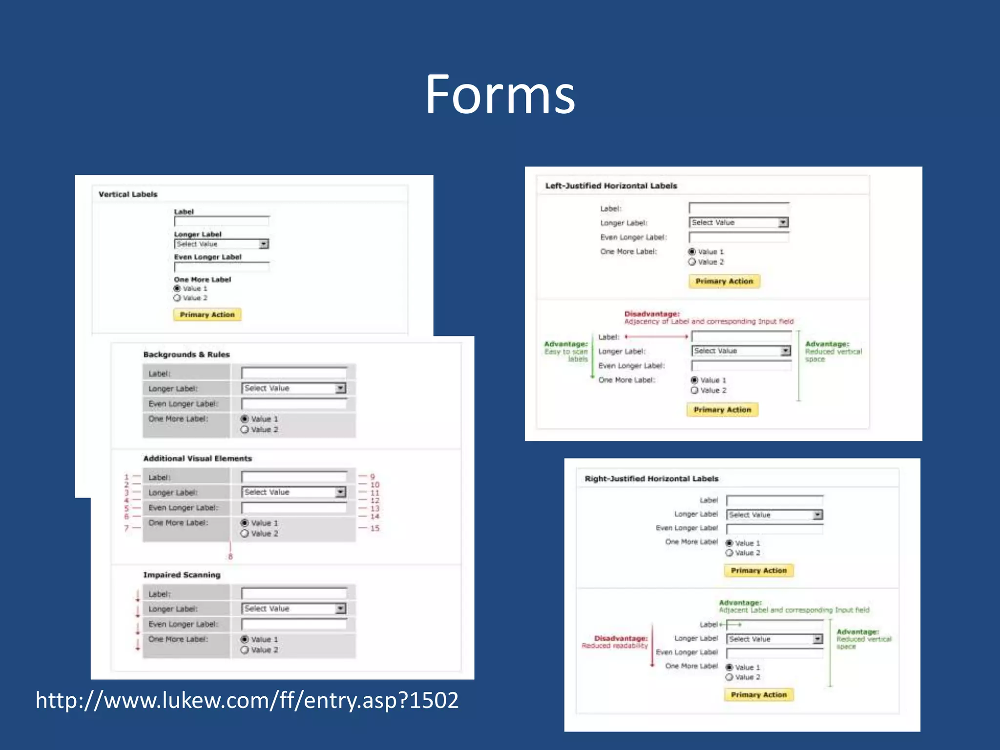
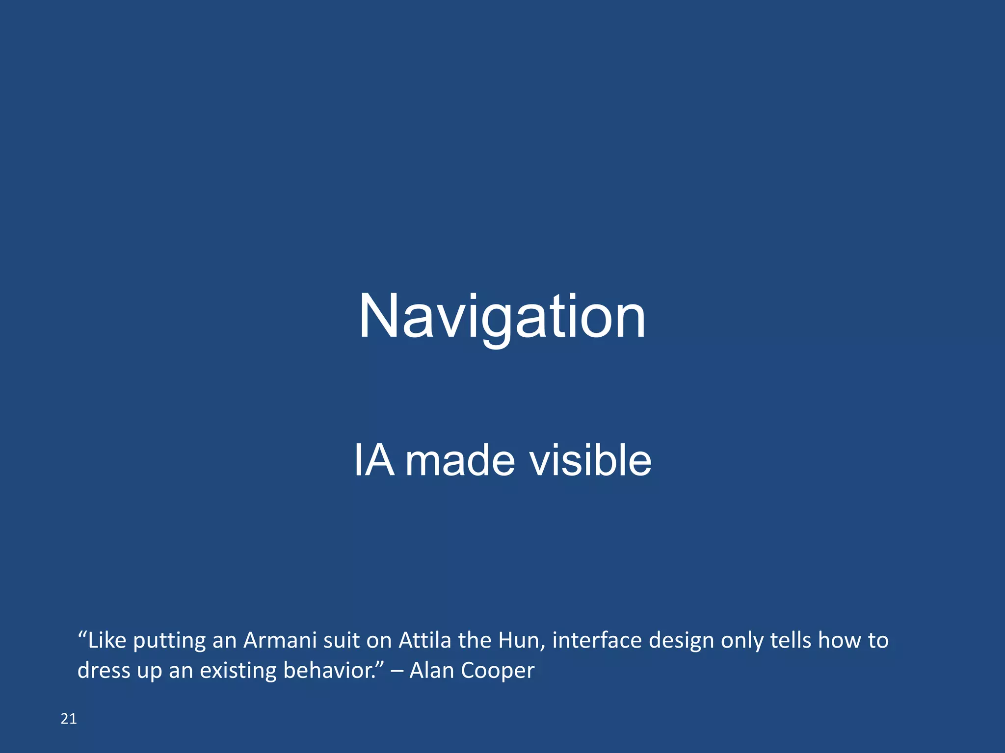

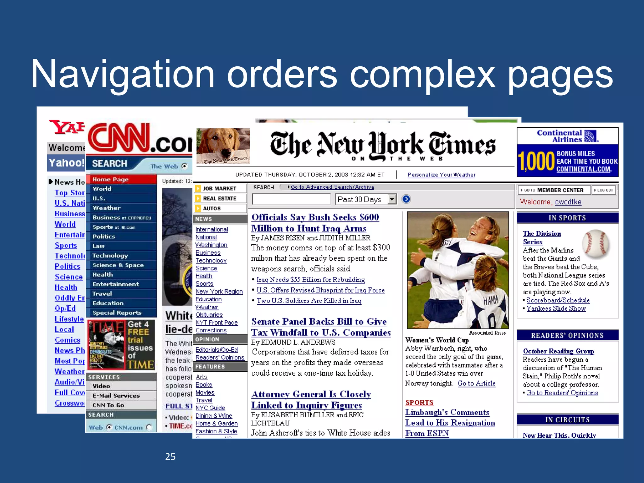
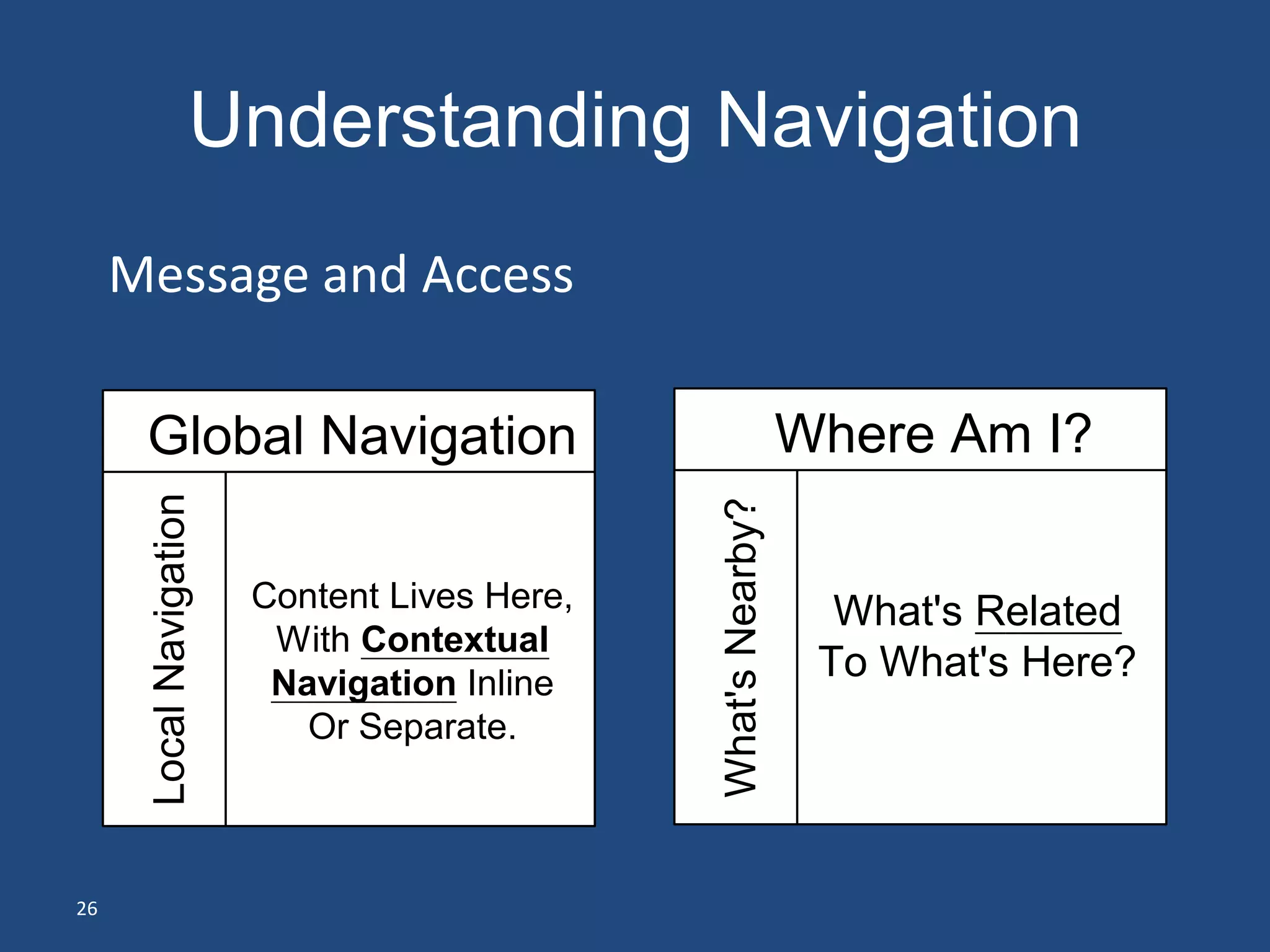

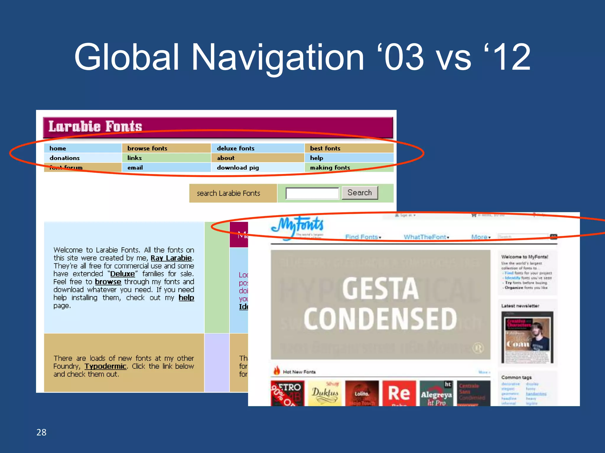


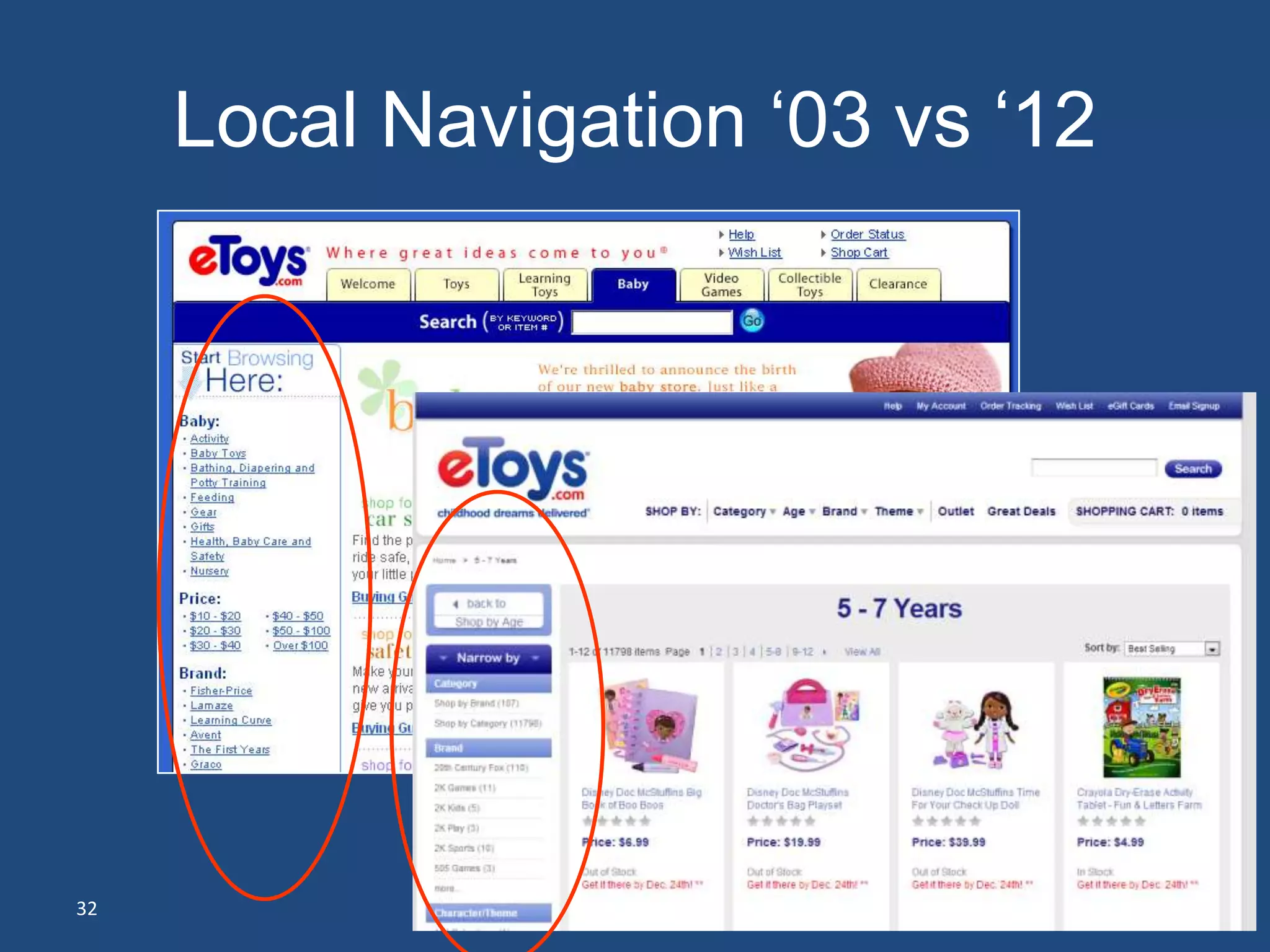

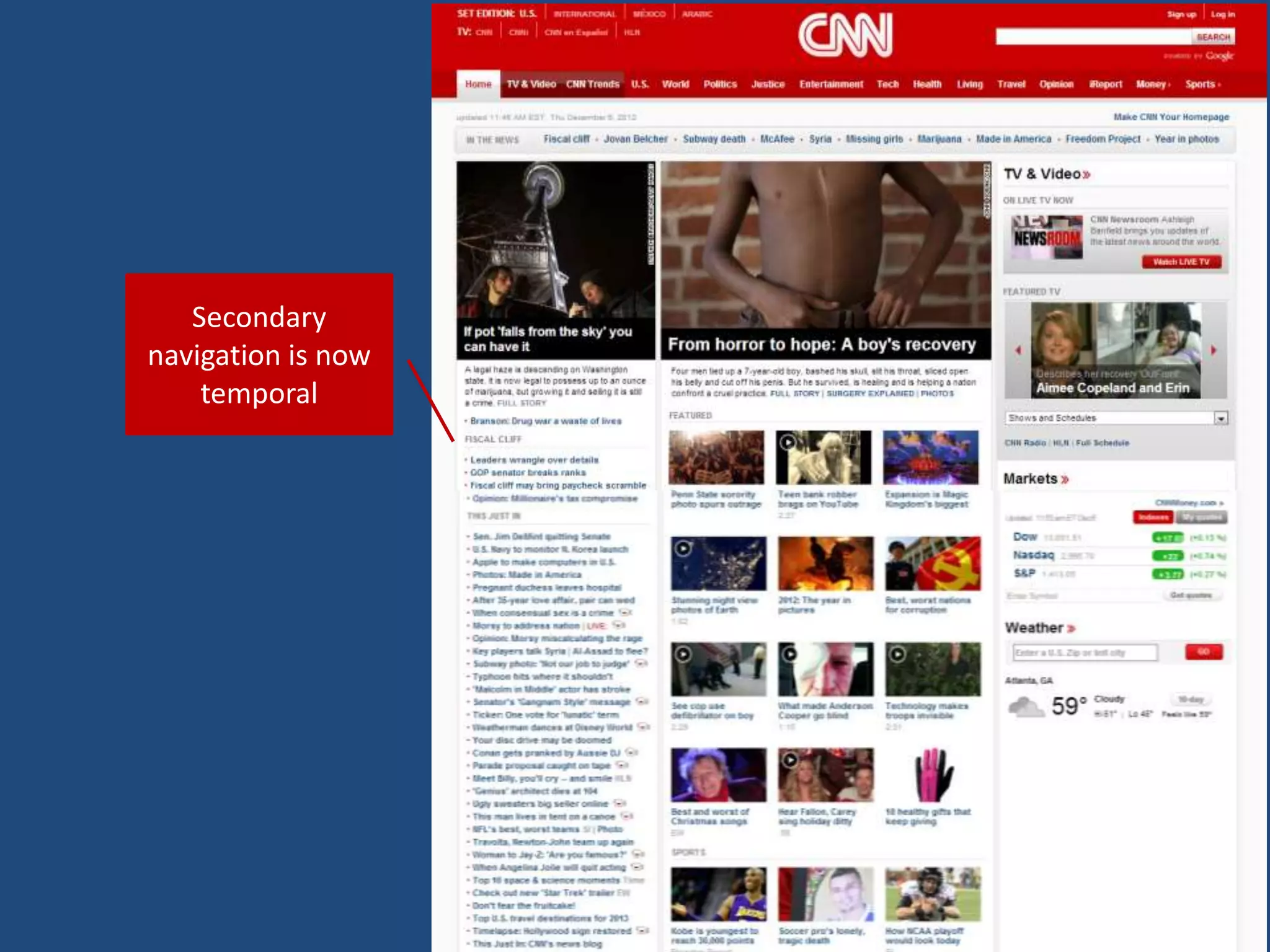
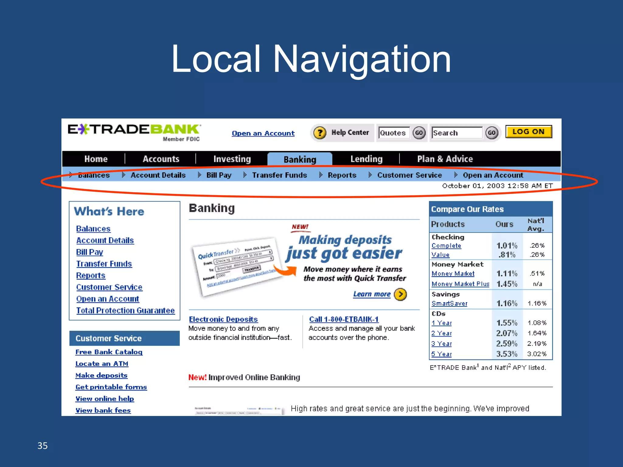


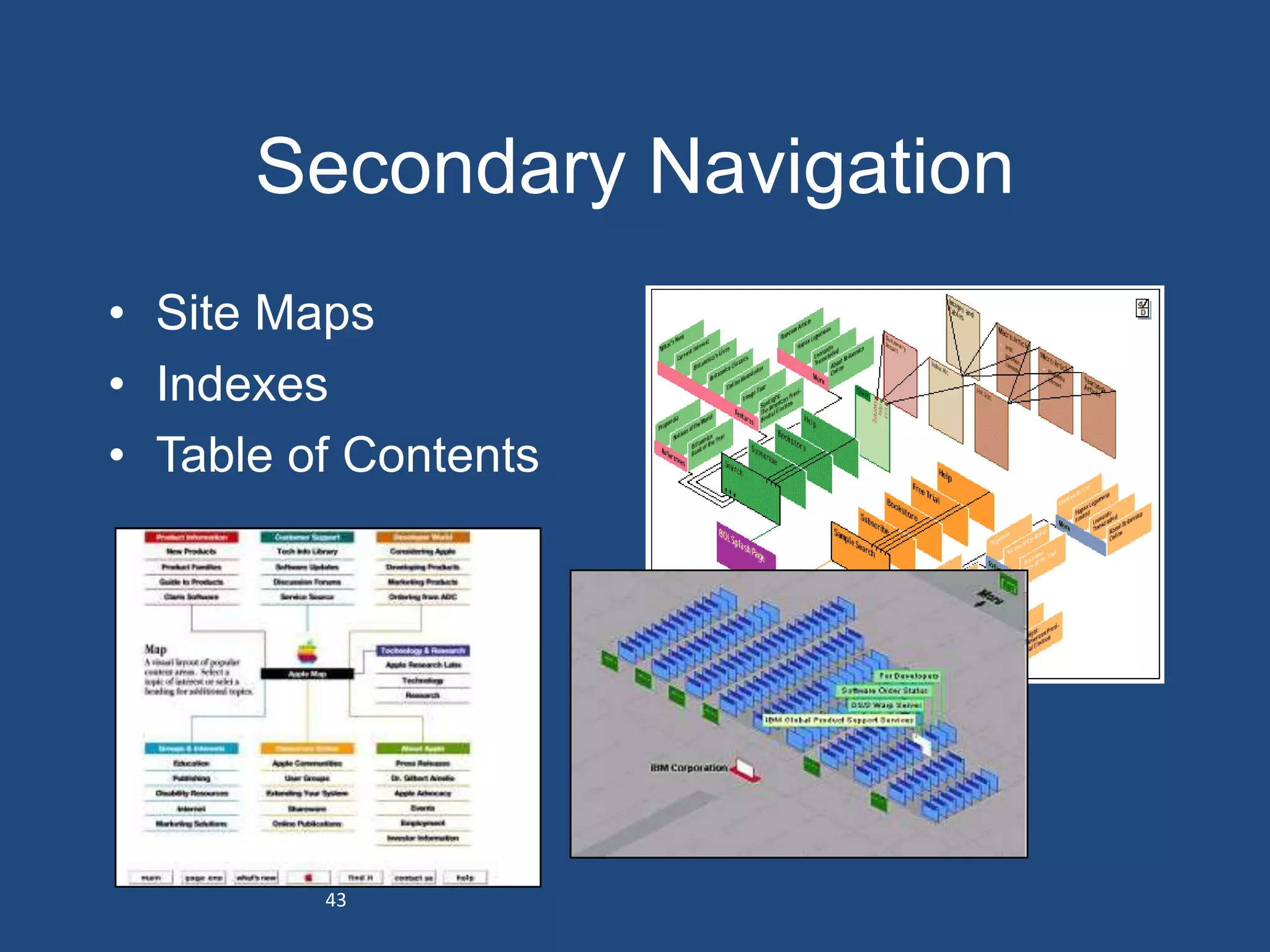

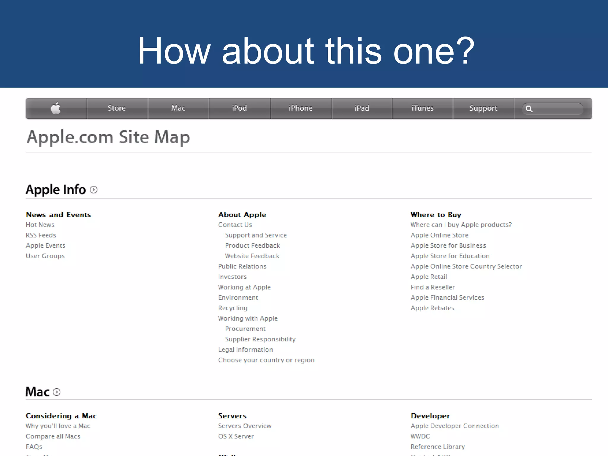
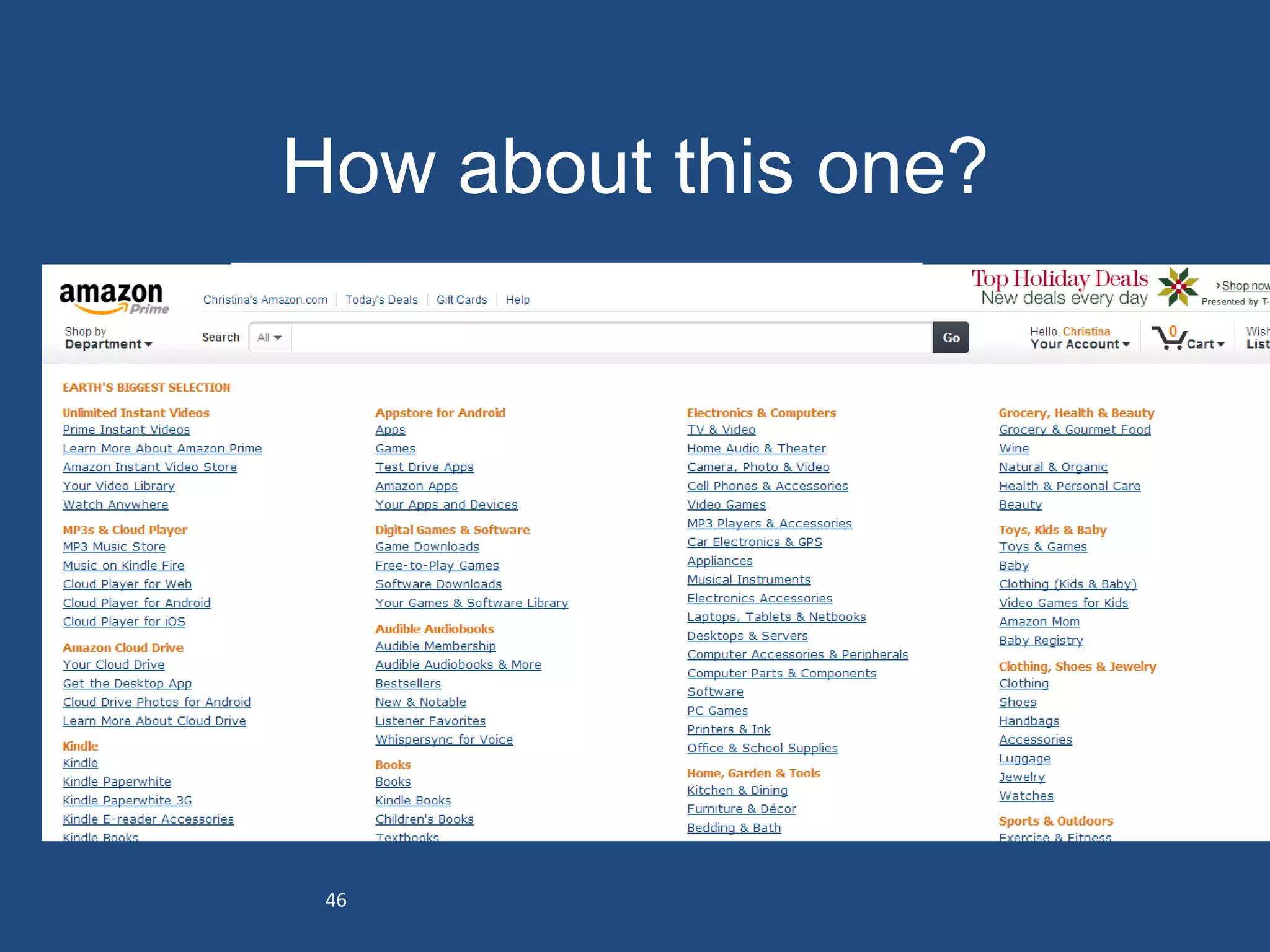
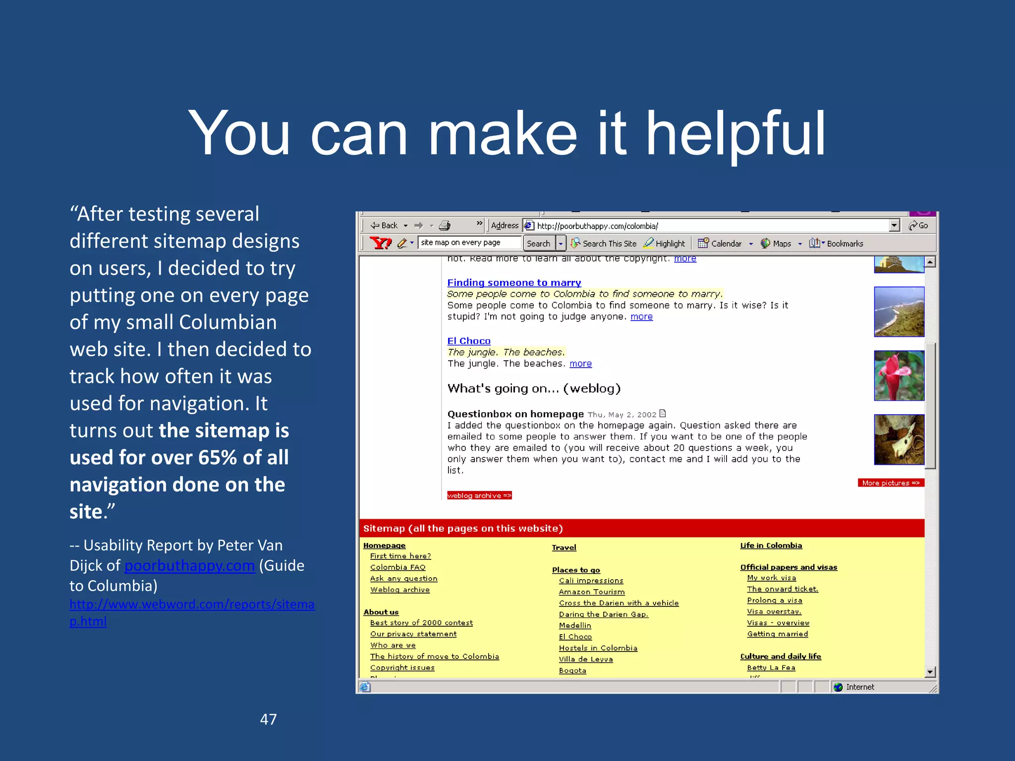


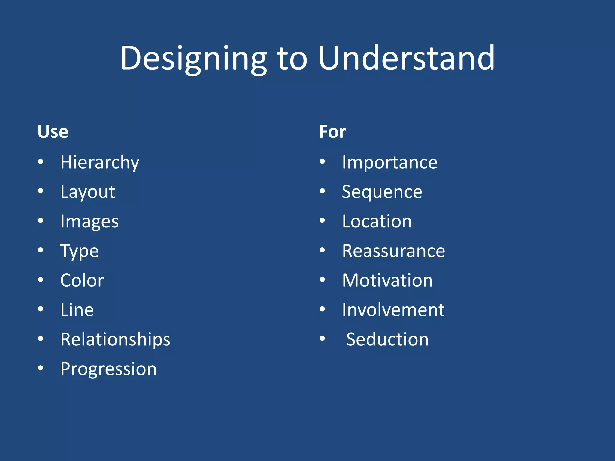


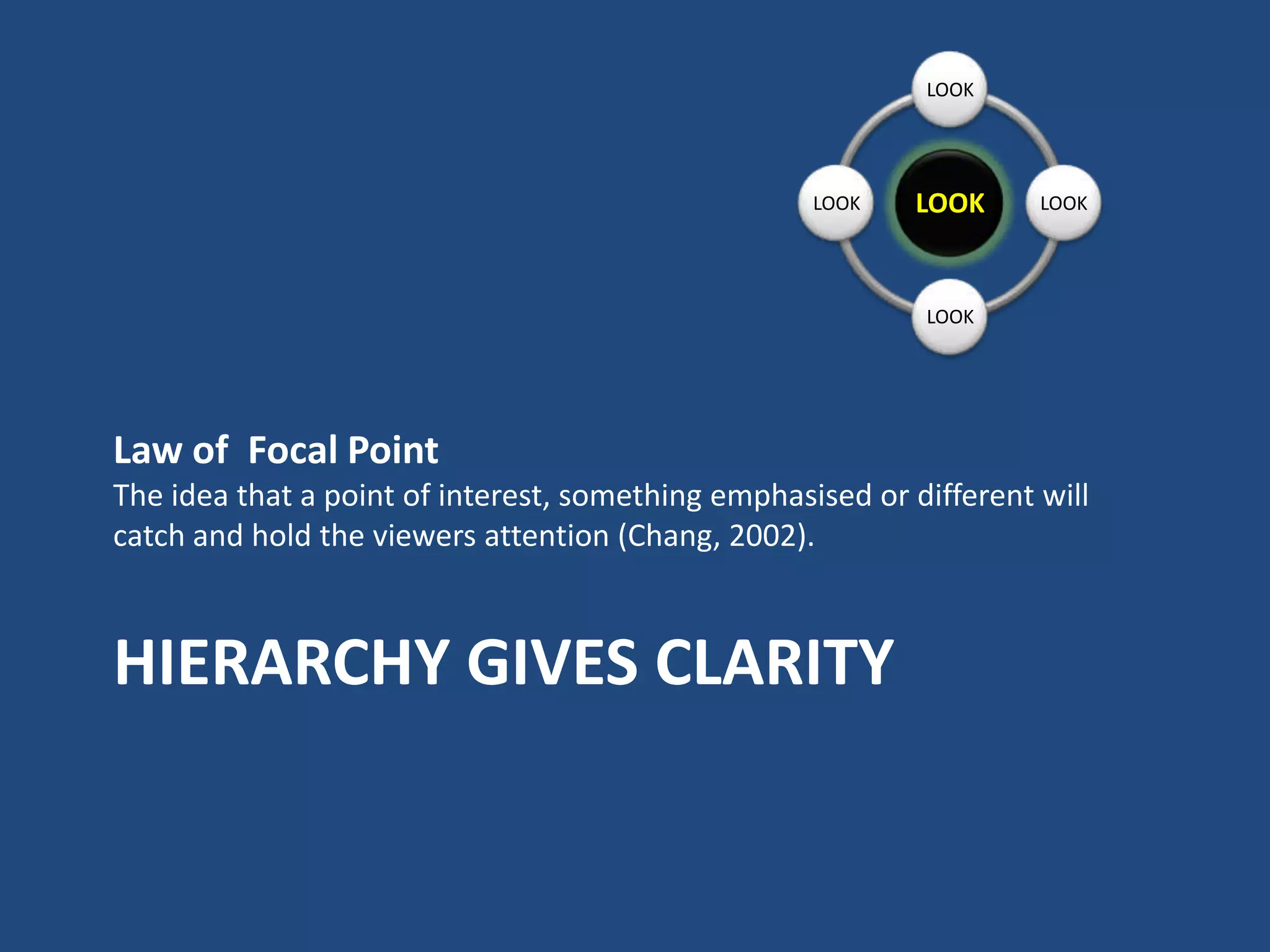

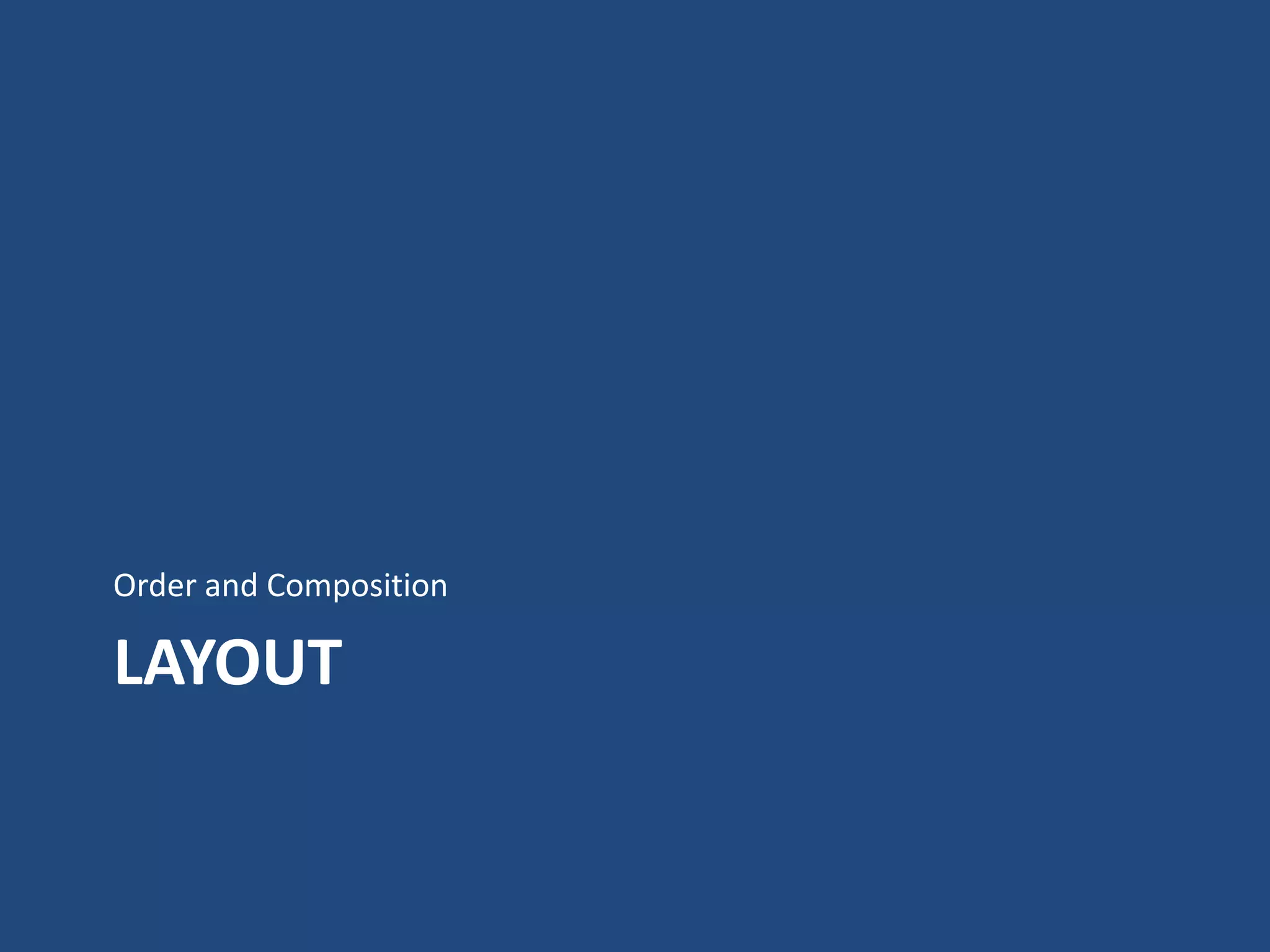


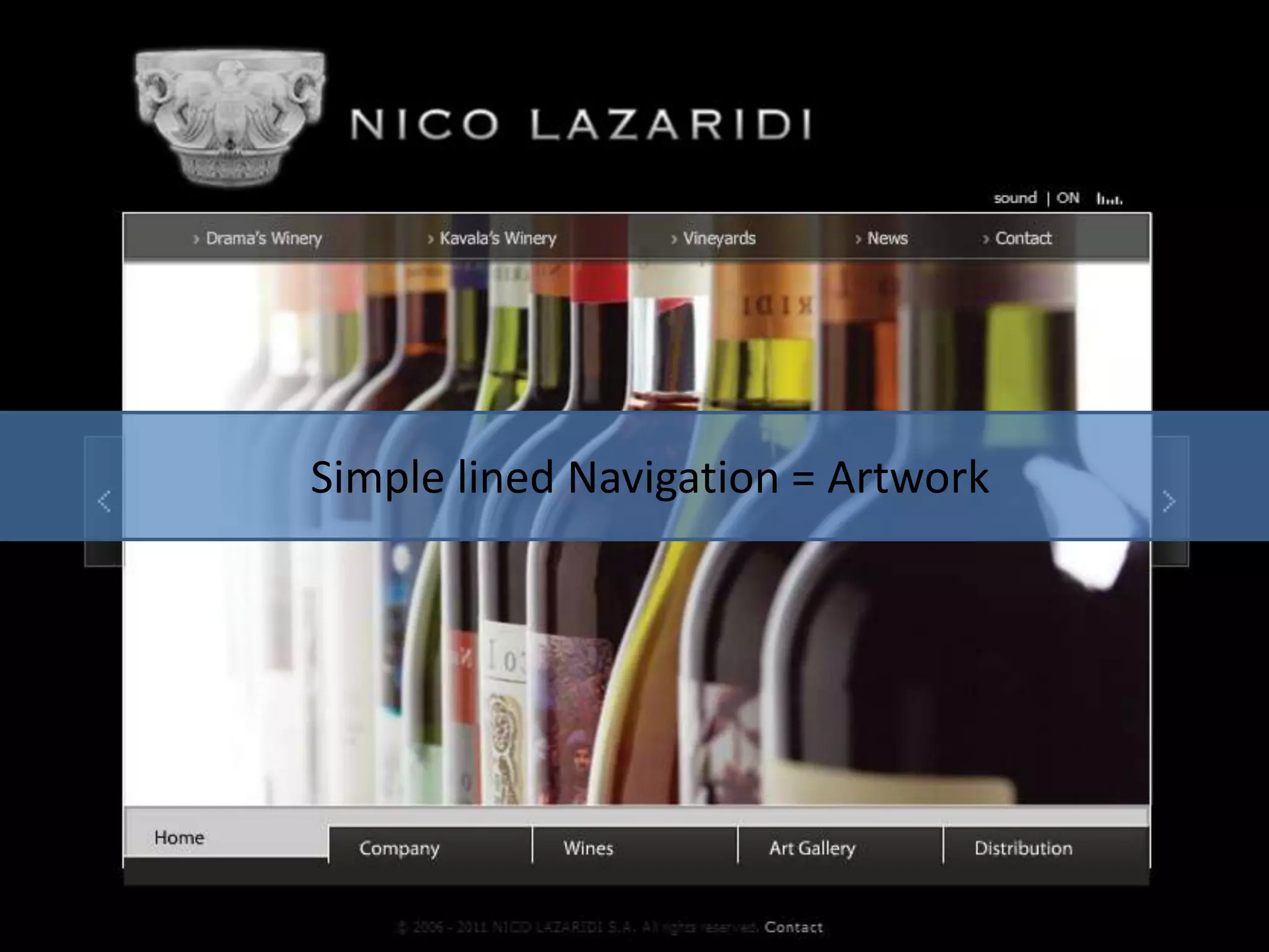
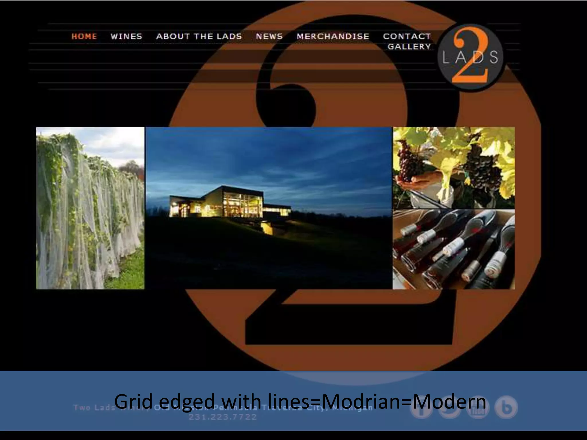


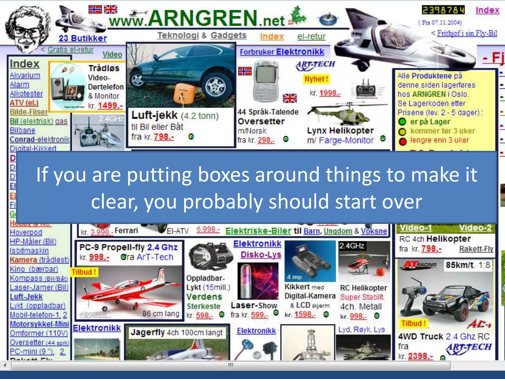


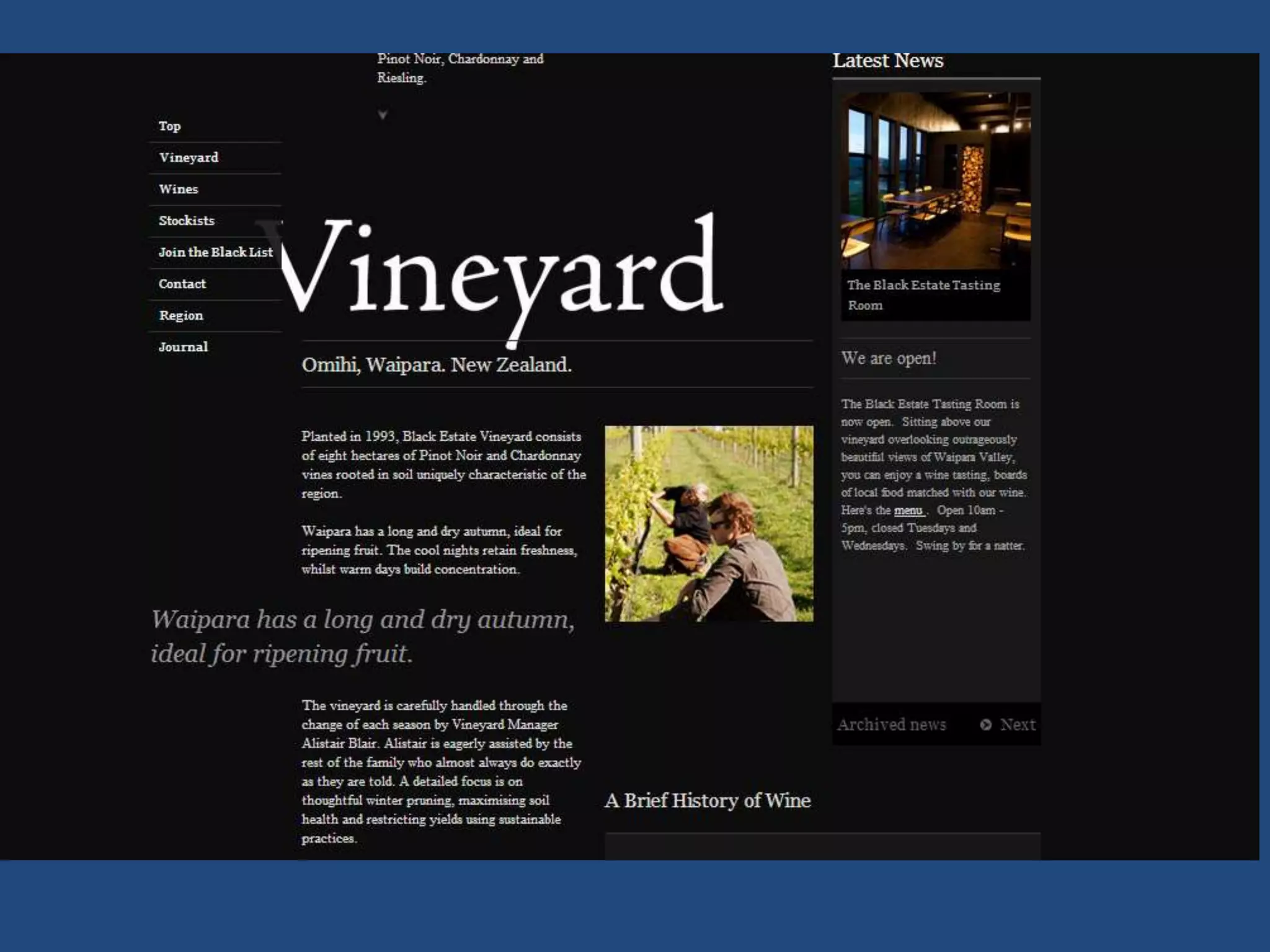
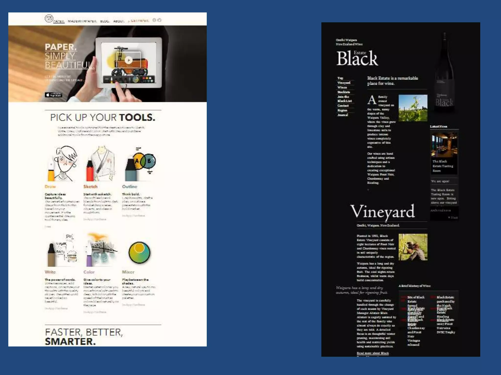


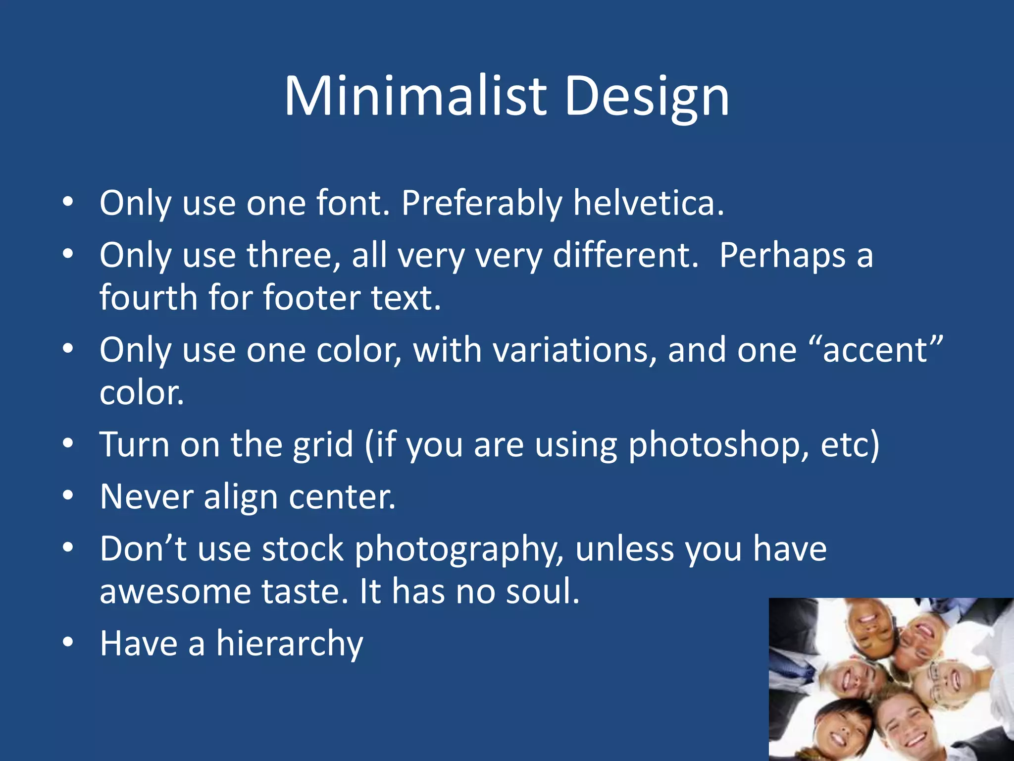
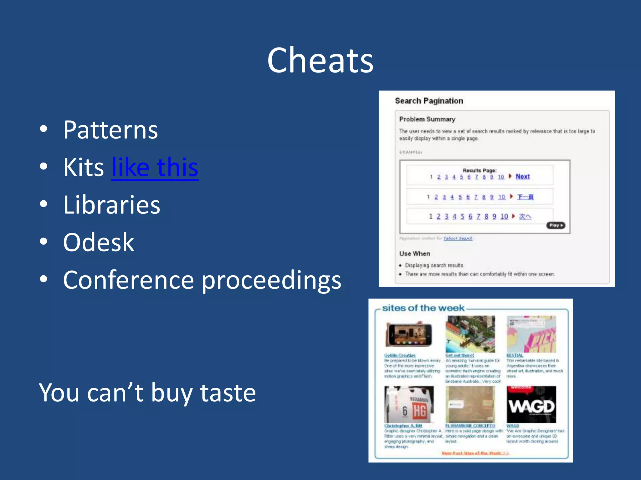

This document discusses core principles and considerations for designing interfaces, including: - The language of interfaces includes graphical elements like layout, objects, type, and color as well as interactive elements like affordances, heads-up displays (HUDs), feedback, input, and navigation. - Interactive interface design focuses on "doing" through affordances, buttons and links that look interactive, and subtle cues when user action is or isn't needed. - Effective navigation orders complex pages through global, local, contextual, and secondary navigation elements. - Graphic design principles like hierarchy, layout, type, color, line, relationships and progression are important for understanding. Minimalism, cheats and hacks can


![[BROCHURE] Italy Tour Project | @SlideON](https://cdn.slidesharecdn.com/ss_thumbnails/brochure8-251215152319-2805af68-thumbnail.jpg?width=640&height=640&fit=bounds)


