
Recommended
More Related Content
What's hot
What's hot (16)
Viewers also liked
Viewers also liked (20)
Similar to CSE 615 - Design Progression
Similar to CSE 615 - Design Progression (20)
Recently uploaded
Recently uploaded (20)
CSE 615 - Design Progression
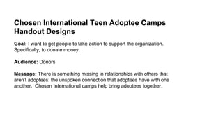
- 1. Chosen International Teen Adoptee Camps Handout Designs Goal: I want to get people to take action to support the organization. Specifically, to donate money. Audience: Donors Message: There is something missing in relationships with others that aren’t adoptees: the unspoken connection that adoptees have with one another. Chosen International camps help bring adoptees together.
- 3. Image: I wanted to direct my design towards my audience, donors, as clearly as possible. I’m going to assume that most of them aren’t adoptees, but I am sure they have experienced the feeling of being alone or singled-out. I want to bring up that image of loneliness, but then follow it up with the image of having fun, making friends, and belonging. Changes made from initial design to Design #2: ● In the end, I made quite a few changes. I decided that I should limit the text and let my images do the talking. ● Took out a couple pictures and then added one of a person sitting all alone. I wanted to help readers’ visualize the feeling of being alone and I thought that would be hard with three pictures of happy groups. ● Changed the font type and text background to match the images better ● Right aligned some text and centered the rest. ● Added text directing readers to a way they can learn more about how to impact adoptees.
- 5. Changes made from Design #2 to Design Set #3 (Alignment): ● Left aligned most of the text and made it so none of them are overlapping ● Used a different “belonging” image. ● Changed the bottom picture so it would match the top one in width and height (I thought it makes it look cleaner). ● Both images moved to the left and the related text is moved next to the images and top aligned. ● The call to action text was moved up and right aligned. ● Eliminated of the border and added horizontal lines. ● The first description lost its shaded box. I like this design and I think it is better in the sense that the alignment makes the design look organized and intentional. It also helps the viewer quickly see what is related. I like the call to action at the top because it is easier for the viewer to see and seems like less of an afterthought.
- 6. Design Set #3: Alignment
- 7. Changes made from Design Set #3 (Alignment) to Design Set #5 (Color): ● Added a banner to create contrast with the header text and background color. ● Changed the colors to better reflect the idea of being “chosen.” Purple is often associated with royalty and yellow is its complementary color. ● Changed the background color from grey to white to create a better contrast and make the complementary colors more prominent. ● Bolded the main header. ● Changed text sizes to create greater contrast: enlarged header texts (main and subheadings) and shrunk body text. ● Changed font types to be more uniform and professional. ● Got rid of the underlines. ● Flipped the girl to face the text, so your eyes are directed towards the text ● Moved the call to action to the top to make it more prominent. I like this design because of the striking contrast between the elements. The header background draws the eye to the poster and makes it look more attractive. Also, I think the new colors better fit the overall theme of our camps that we are a “chosen generation” and royalty in the kingdom of God.
- 8. Design Set #5: Color
- 9. Changes made from Design Set #5 to final design: ● Changed the direction of the banner and header text. ● Moved horizontal line and call to action text to accommodate the slanted banner. ● Changed font types to create contrast between the headings and body text. ● Changed font sizes to keep the contrast and hierarchy between the headings and body text. ● Edited the call to action text: bolded the email and web address to draw attention to them, got rid of the “www.,” and capitalized portions of it. This final design is more dynamic and interesting with the slanted header and font type. The text type is definitely more fun. In the future, I may change the heading text.
- 10. Final Design