Ashlee Foster_CSE 615_Assignment 9-4
•
0 likes•167 views

This presentation was created for the graduate course Designing Information at Western Oregon University. The process was iterative and continually revised weekly based on new concepts conveyed in the course (e.g. alignment, contrast, font style, message, proximity).

Recommended
More Related Content
Viewers also liked
Viewers also liked (20)
Similar to Ashlee Foster_CSE 615_Assignment 9-4
Similar to Ashlee Foster_CSE 615_Assignment 9-4 (20)
Recently uploaded
Recently uploaded (20)
Ashlee Foster_CSE 615_Assignment 9-4
- 1. Ashlee M. C. Foster | CSE 615 | Assignment 9-4
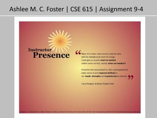
- 2. Your goal for this design… My goal for this design was to make the infographic professional, approachable, and easily understandable. The presentation of the artifact is important since it is targeting those who work in higher education. Therefore, the type of language used needed to represent the domain while remaining simple enough to follow. The information is chunked into sections according to a logical progression of frequently asked questions including 1) ‘What is it?’, 2) ‘Why is it important?’, 3) ‘How do I do it?’, 4) ‘What do I do?’. I attempted to create an approachable design through color, font, and graphics. The color is warm and radiates from the center. The font used for the primary title and sub-titles seems friendly and creative. The image used is an illustration of a light bulb which I hope conveys a level of innovation. Another goal is to demystify instructor presence. Often I see faculty get overwhelmed when they have to incorporating new principles or strategies into their courses. Understandably, continuous improvement can be overwhelming, so my intent was to make a snapshot of the concept and provide practical application tips which could be incorporated relatively easily. Your audience for this design… • The intended audience for the design is distance education faculty within higher education, graduate students, and instructional designers. Your message for this design… • Learning about a new concept doesn’t have to be an overwhelming experience. • These types of artifacts are here to support your professional development. • An incremental approach to incorporating new strategies is OK. • Small changes in the way instructors approach their courses can and do impact student’s learning experiences, engagement, environment, and success. • Small changes can make a difference.
- 4. Design Changes: •Changed the orientation to landscape •Expanded the second question and answer. •Used color to enhance the title and “meaningful enrichment” •Created an interconnected network •Added a red descriptive caption below each image •Added a white separating line for the footer •Added an image in the center of the example network
- 5. Design changes: •Grouping similar objects within physical proximity to one another •Each group was encapsulated under one of two categories •Red sub-titles were removed •Subtitles now appear as a list of examples under the sub-headings (i.e. categories) •Original “what is” narrative has been removed •A “Getting started” narrative has been incorporated •The image representing “timely & meaningful feedback” has been replaced
- 6. Design changes: •Title color changed to black •“Curating” is bolded and italicized •Gray header and footer widened and darkened •Light bulb image placed in top left corner •White thick separating stripes added •Section titles embedded into the white lines •Top subtitle color (i.e. In online education) is an exact match with the color in the light bulb •The category section titles are bolded, italics were removed, left aligned, and the color was matched with the header and footer. •The font color was changed to black for the “How can I….” and “Getting started..” sections. •Reframing of text in the “Getting started” section •Reframing of the example strategies to “active” and “static” •Elimination of example elements and incorporated one visual element for each •Added the separating divider with bulb like end caps to mimic the shape of the light bulb, and it is now the gray color used in the header and footer. •The white highlighting within category examples is eliminated. The font is now black, and the examples are bolded.
- 7. Design changes: •Background changed to a dark blue with a transparent gradient scheme •Added another separating line for the “Getting started” section •Added check mark images to the example columns •Increased the leading between examples •Increased the spacing between the example columns •Changed the separating lines to gray •Changed “Curating” and “In online education” to orange •Changed the font to white •Bolded the questions •Un-bolded the text blocks •Italicized sub-headings •Added an image at the bottom of the infographic which represents the two approaches meeting to facilitate meaningful enrichment.
- 8. Font changes: •Font #1: Rockwell •Category: Slab Serif •Location: Title, Sub-headings •Font #2: Arial •Category: Sans Serif •Location: Text Color scheme changes: •Category: Triad •Color #1: Light Blue Green (94,204,186) •Location: Background •Color #2: Dark Blue Green (46,127,114) •Location: Separating Lines Miscellaneous changes: •Text color is changed to black •Separating lines were decreased in length •Separating lines were alternated between left and right justified •New image added •“In online education” aligned with title
- 9. Font changes: •Font #1: Rockwell (130, 96, 80 point) •Category: Slab Serif •Location: Title, Sub-headings •Font #2: Verdana (66 & 60 point) •Category: Sans Serif •Location: Text Color scheme changes: •Used the light orange color in the image for the background color. •Used a transparent gradient design with the background color Miscellaneous changes: •“About” and “Getting started” blocks of text are indented. •Simplified the text •Aligned the examples with the sub-headings •Centered the checkmarks above the example columns •Centered the bottom image in the white space between the example columns. •Aligned the references with the “Active examples”