Morrissey Poster Designs
•Download as PPTX, PDF•
0 likes•162 views

CSE615 Winter Term, Dr. Bucy

Recommended
More Related Content
What's hot
Viewers also liked
Viewers also liked (20)
Similar to Morrissey Poster Designs
Similar to Morrissey Poster Designs (20)
Recently uploaded
Recently uploaded (20)
Morrissey Poster Designs
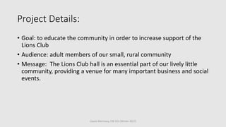
- 1. Project Details: • Goal: to educate the community in order to increase support of the Lions Club • Audience: adult members of our small, rural community • Message: The Lions Club hall is an essential part of our lively little community, providing a venue for many important business and social events. Cassie Morrissey, CSE 615 (Winter 2017)
- 2. Cassie Morrissey, CSE 615 (Winter 2017)
- 3. The next design, I focused heavily on the alignment of my layout. I also worked to make the language feel more relaxed (calling the hall a gathering place, rather than a venue) to appeal to our relaxed, rural community. I also explored with fonts (with poor results, it seems, haha) and worked to reduce my text to a more concise, list format to minimize the effort required to access the information. Cassie Morrissey, CSE 615 (Winter 2017)
- 4. Cassie Morrissey, CSE 615 (Winter 2017)
- 5. Cassie Morrissey, CSE 615 (Winter 2017) Next, I explored the use of color more boldly in my design. I used a monochromatic color scheme created with the blue I pulled from the Lions Club logo. I made use of repetition in heading styles, etc., in an attempt to create a cohesive design with a natural flow. I attempted to make use of proximity of photos to help support the text, but it is not as effective as I’d hoped.
- 6. Cassie Morrissey, CSE 615 (Winter 2017)
- 7. Cassie Morrissey, CSE 615 (Winter 2017) My next design had a few focuses. Again, I used repetition in heading styles. This time, I also added a repeated bullet image to my lists. I made use of casual fonts in an attempt to portray the Lions Club as a “casual, fun” organization. I added the dark blue bars on the top and bottom of the page to pull the eye downward and through the content. Alignment was clearly set to left justification throughout the design.
- 8. Cassie Morrissey, CSE 615 (Winter 2017)
- 9. Cassie Morrissey, CSE 615 (Winter 2017) For my final design, I used some of the components of several earlier designs to produce the last poster. I pulled the yellow background used in the previous design but reduced the intensity of the yellow background to a more comfortable hue. On the text that reads “Halfway Lions Club,” I chose a rich color of red to make it easier to read (as compared to yellow), and to draw the eyes to the text. As a general rule with this design, I omitted the drop shadows from the text. (which I’ve used in several previous designs), making the text clearer and easier to read. I also went back to make sure that all items had been purposefully aligned with another part of the design.
- 10. Final Poster Design Cassie Morrissey, CSE 615 (Winter 2017)