Unit-IV; Professional Sales Representative (PSR).pptx
Contents page annotation
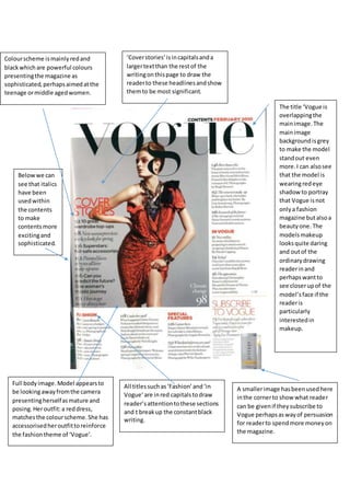
1. Colourscheme ismainlyredand
blackwhichare powerful colours
presentingthe magazine as
sophisticated,perhapsaimedatthe
teenage ormiddle agedwomen.
Full bodyimage.Model appearsto
be lookingawayfromthe camera
presentingherselfasmature and
posing.Heroutfit:a reddress,
matchesthe colourscheme.She has
accessorisedheroutfittoreinforce
the fashiontheme of ‘Vogue’.
‘Coverstories’isincapitalsanda
largertextthan the restof the
writingonthispage to draw the
readerto these headlinesandshow
themto be most significant.
All titlessuch as‘Fashion’and‘in
Vogue’are inred capitalstodraw
reader’sattentiontothese sections
and t breakup the constantblack
writing.
Belowwe can
see that italics
have been
usedwithin
the contents
to make
contentsmore
excitingand
sophisticated.
A smallerimage hasbeenusedhere
inthe cornerto show what reader
can be givenif theysubscribe to
Vogue perhapsaswayof persuasion
for readerto spendmore moneyon
the magazine.
The title ‘Vogue is
overlappingthe
mainimage.The
mainimage
backgroundisgrey
to make the model
standout even
more.I can alsosee
that the model is
wearingredeye
shadow to portray
that Vogue isnot
onlya fashion
magazine butalsoa
beautyone. The
modelsmakeup
looksquite daring
and outof the
ordinarydrawing
readerinand
perhapswantto
see closerupof the
model’sface if the
readeris
particularly
interestedin
makeup.
2. Main coloursusedare orange and
black.The titlesappearto be orange
and ina largertextthanthe smaller
titlestodraw attentiontothemand
to summarise the titleswhichare
goingto be underneath.If the
readerhas the magazine tofocuson
home designsthentheywillbe able
to findthese pageseasilybyusing
the contents
Three imagesina row have been
used.Each image isdifferent
showingdifferentviewsof ahome.
Each picture looksappetisingand
usesinterestingcolourstobrighten
the contentsup andappeal to the
reader.
The picturesused
showhouseswhich
lookwealthyand
quite poshperhaps
showingthatthis
readerisaimedmore
at the wealthier
home ownerswho
enjoyinteriordesign.
At the bottomI can see a website is
on the page showingthatif the
readerwantsto findoutmore the
readerhas online resourcesthatare
alsoavailable.
Brightblue andgreen
has beenusedinthis
image makingthe
contentscolourful.If
a dark greysky had
beenusedthenit
would’ve made the
house lookless
appealing.
Contentshasbeenclearlylaidout
withnumbersatthe side,titlesin
capitalsandextrainformation
underneathmakingthe contents
easyto use and clear.
3. Here I can see that actual food
products:pepperandtomatohas
beenusedasthe main title
reinforcingthe ideathatthisisa
foodmagazine andmakingthe
contentsmore intriguing,funfor
the readerinsteadof havingjusta
normal fontfor the title.Thisis
more artisticand creative.
The main coloursusedare green and
black.Greenisa typical colourrelated
to vegetablesperhapspresentingthe
magazine asquite a healthymagazine.
Greenwe can see isusedregularlyin
the picturesdownthe side andalsoas a
border-likeimage atthe bottom.
The titlesonthiscontentspage are in
Italics.Italicstendtobe usedon the
namesof dishesinposh,expensive
restaurantsperhapsshowingthe recipes
usedinthe magazine use expensive
ingredients,fancyfood.The contents
has overall been laidoutlikeamenu
linkingtothe foodtheme.
The fourth image showndown
the right handside of the
contentsisof cupcakesthatlook
like theyhave beendecoratedto
looklike witcheshatsperhaps
portrayingthatthis magazine
was issuedaroundHalloween.
Thiswouldalsoexplainthe
constantuse of the colourgreen.
The contentsisa
double page which
because of my
researchI foundquite
unusual asthe
contentsisnormallya
single page.However
the double page I
believemakesitlook
more spreadout and
clear.
4. The main colourscheme usedis
yellowandwhite.Thesecolours
massivelystandoutfromthe dull
greybackgroundmakingthe
contentseasyto readand clear.
The main image isof a cat lookingaway
fromthe camera.We can see mostof
the cat’s body.The cat lookswell fed
and lookedaftershowingthatthis
magazine isperhapsaimedatpeople
whohave petcats or are lookingtobuy
a cat.
Againthe contents
has beenclearlylaid
out withnumbers
downthe side to
showthe page
numbersanda title in
capital,large letters
witha summary/small
insightunderneath.
The cat shownisa tabby
cat whichis a popularcat
normallykeptasa pet by
familiesshowingthatthis
magazine isperhaps
aimedat familieslooking
for a petcat? The cat is
lookingawaymakingthe
picture indirect.
The cat’s eyesare yellowish
matchingthe colourscheme.The
cat’s furis mostlya greyishcolour
againmatchingthe colour scheme
whilststandingoutfromthe
background.
The magazine appearsto be called
Cat Fancy as thisisin capital letters
and alsomatchesthe colour
scheme. The word‘Fancy’shows
that thisisa magazine perhaps
aimedat more poshgenerations.