
Recommended
More Related Content
What's hot
What's hot (20)
Viewers also liked
Viewers also liked (20)
Similar to Front cover designs of magazines
Similar to Front cover designs of magazines (20)
More from charlie_99Xx
More from charlie_99Xx (20)
Recently uploaded
Recently uploaded (20)
Front cover designs of magazines
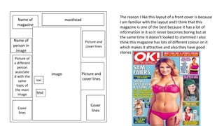
- 1. Name of magazine masthead Picture and cover lines Picture and cover lines Cover lines image Name of person in image Cover lines Picture of a different person associate d with the same topic of the main image The reason I like this layout of a front cover is because I am familiar with the layout and I think that this magazine is one of the best because it has a lot of information in it so it never becomes boring but at the same time it doesn’t looked to crammed I also think this magazine has lots of different colour on it which makes it attractive and also they have good stories inside. text text
- 2. masthead image Info and name of image Cover lines Cover lines Cover lines text I like this layout of this magazine because it looks very formal, it isn’t all over the place and looks very structural. It sticks to the colour theme, the typography is the same and uses a thin font through out.
- 3. Masthead Cover lines Cover lines puff Cover lines I like this layout pf this magazine because I think it is very formal. It think this magazine cover is a good lay out because it has a lot of key information on the front which will draw in the readers attention and also it the information is also key to the theme of the magazine.