
Recommended
More Related Content
What's hot
What's hot (16)
Viewers also liked
Viewers also liked (20)
Similar to Mixed genre contents mrs robbins media
Similar to Mixed genre contents mrs robbins media (20)
More from charlie_99Xx
More from charlie_99Xx (18)
Recently uploaded
Recently uploaded (20)
Mixed genre contents mrs robbins media
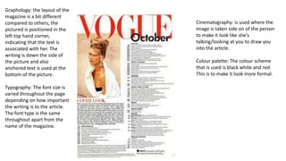
- 1. Graphology: the layout of the magazine is a bit different compared to others, the pictured is positioned in the left top hand corner, indicating that the text is associated with her. The writing is down the side of the picture and also anchored text is used at the bottom of the picture. Typography: The font size is varied throughout the page depending on how important the writing is to the article. The font type is the same throughout apart from the name of the magazine. Cinematography: is used where the image is taken side on of the person to make it look like she's talking/looking at you to draw you into the article. Colour palette: The colour scheme that is used is black white and red. This is to make it look more formal.
- 2. Graphology: The layout has more pictures than writing in this article because its talking about food it is to draw in the reader and make them more interested in making these dishes. Typography: The font used is very small and a lot of short sentences are used to make what the writer is saying more easier to understand. The font sizes used are varied depending on how important it is. Mode of address: the address is direct to cookers that would like new ideas or families that would like to cook more meals for their family. Anchorage text is used so that the readers can clearly understand what the writing is about. Cinematography: The pictures that are used are directed at the writing to try and interest readers in following up with what the article is saying. Colour pallet: There are mainly lights colours used throughout apart from the writing.
- 3. Colour pallet: the colour scheme used is light blue, red, black, grey and white. This is so that there is a consistent structure throughout the magazine. Graphology: The layout is structured so that the pictures go with the small paragraphs of writing. Typography: The font is the same throughout but the sizes vary depending on the importance of the writing. Mode of address: The address of this magazine is indirect as it is taking to a verity of different people.
- 4. Graphology: The layout is set out so that the images related to the text is on the left hand side with bits of important information next to it, however the main bits of writing is on the right hand side of the article and the title is in larger text in the top left hand corner. Typography: The font varies on this with the writing being smaller next to images and larger when it is on its own. Anchorage text is also used. Mode of address: is direct to women who like to wear makeup. Colour palette: The colours used are orange, yellow, red, white and black this is the same colour theme used on the title of the article.