Enhancing Worker Digital Experience: A Hands-on Workshop for Partners
Kerrang Contents Page
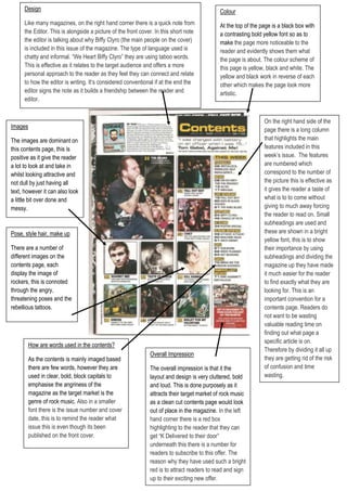
1. Overall Impression The overall impression is that it the layout and design is very cluttered, bold and loud. This is done purposely as it attracts their target market of rock music as a clean cut contents page would look out of place in the magazine. In the left hand corner there is a red box highlighting to the reader that they can get “K Delivered to their door” underneath this there is a number for readers to subscribe to this offer. The reason why they have used such a bright red is to attract readers to read and sign up to their exciting new offer.How are words used in the contents?As the contents is mainly imaged based there are few words, however they are used in clear, bold, block capitals to emphasise the angriness of the magazine as the target market is the genre of rock music. Also in a smaller font there is the issue number and cover date, this is to remind the reader what issue this is even though its been published on the front cover.Pose, style hair, make up There are a number of different images on the contents page, each display the image of rockers, this is connoted through the angry, threatening poses and the rebellious tattoos.On the right hand side of the page there is a long column that highlights the main features included in this week’s issue. The features are numbered which correspond to the number of the picture this is effective as it gives the reader a taste of what is to to come without giving to much away forcing the reader to read on. Small subheadings are used and these are shown in a bright yellow font, this is to show their importance by using subheadings and dividing the magazine up they have made it much easier for the reader to find exactly what they are looking for. This is an important convention for a contents page. Readers do not want to be wasting valuable reading time on finding out what page a specific article is on. Therefore by dividing it all up they are getting rid of the risk of confusion and time wasting.ImagesThe images are dominant on this contents page, this is positive as it give the reader a lot to look at and take in whilst looking attractive and not dull by just having all text, however it can also look a little bit over done and messy. DesignLike many magazines, on the right hand corner there is a quick note from the Editor. This is alongside a picture of the front cover. In this short note the editor is talking about why Biffy Clyro (the main people on the cover) is included in this issue of the magazine. The type of language used is chatty and informal. “We Heart Biffy Clyro” they are using taboo words. This is effective as it relates to the target audience and offers a more personal approach to the reader as they feel they can connect and relate to how the editor is writing. It’s considered conventional if at the end the editor signs the note as it builds a friendship between the reader and editor.ColourAt the top of the page is a black box with a contrasting bold yellow font so as to make the page more noticeable to the reader and evidently shows them what the page is about. The colour scheme of this page is yellow, black and white. The yellow and black work in reverse of each other which makes the page look more artistic. 10191751457325